
A toggle switch is a stylish and interactive UI component often used for dark mode toggles, settings controls, and other interactive elements on a website. In this guide, you’ll learn how to create a fully customizable toggle switch using HTML, CSS, and JavaScript with smooth animations and a modern look. 🚀
Why Use a Toggle Switch?
A toggle switch is more user-friendly than a traditional checkbox or button. It provides a smooth UI experience and is commonly used for:
✔️ Dark Mode Toggles
✔️ Settings & Preferences
✔️ Enable/Disable Features
✔️ Interactive UI Components
Now, let’s build one from scratch! 🎨
Step 1: Creating the HTML Structure
First, create an index.html file and add the following code:
htmlCopyEdit<!DOCTYPE html>
<html lang="en">
<head>
    <meta charset="UTF-8">
    <meta name="viewport" content="width=device-width, initial-scale=1.0">
    <title>Customizable Toggle Switch</title>
    <link rel="stylesheet" href="style.css">
</head>
<body>
    <h1>Customizable Toggle Switch</h1>
    <div class="toggle-container">
        <label class="toggle-switch">
            <input type="checkbox" class="toggle-input">
            <span class="toggle-slider"></span>
        </label>
        <span class="toggle-label">Toggle Mode</span>
    </div>

    <script src="script.js"></script>
</body>
</html>
This basic structure contains:
✅ A toggle switch container
✅ A checkbox input to handle toggle functionality
✅ A slider span that visually represents the switch
Step 2: Styling the Toggle Switch with CSS
Create a style.css file and add the following CSS:
cssCopyEditbody {
    display: flex;
    flex-direction: column;
    justify-content: center;
    align-items: center;
    height: 100vh;
    background-color: #f4f4f4;
    font-family: Arial, sans-serif;
}

h1 {
    margin-bottom: 70px;
    color: #333;
}

.toggle-container {
    display: flex;
    align-items: center;
    gap: 10px;
}

.toggle-switch {
    position: relative;
    width: 70px;
    height: 34px;
}

.toggle-input {
    opacity: 0;
    width: 0;
    height: 0;
}

.toggle-slider {
    position: absolute;
    top: 0;
    left: 0;
    right: 0;
    bottom: 0;
    background-color: #ccc;
    border-radius: 34px;
    transition: 0.4s;
    box-shadow: inset 0 0 5px rgba(0, 0, 0, 0.2);
}

.toggle-slider::before {
    content: "";
    position: absolute;
    width: 30px;
    height: 30px;
    left: 2px;
    bottom: 2px;
    background-color: white;
    border-radius: 50%;
    transition: 0.4s;
    box-shadow: 0 2px 5px rgba(0, 0, 0, 0.3);
}

.toggle-input:checked + .toggle-slider {
    background-color: #4CAF50;
}

.toggle-input:checked + .toggle-slider::before {
    transform: translateX(36px);
}

.toggle-label {
    font-size: 16px;
    color: #333;
    font-weight: bold;
}
Key Features of This CSS
✔️ Smooth Transitions for a natural feel.
✔️ Shadow Effects for depth and realism.
✔️ Checked State Styling for when the switch is turned ON.
Step 3: Adding JavaScript for Additional Features (Optional)
If you want to add more interactivity, create a script.js file:
jsCopyEditconst toggleInput = document.querySelector(".toggle-input");

toggleInput.addEventListener("change", () => {
    if (toggleInput.checked) {
        document.body.style.backgroundColor = "#222";
        document.body.style.color = "#fff";
    } else {
        document.body.style.backgroundColor = "#f4f4f4";
        document.body.style.color = "#333";
    }
});
Now, when the toggle is switched ON, the background turns dark, mimicking a dark mode feature! 🌙
Step 4: Making the Toggle Switch Responsive
To ensure it works on all devices, add this CSS:
cssCopyEdit@media screen and (max-width: 768px) {
    .toggle-switch {
        width: 50px;
        height: 24px;
    }

    .toggle-slider::before {
        width: 20px;
        height: 20px;
    }

    .toggle-input:checked + .toggle-slider::before {
        transform: translateX(26px);
    }
}
Now, your toggle switch will resize properly on mobile devices! 📱
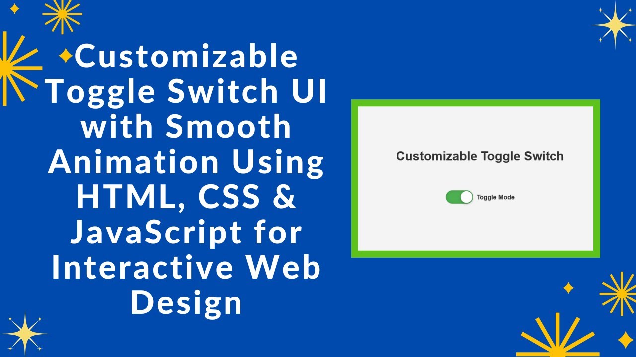
Final Output 🎨
After following these steps, you’ll have a modern, animated, and responsive toggle switch that you can use in any web project! 🚀
✨ Features Included:
✅ Stylish toggle switch design
✅ Smooth animations & transitions
✅ Dark mode toggle effect
✅ Fully responsive & mobile-friendly
Step 5: Deploying Your Code Online
To share your project, you can upload your code to GitHub and host it on GitHub Pages, Netlify, or Vercel for free!
GitHub Deployment Steps
1️⃣ Push your code to GitHub.
2️⃣ Go to Settings > Pages in your repository.
3️⃣ Select the main branch and save.
Your toggle switch will be live at https://yourusername.github.io/toggle-switch/ 🚀
🎯 Final Thoughts
You’ve now built a fully functional and stylish toggle switch using HTML, CSS, and JavaScript! This is a great addition to any website, whether for dark mode toggles, settings panels, or interactive UI elements.
💡 Next Steps:
🔹 Try adding more customization options (colors, sizes, effects)
🔹 Integrate with local storage to save the toggle state
🔹 Use it in a full website project
If you found this tutorial helpful, share it with others and feel free to ask any questions in the comments! 👇
🔗 Code Repository:
GitHub – Toggle Switch Project
🎥 Watch the Full Video Tutorial on YouTube
Happy coding! 🚀🎨