
A resizable split screen layout is a useful UI feature that allows users to dynamically adjust the width of panels by dragging a resizer. This functionality is commonly seen in dashboard layouts, code editors, and interactive web applications.
In this tutorial, you’ll learn how to build a fully functional resizable split screen using HTML, CSS, and JavaScript with a draggable resizer for smooth user interaction. 🚀
Why Use a Resizable Split Screen?
A split screen layout is great for:
✔️ Dashboard Interfaces (e.g., admin panels)
✔️ Side-by-Side Comparisons (e.g., before/after views)
✔️ Code Editors & File Managers
✔️ Customizable UI Panels
With just HTML, CSS, and JavaScript, we can create a fully functional resizable split screen layout. Let’s get started! 🎨
Step 1: Creating the HTML Structure
First, create an index.html file and add the following code:
htmlCopyEdit<!DOCTYPE html>
<html lang="en">
<head>
<meta charset="UTF-8">
<meta name="viewport" content="width=device-width, initial-scale=1.0">
<title>Resizable Split Screen</title>
<link rel="stylesheet" href="style.css">
</head>
<body>
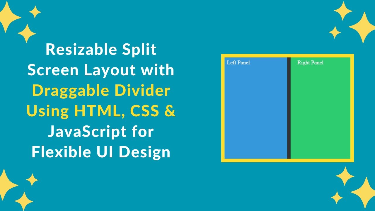
<div class="panel left" id="leftPanel">Left Panel</div>
<div class="resizer" id="resizer"></div>
<div class="panel right">Right Panel</div>
<script src="script.js"></script>
</body>
</html>
Breakdown of the HTML Structure:
✅ Left Panel (.left) – Initially takes 50% width.
✅ Resizer (.resizer) – Draggable divider between the two panels.
✅ Right Panel (.right) – Takes the remaining available space.
Step 2: Styling the Split Screen with CSS
Create a style.css file and add the following styles:
cssCopyEdit* {
    margin: 0;
    padding: 0;
    box-sizing: border-box;
}

body {
    display: flex;
    height: 100vh;
}

.panel {
    overflow: auto;
    padding: 20px;
}

.left {
    background-color: #3498db;
    color: white;
    width: 50%;
}

.right {
    background-color: #2ecc71;
    color: white;
    flex-grow: 1;
}

.resizer {
    width: 10px;
    cursor: ew-resize;
    background-color: #333;
}
Key Features of This CSS:
✔️ Flexible Layout – The left panel has a fixed width, and the right panel expands automatically.
✔️ Draggable Resizer – Styled as a thin divider with a cursor: ew-resize property for easy resizing.
✔️ Smooth User Experience – Ensures smooth transitions when dragging the resizer.
Step 3: Implementing Resizable Functionality with JavaScript
Create a script.js file and add the following code:
jsCopyEditconst resizer = document.getElementById("resizer");
const leftPanel = document.getElementById("leftPanel");
let isResizing = false;

resizer.addEventListener("mousedown", (e) => {
    isResizing = true;
    document.addEventListener("mousemove", resize);
    document.addEventListener("mouseup", stopResize);
});

function resize(e) {
    if (isResizing) {
        let newWidth = Math.max(100, e.clientX);
        leftPanel.style.width = `${newWidth}px`;
    }
}

function stopResize() {
    isResizing = false;
    document.removeEventListener("mousemove", resize);
    document.removeEventListener("mouseup", stopResize);
}
How This JavaScript Works:
🔹 Detects mouse press (mousedown) on the resizer.
🔹 Tracks mouse movement (mousemove) and updates the left panel’s width dynamically.
🔹 Stops resizing (mouseup) when the mouse button is released.
Step 4: Enhancing the User Experience
To make the resizer more user-friendly, we can add some enhancements:
1️⃣ Adding Hover Effects for the Resizer
Modify the .resizer style in style.css:
cssCopyEdit.resizer:hover {
    background-color: #555;
}
2️⃣ Making the Layout Mobile-Friendly
Add the following media query to style.css:
cssCopyEdit@media screen and (max-width: 768px) {
    .resizer {
        width: 5px;
    }

    .left {
        width: 40%;
    }
}
Now, the resizer and panels adjust properly on smaller screens! 📱
Step 5: Deploying Your Code Online
To share your project, upload your code to GitHub and host it on GitHub Pages, Netlify, or Vercel for free!
GitHub Deployment Steps:
1️⃣ Push your code to GitHub.
2️⃣ Go to Settings > Pages in your repository.
3️⃣ Select the main branch and save.
Your resizable split screen will be live at:
🌍 https://yourusername.github.io/split-screen/
Final Output Preview 🎨
After following these steps, you’ll have a modern, interactive, and fully responsive resizable split screen! 🚀
✨ Features Included:
✅ Customizable panel resizing with a draggable resizer.
✅ Smooth animations & transitions for an enhanced user experience.
✅ Mobile-friendly design with flexible panel widths.
✅ Minimalist, modern UI with CSS styling.
🎯 Next Steps
💡 Want to improve this project? Try these advanced features:
🔹 Save user preferences (store panel size in localStorage).
🔹 Add animations for a smoother resizing effect.
🔹 Enable vertical resizing (for a full-screen split editor).
If you found this tutorial helpful, share it with others and feel free to ask any questions in the comments! 👇
🔗 Code Repository:
GitHub – Resizable Split Screen Project
🎥 Watch the Full Video Tutorial on YouTube
Happy coding! 🚀🎨