
A morphing UI effect is a great way to add interactivity and a modern touch to your web applications. With smooth transitions, elements can change shape and color dynamically, providing a visually appealing experience for users.
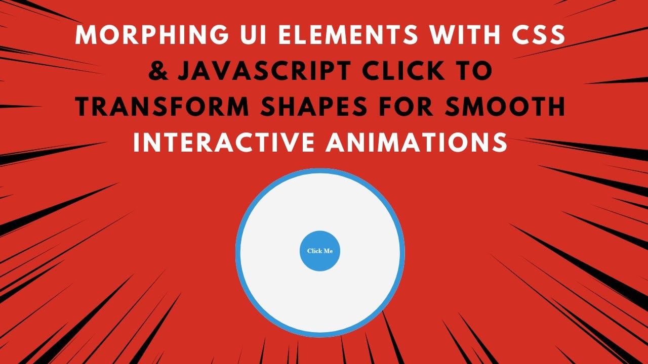
In this tutorial, you’ll learn how to create a morphing button using HTML, CSS, and JavaScript. With a simple click, the button will transform its shape and color, making your UI more engaging. 🚀
Why Use Morphing UI Elements?
Morphing UI elements are useful for:
✔️ Call-to-Action Buttons – Engage users with interactive UI.
✔️ Modern UI Components – Make designs stand out with smooth transitions.
✔️ Hover & Click Effects – Enhance UX by providing real-time feedback.
✔️ Menu Toggles & Animated Buttons – Create dynamic UI elements with ease.
With just a few lines of code, you can create a stylish morphing effect that enhances your project’s visual appeal. Let’s get started! 🎨
Step 1: Setting Up the HTML Structure
Create an index.html file and add the following code:
htmlCopyEdit<!DOCTYPE html>
<html lang="en">
<head>
    <meta charset="UTF-8">
    <meta name="viewport" content="width=device-width, initial-scale=1.0">
    <title>Morphing UI Elements</title>
    <link rel="stylesheet" href="style.css">
</head>
<body>
    <div class="morph" id="morphBox">Click Me</div>
    <script src="script.js"></script>
</body>
</html>
Breakdown of the HTML Structure:
✅ Single Div (.morph) – Serves as the morphing button.
✅ Text Inside the Button – Displays "Click Me" to indicate interaction.
✅ External CSS and JavaScript Files – Keep the structure clean and maintainable.
Step 2: Styling the Morphing Button with CSS
Create a style.css file and add the following styles:
cssCopyEdit* {
    margin: 0;
    padding: 0;
    box-sizing: border-box;
}

body {
    display: flex;
    justify-content: center;
    align-items: center;
    height: 100vh;
    background-color: #f4f4f4;
}

.morph {
    width: 100px;
    height: 100px;
    background-color: #3498db;
    border-radius: 50%;
    display: flex;
    justify-content: center;
    align-items: center;
    color: white;
    font-weight: bold;
    font-size: 16px;
    cursor: pointer;
    transition: all 0.5s ease-in-out;
}

.morph.active {
    width: 150px;
    height: 80px;
    border-radius: 10px;
    background-color: #e74c3c;
}
Key Features of This CSS:
✔️ Smooth Transitions – The button morphs between two states smoothly.
✔️ Shape Change – The button changes from a circle (border-radius: 50%) to a rounded rectangle.
✔️ Color Transformation – The background color changes from blue (#3498db) to red (#e74c3c).
Step 3: Adding Click Event with JavaScript
Create a script.js file and add the following JavaScript code:
jsCopyEditconst morphBox = document.getElementById("morphBox");

morphBox.addEventListener("click", () => {
    morphBox.classList.toggle("active");
});
How This JavaScript Works:
🔹 Listens for Click Events – When the user clicks the button, the script runs.
🔹 Toggles the “active” Class – If the class is present, it removes it; otherwise, it adds it.
🔹 Triggers CSS Transformations – The .active class in CSS controls the shape and color changes.
Step 4: Enhancing the Effect with Hover & More Customizations
1️⃣ Adding a Hover Effect
Modify the .morph style in style.css:
cssCopyEdit.morph:hover {
    transform: scale(1.1);
}
📌 Effect: The button slightly enlarges when hovered, improving the interactive feel.
2️⃣ Making the Transition More Engaging
Update the transition property in style.css:
cssCopyEdittransition: transform 0.5s ease-in-out, background-color 0.5s ease-in-out, border-radius 0.5s ease-in-out;
📌 Effect: The shape and color transition smoothly without sudden jumps.
Final Output Preview 🎨
After following these steps, you’ll have a modern, interactive, and fully responsive morphing UI element! 🚀
✨ Features Included:
✅ Click to Morph – The button transforms shape and color dynamically.
✅ Smooth Animation – CSS transitions create a fluid effect.
✅ Minimalist & Modern UI – Perfect for call-to-action buttons and interactive UI elements.
Step 5: Deploying Your Code Online
To share your project, upload your code to GitHub and host it on GitHub Pages, Netlify, or Vercel for free!
GitHub Deployment Steps:
1️⃣ Push your code to GitHub.
2️⃣ Go to Settings > Pages in your repository.
3️⃣ Select the main branch and save.
Your morphing UI project will be live at:
🌍 https://yourusername.github.io/morphing-ui/
🎯 Next Steps
💡 Want to enhance this project? Try these advanced features:
🔹 Add multiple morphing effects (e.g., size, rotation, opacity).
🔹 Use keyframes animation for a smoother morphing effect.
🔹 Integrate sound effects when the button morphs for better engagement.
If you found this tutorial helpful, share it with others and feel free to ask any questions in the comments! 👇
🔗 Code Repository:
GitHub – Morphing UI Elements
🎥 Watch the Full Video Tutorial on YouTube
Happy coding! 🚀🎨