
In modern web development, creating dynamic and interactive layouts is essential for engaging user interfaces. One such interactive design is the sliding panels layout, which provides smooth transitions between content panels. In this tutorial, we’ll guide you through the process of creating a sliding panels layout using HTML, CSS, and JavaScript.
By the end of this tutorial, you’ll have a working sliding panel layout that you can integrate into your projects, enhancing both functionality and user experience.
What You’ll Learn:
- How to create a two-panel layout using HTML 🖥️
- Styling the panels with modern CSS techniques 🎨
- Adding a smooth sliding transition effect with CSS and JavaScript 🔄
- Implementing a toggle function to switch between the panels 🖱️
- Customizing the design to suit various UI themes 🎯
Step 1: HTML Structure
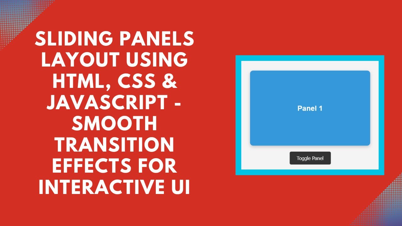
Start by setting up the basic HTML structure for your sliding panels. We’ll have two panels, each containing some text. The goal is to toggle between these two panels when the user clicks the button.
htmlCopyEdit<div class="container" id="slider">
    <div class="panel one">Panel 1</div>
    <div class="panel two">Panel 2</div>
</div>
<button onclick="togglePanel()">Toggle Panel</button>
Here’s a breakdown of the structure:
- Container: This div wraps both panels and is the main area that holds the sliding panels.
- Panels: The two divs represent the sliding panels. Each one is styled to take up the full space of the container.
- Button: A button is added to toggle between the panels when clicked.
Step 2: CSS Styling
Next, let’s add the CSS to style the container and the panels. We’ll also add the necessary transitions to make the sliding effect smooth.
cssCopyEditbody {
    display: flex;
    flex-direction: column;
    align-items: center;
    justify-content: center;
    height: 100vh;
    background: #f4f4f4;
    font-family: Arial, sans-serif;
    margin: 0;
}

.container {
    position: relative;
    width: 400px;
    height: 250px;
    overflow: hidden;
    border-radius: 10px;
    box-shadow: 0 4px 10px rgba(0, 0, 0, 0.2);
    display: flex;
}

.panel {
    position: absolute;
    width: 100%;
    height: 100%;
    display: flex;
    align-items: center;
    justify-content: center;
    font-size: 24px;
    font-weight: bold;
    color: white;
    transition: transform 0.5s ease-in-out;
}

.panel.one {
    background: #3498db;
    transform: translateX(0);
}

.panel.two {
    background: #2ecc71;
    transform: translateX(100%);
}

.container.active .panel.one {
    transform: translateX(-100%);
}

.container.active .panel.two {
    transform: translateX(0);
}

button {
    margin-top: 20px;
    padding: 12px 24px;
    border: none;
    background: #333;
    color: white;
    font-size: 16px;
    cursor: pointer;
    border-radius: 5px;
    transition: background 0.3s;
}

button:hover {
    background: #555;
}
Here’s what we’re doing in the CSS:
- Container: The container is set to a fixed width and height, and the overflow is hidden to prevent panels from spilling out.
- Panels: Each panel is absolutely positioned and initially set to slide off-screen. Panel 1 starts at its normal position, and Panel 2 starts to the right.
- Transitions: We use the
transformproperty to smoothly slide the panels left or right. When the container has the classactive, Panel 1 slides out, and Panel 2 slides in.
Step 3: JavaScript for Toggle Functionality
Now, let’s add the JavaScript to handle the toggling of the panels when the button is clicked.
javascriptCopyEditfunction togglePanel() {
    document.getElementById("slider").classList.toggle("active");
}
The togglePanel() function simply toggles the active class on the container. When the class is added, it triggers the sliding animation, making Panel 1 slide out and Panel 2 slide in.
YouTube Tutorial
For a more detailed walkthrough of this sliding panels layout, check out our YouTube tutorial:
Conclusion
With just a few lines of code, you’ve learned how to create a sliding panels layout that adds dynamic interaction to your web pages. This layout can be easily customized to fit your design needs and can be extended to more panels if required. Adding smooth transitions and toggle functionality improves the overall user experience on your website.
For the complete source code, visit the GitHub repository:
Code Repository:
GitHub – Sliding Panels Layout
If you found this tutorial helpful, don’t forget to like, comment, and subscribe for more exciting web development tutorials!