
Neumorphism is a modern design trend that brings a soft, realistic look to UI elements, giving them an embossed or extruded appearance. By using subtle shadows and highlights, Neumorphism creates a visually appealing, three-dimensional effect that feels intuitive and interactive. In this tutorial, we’ll guide you through creating a Neumorphic UI design using HTML and CSS.
By the end of this tutorial, you’ll have a sleek, modern user interface with soft shadows and interactive animations, perfect for any contemporary web design.
What You’ll Learn:
- How to create a Neumorphic card design using CSS 🖥️
- Designing a soft 3D button effect with shadowing 🎨
- Understanding how to use light and shadow to create depth ✨
- Implementing smooth click animations for a more interactive experience 🖱️
- Customizing your design to fit different themes 🎯
Step 1: HTML Structure
Start by setting up the basic structure of your page. You’ll create a simple Neumorphic card and button element.
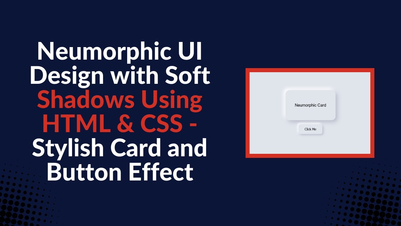
htmlCopyEdit<div class="card">Neumorphic Card</div>
<button class="button">Click Me</button>
This code defines the two core components of your design: the card and the button. You can easily customize them as needed.
Step 2: CSS Styling for Neumorphism
Neumorphism is all about using soft shadows and highlights to give elements a “pushed-out” or “pressed-in” appearance. Here’s how to style the card and button with CSS:
cssCopyEditbody {
    display: flex;
    flex-direction: column;
    align-items: center;
    justify-content: center;
    height: 100vh;
    background: #e0e5ec;
    font-family: Arial, sans-serif;
}

.card {
    width: 250px;
    height: 150px;
    background: #e0e5ec;
    border-radius: 20px;
    box-shadow: 10px 10px 20px #babecc, -10px -10px 20px #ffffff;
    display: flex;
    align-items: center;
    justify-content: center;
    font-size: 20px;
    margin-bottom: 20px;
}

.button {
    padding: 15px 30px;
    font-size: 16px;
    border: none;
    background: #e0e5ec;
    border-radius: 10px;
    box-shadow: 5px 5px 10px #babecc, -5px -5px 10px #ffffff;
    cursor: pointer;
    transition: all 0.3s ease;
}

.button:active {
    box-shadow: inset 5px 5px 10px #babecc, inset -5px -5px 10px #ffffff;
}
How it Works:
- Card Styling: The
.cardhas a soft background color and is rounded at the corners. Thebox-shadowproperty creates the effect of depth by adding both a dark shadow and a highlight to simulate a raised element. - Button Styling: The
.buttonhas a similar design with a shadow effect. On clicking, the button’s shadow inverts, simulating the effect of being pressed down. - Global Styles: The body has a soft background color that matches the card and button to maintain a consistent, smooth UI. Flexbox is used to center the elements on the page.
Step 3: Interaction with Smooth Animations
The Neumorphic design includes subtle, interactive animations, such as the button’s click effect. Using the :active pseudo-class, the button’s shadow moves inward to create the impression of being clicked or pressed.
cssCopyEdit.button:active {
    box-shadow: inset 5px 5px 10px #babecc, inset -5px -5px 10px #ffffff;
}
This provides smooth feedback to users, enhancing the overall experience.
YouTube Tutorial
For a more detailed explanation of the Neumorphic UI design process, check out our YouTube tutorial:
Conclusion
Neumorphic design offers a fresh and modern aesthetic for your web pages, with soft shadows and smooth transitions that enhance the overall user experience. By following this tutorial, you’ve learned how to implement a Neumorphic UI design using simple HTML and CSS techniques, including card and button styles with interactive effects.
For the complete source code, visit the GitHub repository:
Code Repository:
GitHub – Neumorphic UI Design
If you enjoyed this tutorial, don’t forget to like, comment, and subscribe for more exciting web development tutorials!