
Looking to add depth and interactivity to your website? This 3D shadow tilt effect will make your elements respond dynamically to mouse movements, creating a smooth and engaging experience!
Using HTML, CSS, and JavaScript, we’ll build a hover effect that gives a realistic tilt and shadow to your UI elements—perfect for cards, buttons, or interactive elements.
What You’ll Learn
✅ HTML structure for the tilt effect 📄
✅ CSS styling with gradients, shadows, and smooth transitions 🎨
✅ JavaScript mouse tracking for real-time 3D movement 🎯
✅ Smooth animations for a seamless reset 🌟
✅ Customization tips to tweak colors, shadows, and tilt intensity 🛠️
Step 1: Setting Up the HTML
Start by creating a simple structure for the tilt box.
<!DOCTYPE html>
<html lang="en">
<head>
<meta charset="UTF-8">
<meta name="viewport" content="width=device-width, initial-scale=1.0">
<title>3D Shadow Tilt Effect</title>
<link rel="stylesheet" href="styles.css">
</head>
<body>
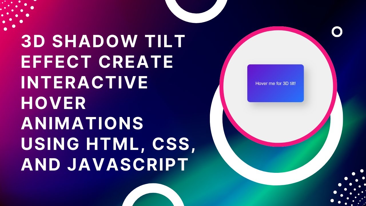
<div class="tilt-box">Hover me for 3D tilt!</div>
<script src="script.js"></script>
</body>
</html>
✔ Defines the tilt box structure
✔ Links to external CSS and JavaScript files for clean code
Step 2: Styling with CSS
Now, let’s add CSS styles to create a sleek 3D shadow effect.
/* Center content */
body {
  display: flex;
  justify-content: center;
  align-items: center;
  height: 100vh;
  margin: 0;
  background-color: #f0f0f0;
  font-family: Arial, sans-serif;
}

/* Tilt Box Styling */
.tilt-box {
  width: 300px;
  height: 200px;
  background: linear-gradient(135deg, #6a11cb, #2575fc);
  color: white;
  font-size: 24px;
  display: flex;
  align-items: center;
  justify-content: center;
  border-radius: 15px;
  text-align: center;
  box-shadow: 20px 20px 40px rgba(0, 0, 0, 0.2);
  transition: transform 0.1s ease-out, box-shadow 0.1s ease-out;
}
✔ Applies a modern gradient background
✔ Uses box-shadow to add depth
✔ Includes smooth transitions for realistic motion
Step 3: Adding 3D Effect with JavaScript
Next, we’ll use JavaScript to track mouse movements and create a 3D tilt effect.
const box = document.querySelector('.tilt-box');

box.addEventListener('mousemove', (e) => {
  const boxRect = box.getBoundingClientRect();
  const centerX = boxRect.left + boxRect.width / 2;
  const centerY = boxRect.top + boxRect.height / 2;

  const xOffset = (e.clientX - centerX) / 10;
  const yOffset = (e.clientY - centerY) / 10;

  box.style.transform = `rotateY(${xOffset}deg) rotateX(${-yOffset}deg)`;
  box.style.boxShadow = `${xOffset * 2}px ${yOffset * 2}px 40px rgba(0, 0, 0, 0.3)`;
});

// Reset effect on mouse leave
box.addEventListener('mouseleave', () => {
  box.style.transform = 'rotateY(0) rotateX(0)';
  box.style.boxShadow = '20px 20px 40px rgba(0, 0, 0, 0.2)';
});
✔ Tracks mouse position relative to the tilt box
✔ Applies rotation (rotateX and rotateY) based on movement
✔ Modifies shadow dynamically for a realistic 3D look
How It Works 🎥
🎡 The tilt box rotates based on mouse movement
🔄 The shadow dynamically shifts, adding depth
🖱️ On hover out, the effect resets smoothly
Customization Tips
🔹 Adjust tilt strength: Change the /10 divisor in JavaScript for more or less rotation.
🔹 Modify shadow intensity: Adjust box-shadow values in .tilt-box.
🔹 Try different colors: Change the gradient colors in background: linear-gradient(...).
🔹 Use different easing effects: Experiment with ease-in-out in the transition property.
Final Output: A Dynamic 3D Shadow Tilt Effect!
With minimal code, you’ve added a modern, interactive tilt effect to your website. Perfect for UI elements, buttons, or call-to-actions! 🚀
Watch the Full Video Tutorial 🎥
Follow along as we build this effect step by step!
Download the Full Code
Get the complete source code on GitHub:
🔗 GitHub – 3D Shadow Tilt Effect
Conclusion
In this tutorial, you learned how to create a cool 3D tilt effect using HTML, CSS, and JavaScript.
💡 Next Steps:
✔ Try different animations and hover effects 🎨
✔ Apply the effect to cards, buttons, or images 🖼️
✔ Combine with other UI elements for a unique experience 🚀
Did you enjoy this tutorial?
💡 Like this post
💬 Comment your thoughts
🔔 Subscribe for more web development tutorials!
🚀 Happy Coding! 🎡💻✨