
Want to add a smooth, interactive blurry background effect to your website? This dynamic background effect moves as the user moves their mouse, creating an engaging and immersive visual experience.
Using HTML, CSS, and JavaScript, we’ll create a colorful gradient background that reacts to user interaction, making your website feel more modern and dynamic.
What You’ll Learn
✅ HTML structure for a simple, responsive layout 📄
✅ CSS gradients and blur effects for a modern look 🎨
✅ JavaScript mouse tracking to shift the background interactively 🖱️
✅ Smooth transitions for a seamless, polished experience 🌟
✅ Customization tips to adapt the design for your website 🎯
Step 1: Setting Up the HTML
Start by creating a basic HTML structure for the background effect.
<!DOCTYPE html>
<html lang="en">
<head>
<meta charset="UTF-8">
<meta name="viewport" content="width=device-width, initial-scale=1.0">
<title>Dynamic Blurry Background</title>
<link rel="stylesheet" href="styles.css">
</head>
<body>
<div class="background"></div>
<div class="content">
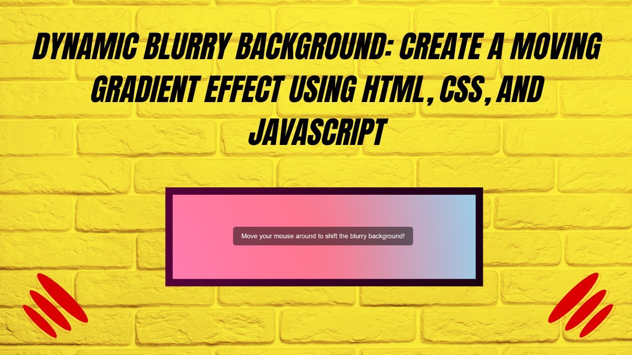
Move your mouse around to shift the blurry background!
</div>
<script src="script.js"></script>
</body>
</html>
✔ Includes a background container and a content box
✔ Links external CSS and JavaScript files for clean code
Step 2: Styling with CSS
Now, let’s apply CSS styles to create the blurred background effect.
/* Reset and full-screen styling */
* {
  margin: 0;
  padding: 0;
  box-sizing: border-box;
}

body {
  height: 100vh;
  display: flex;
  align-items: center;
  justify-content: center;
  overflow: hidden;
  font-family: Arial, sans-serif;
  background-color: #333;
}

/* Blurry Background */
.background {
  position: absolute;
  top: 0;
  left: 0;
  width: 200%;
  height: 200%;
  background: radial-gradient(circle at center, #ff7eb9, #ff758c, #85e3ff, #b9fbc0);
  filter: blur(80px);
  transition: transform 0.3s ease-out;
}

/* Content Box */
.content {
  position: relative;
  z-index: 10;
  color: white;
  font-size: 24px;
  text-align: center;
  background: rgba(0, 0, 0, 0.5);
  padding: 20px 30px;
  border-radius: 10px;
}
✔ Applies a colorful gradient with radial-gradient
✔ Uses filter: blur(80px) to create the blurred background effect
✔ Adds smooth transitions for fluid movement
Step 3: Adding JavaScript for Interactivity
Now, we’ll use JavaScript to track mouse movement and adjust the background’s position dynamically.
const background = document.querySelector(".background");

document.addEventListener("mousemove", (e) => {
  const x = (e.clientX / window.innerWidth) * 100;
  const y = (e.clientY / window.innerHeight) * 100;
  background.style.transform = `translate(-${x / 2}%, -${y / 2}%)`;
});
✔ Tracks the user’s mouse position
✔ Moves the background accordingly to create a shifting effect
✔ Creates an interactive and engaging visual experience
How It Works 🎥
🎨 The blurred gradient background moves dynamically
🖱️ Mouse movements shift the colors, creating a parallax-like effect
🔄 Smooth transitions make the effect feel polished
Customization Tips
🎨 Modify the gradient colors:
Change the colors in radial-gradient(circle at center, color1, color2, ...)
⚡ Adjust blur intensity:
Change filter: blur(80px); to a higher or lower value for different effects.
🖱️ Increase or decrease movement speed:
Modify transform: translate(-${x / 2}%, -${y / 2}%) by adjusting the /2 value.
💡 Try different shapes:
Use linear-gradient instead of radial-gradient for a different effect.
Final Output: A Stunning Dynamic Blurry Background!
This effect adds depth and interactivity to your website with minimal code. Perfect for landing pages, UI backgrounds, or hover effects! 🚀
Watch the Full Video Tutorial 🎥
Follow along as we build this effect step by step!
Download the Full Code
Get the complete source code on GitHub:
🔗 GitHub – Dynamic Blurry Background
Conclusion
In this tutorial, you learned how to create a smooth, interactive blurry background effect using HTML, CSS, and JavaScript.
💡 Next Steps:
✔ Experiment with different color schemes 🎨
✔ Use the effect for hero sections, buttons, or overlays 🚀
✔ Combine with other UI animations for a unique experience ✨
Did you enjoy this tutorial?
💡 Like this post
💬 Comment your thoughts
🔔 Subscribe for more web development tutorials!
🚀 Happy Coding! 🎡💻✨