
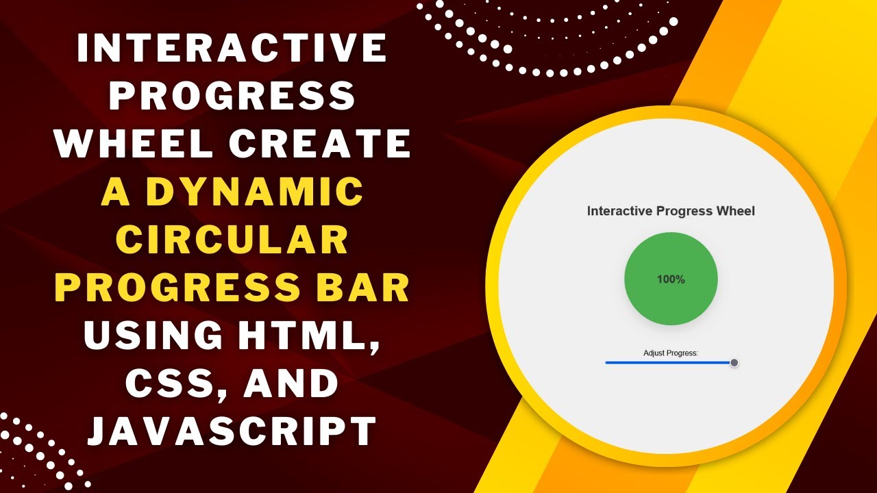
Want to add a dynamic progress wheel to your website? This interactive progress indicator updates in real time as you adjust a slider, providing a visually engaging way to represent progress.
Using HTML, CSS, and JavaScript, we’ll build a circular progress bar that dynamically updates based on user input. This is perfect for dashboards, loading indicators, and interactive UI components!
What You’ll Learn
✅ HTML structure for the progress wheel and slider 📄
✅ CSS conic gradients to create a modern circular progress effect 🎨
✅ JavaScript logic to sync slider input with the progress display 🔄
✅ Dynamic animations to enhance user experience 🌟
✅ Customization tips to match your website’s design 🛠️
Step 1: Setting Up the HTML
First, create a simple HTML structure for the progress wheel and slider.
<!DOCTYPE html>
<html lang="en">
<head>
  <meta charset="UTF-8">
  <meta name="viewport" content="width=device-width, initial-scale=1.0">
  <title>Interactive Progress Wheel</title>
  <link rel="stylesheet" href="styles.css">
</head>
<body>
  <h1>Interactive Progress Wheel</h1>
  <div class="progress-container" id="progress-container">
    <div class="progress-text" id="progress-text">0%</div>
  </div>

  <div class="slider-container">
    <label for="progress-slider">Adjust Progress:</label>
    <input type="range" id="progress-slider" min="0" max="100" value="0">
  </div>

  <script src="script.js"></script>
</body>
</html>
✔ Includes a circular progress indicator
✔ Adds a slider to adjust the progress dynamically
✔ Links external CSS and JavaScript for better organization
Step 2: Styling with CSS
Now, let’s apply CSS styles to create a beautiful progress wheel effect.
/* General Styling */
body {
  display: flex;
  flex-direction: column;
  align-items: center;
  justify-content: center;
  height: 100vh;
  margin: 0;
  font-family: Arial, sans-serif;
  background-color: #f0f0f0;
}

/* Heading */
h1 {
  font-size: 28px;
  color: #333;
  margin-bottom: 30px;
}

/* Circular Progress Container */
.progress-container {
  position: relative;
  width: 200px;
  height: 200px;
  background: conic-gradient(#4caf50 0% 0%, #ddd 0% 100%);
  border-radius: 50%;
  display: flex;
  align-items: center;
  justify-content: center;
  box-shadow: 0px 10px 20px rgba(0, 0, 0, 0.1);
}

/* Progress Percentage Text */
.progress-text {
  position: absolute;
  font-size: 24px;
  font-weight: bold;
  color: #333;
}

/* Slider Container */
.slider-container {
  margin-top: 50px;
  text-align: center;
}

input[type="range"] {
  width: 100%;
  max-width: 300px;
}
✔ Uses conic-gradient for a smooth circular progress effect
✔ Centers the progress percentage inside the wheel
✔ Adds a stylish shadow effect for better visibility
Step 3: Adding JavaScript for Interactivity
Now, we’ll use JavaScript to dynamically update the progress wheel based on the slider value.
const progressContainer = document.getElementById("progress-container");
const progressText = document.getElementById("progress-text");
const progressSlider = document.getElementById("progress-slider");

progressSlider.addEventListener("input", (e) => {
  const progressValue = e.target.value;
  progressText.textContent = `${progressValue}%`;
  progressContainer.style.background = `conic-gradient(
    #4caf50 ${progressValue * 3.6}deg,
    #ddd ${progressValue * 3.6}deg
  )`;
});
✔ Tracks the slider value and updates the progress text
✔ Dynamically changes the circular gradient to reflect progress
✔ Creates a smooth and interactive user experience
How It Works 🎥
🎡 The circular progress wheel updates in real time
🖱️ Users can adjust the slider to change the progress value
🔄 A conic gradient visually represents the progress
Customization Tips
🎨 Change the progress color:
Modify #4caf50 in conic-gradient to your preferred color.
⚡ Adjust the progress speed:
Use transition: background 0.3s ease-out; in CSS for smoother updates.
🔄 Increase or decrease size:
Modify .progress-container width & height for different sizes.
📊 Use for different applications:
Customize this effect for loading indicators, skill meters, or fitness tracking.
Final Output: A Stunning Interactive Progress Wheel!
This effect enhances user engagement and adds a modern UI element to your website. Perfect for dashboards, progress tracking, and loading animations! 🚀
Watch the Full Video Tutorial 🎥
Follow along with a step-by-step video guide!
Download the Full Code
Get the complete source code on GitHub:
🔗 GitHub – Interactive Progress Wheel
Conclusion
In this tutorial, you learned how to create a smooth, interactive circular progress wheel using HTML, CSS, and JavaScript.
💡 Next Steps:
✔ Experiment with different color schemes 🎨
✔ Use the effect for progress tracking, skill bars, or loading screens 🚀
✔ Combine with other UI animations for a unique experience ✨
Did you enjoy this tutorial?
💡 Like this post
💬 Comment your thoughts
🔔 Subscribe for more web development tutorials!
🚀 Happy Coding! 🎡💻✨