
Creating a responsive left-side navigation menu is essential for modern web design. A well-designed navigation bar enhances user experience, making it easier for visitors to explore your website. In this guide, we’ll walk you through building a stylish, mobile-friendly navigation menu using HTML, CSS, and JavaScript.
Why a Left-Side Navigation Menu?
A left-side navigation menu is commonly used in modern websites and web applications due to its accessibility and ease of use. It allows quick access to important sections of a site and works well across all screen sizes, especially with a responsive design.
Features of This Navigation Menu
✅ Fixed left-side navigation panel for easy access 📌
✅ Gradient background for a sleek, modern look 🎨
✅ Hover effects and active link highlights 🔍
✅ Mobile-friendly hamburger menu for smaller screens 🍔
✅ Smooth transitions for better user interaction 🚀
By the end of this tutorial, you’ll have a fully functional, professional-looking navigation menu that adapts to all devices!
Step-by-Step Guide to Building a Responsive Left-Side Navigation Menu
1️⃣ HTML Structure
We’ll start by setting up the basic structure with semantic HTML elements.
<!DOCTYPE html>
<html lang="en">
<head>
<meta charset="UTF-8">
<meta name="viewport" content="width=device-width, initial-scale=1.0">
<title>Responsive Left Side Nav</title>
<link rel="stylesheet" href="https://cdnjs.cloudflare.com/ajax/libs/font-awesome/6.0.0/css/all.min.css">
</head>
<body>
<!-- Hamburger button for mobile view -->
<div class="hamburger" id="hamburgerMenu">☰</div>
<!-- Left navigation menu -->
<nav class="nav" id="leftNav">
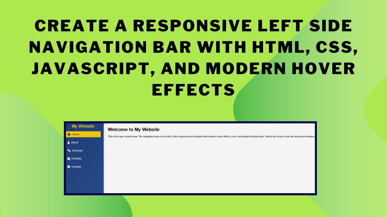
<h2>My Website</h2>
<ul>
<li><a href="#home" class="active"><i class="fas fa-home"></i> Home</a></li>
<li><a href="#about"><i class="fas fa-user"></i> About</a></li>
<li><a href="#services"><i class="fas fa-cogs"></i> Services</a></li>
<li><a href="#portfolio"><i class="fas fa-briefcase"></i> Portfolio</a></li>
<li><a href="#contact"><i class="fas fa-envelope"></i> Contact</a></li>
</ul>
</nav>
<!-- Main content area -->
<div class="content">
<h1>Welcome to My Website</h1>
<p>This is the main content area. The navigation menu on the left is fully responsive and designed with modern hover effects, icons, and gradient backgrounds.</p>
</div>
</body>
</html>2️⃣ CSS Styling
Now, let’s style the navigation menu for a modern look.
body {
  font-family: Arial, sans-serif;
  margin: 0;
  padding: 0;
  display: flex;
  background-color: #f4f4f4;
}

/* Navigation styles */
.nav {
  position: fixed;
  left: 0;
  top: 0;
  width: 250px;
  height: 100vh;
  background: linear-gradient(135deg, #1e3c72, #2a5298);
  padding: 20px;
  box-shadow: 2px 0 5px rgba(0, 0, 0, 0.3);
  color: white;
  transition: transform 0.3s ease;
}

.nav h2 {
  text-align: center;
  color: #f1c40f;
}

.nav ul {
  list-style: none;
  padding: 0;
}

.nav ul li a {
  display: flex;
  align-items: center;
  text-decoration: none;
  color: white;
  font-size: 1.2rem;
  padding: 10px 15px;
  border-radius: 5px;
  transition: background 0.3s ease, transform 0.2s;
}

.nav ul li a:hover {
  background-color: rgba(255, 255, 255, 0.2);
  transform: translateX(5px);
}

.nav ul li a.active {
  background-color: #f1c40f;
  color: #2c3e50;
}

.nav ul li a i {
  margin-right: 10px;
}

/* Mobile Styles */
.hamburger {
  display: none;
  position: fixed;
  left: 20px;
  top: 20px;
  font-size: 2rem;
  color: white;
  background-color: #1abc9c;
  padding: 10px;
  border-radius: 5px;
  cursor: pointer;
  z-index: 1000;
}

@media (max-width: 768px) {
  .nav {
    transform: translateX(-100%);
  }
  .nav.open {
    transform: translateX(0);
  }
  .hamburger {
    display: block;
  }
}
3️⃣ JavaScript for Mobile Menu
To make the menu interactive, let’s add JavaScript.
const hamburger = document.getElementById('hamburgerMenu');
const nav = document.getElementById('leftNav');

hamburger.addEventListener('click', function () {
  nav.classList.toggle('open');
});
Conclusion 🎯
By following these steps, you have successfully created a fully responsive left-side navigation menu! This menu improves user experience, adapts to different screen sizes, and enhances your website’s look.
🚀 Next Steps
🔹 Customize the colors and fonts to match your website’s theme.
🔹 Add dropdown menus for more navigation options.
🔹 Enhance the animations for a smoother experience.
💡 Check out the video tutorial here:
📂 Get the source code on GitHub:
🔗 View on GitHub
If you found this guide helpful, don’t forget to like, comment, and subscribe to Madras Academy for more web development tutorials! 🚀