
Creating visually appealing web elements is crucial for engaging users, and neon glowing effects can add a futuristic and eye-catching touch to your website. In this tutorial, we’ll explore how to implement stunning neon glowing effects on text and icons using HTML and CSS. These effects activate when users hover over the elements, making them stand out dynamically.
What You’ll Learn
✅ How to create neon glowing text with CSS
✅ Styling text and icons with glowing effects
✅ Adding hover effects to activate the neon glow and scale transformation
✅ Customizing glow color and intensity to match your website’s theme
✅ Implementing smooth transitions for an engaging user experience
Setting Up the HTML Structure
We begin by creating a simple HTML file with a heading and an icon. The h1 element represents the neon text, while a div with a span holds the glowing star icon.
<!DOCTYPE html>
<html lang="en">
<head>
<meta charset="UTF-8">
<meta name="viewport" content="width=device-width, initial-scale=1.0">
<title>Neon Glowing Effects on Hover</title>
<link rel="stylesheet" href="styles.css">
</head>
<body>
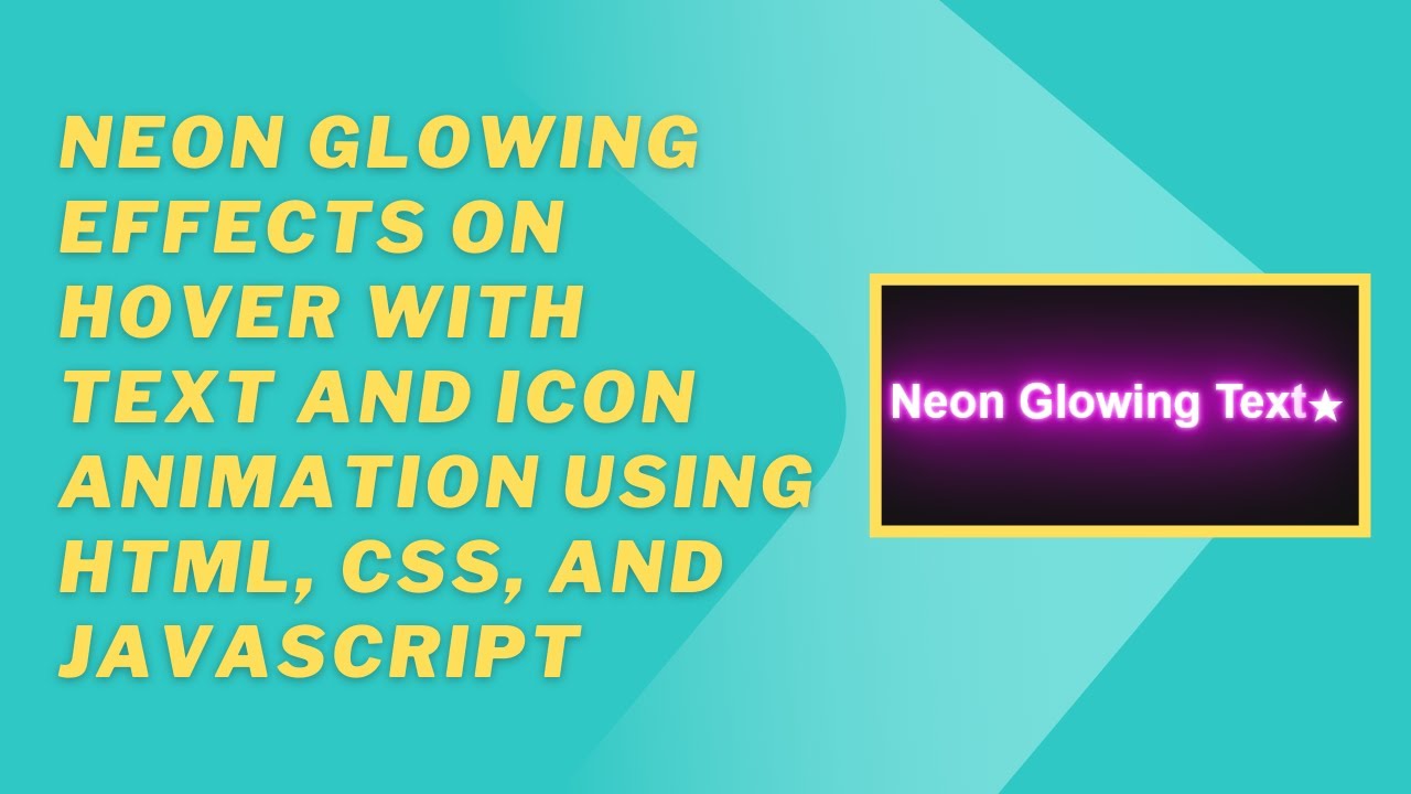
<h1>Neon Glowing Text</h1>
<div class="icon">
<span>★</span> <!-- Star Icon -->
</div>
</body>
</html>Adding the Neon Glow Effect with CSS
To achieve the neon glowing effect, we utilize CSS text-shadow properties, giving the text and icons a vibrant glow.
body {
  margin: 0;
  padding: 0;
  height: 100vh;
  display: flex;
  justify-content: center;
  align-items: center;
  background-color: #121212;
}

h1, .icon {
  font-family: Arial, sans-serif;
  font-size: 3em;
  color: #fff;
  text-align: center;
  transition: all 0.3s ease;
}

h1 {
  text-shadow: 0 0 5px #fff, 0 0 10px #ff00ff, 0 0 20px #ff00ff, 0 0 40px #ff00ff;
}

h1:hover {
  text-shadow: 0 0 10px #fff, 0 0 30px #ff00ff, 0 0 60px #ff00ff;
}

.icon {
  display: inline-block;
  text-shadow: 0 0 5px #fff, 0 0 20px #ff00ff;
}

.icon:hover {
  text-shadow: 0 0 10px #fff, 0 0 50px #ff00ff;
  transform: scale(1.1);
}
How the Effects Work
- Text Glow: The
text-shadowproperty adds multiple layers of glow with different intensities, giving the text a neon effect. - Hover Effects: On hover, the glow becomes more intense, and the icon scales up slightly to create a dynamic effect.
- Smooth Transitions: The
transitionproperty ensures the hover effects appear smoothly instead of suddenly.
Final Thoughts
Neon glowing effects are a great way to enhance the visual appeal of your website. Whether for headings, buttons, or icons, these effects can make your UI elements stand out and provide a modern feel. Try experimenting with different colors and shadow intensities to create unique neon designs!
Watch the Tutorial
For a step-by-step guide, check out our video tutorial:
Get the Code
Access the complete source code on GitHub:
🔗 GitHub Repository
If you enjoyed this tutorial, don’t forget to like, comment, and subscribe to Madras Academy for more exciting web development guides! 🚀