
Adding an interactive gradient background to your website can enhance its visual appeal and create a dynamic user experience. In this tutorial, we’ll guide you through creating a stunning gradient background that changes with the click of a button using HTML, CSS, and JavaScript.
Why Use an Interactive Gradient Background?
A gradient background adds depth and vibrancy to a webpage. By making it interactive, users can engage with your site in a fun and visually appealing way. This feature is great for:
- Personal websites
- Landing pages
- Portfolio designs
- Any webpage that aims to stand out!
What You’ll Learn
✅ How to create a full-screen gradient background using HTML and CSS 🖥️
✅ How to style the background with smooth transition effects 🎨
✅ How to use JavaScript to cycle through different gradient colors with a button click 🖱️
✅ How to enhance user experience with dynamic visual changes 🌟
✅ How to customize gradients to match your website’s theme 🎯
Step-by-Step Guide
1. Setting Up the HTML Structure
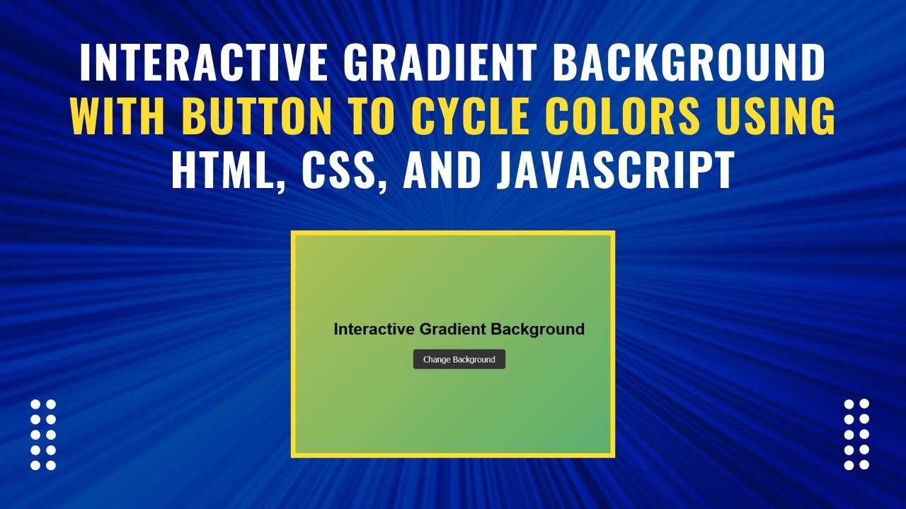
Create a simple HTML structure with a button that will trigger the gradient background change.
<!DOCTYPE html>
<html lang="en">
<head>
  <meta charset="UTF-8">
  <meta name="viewport" content="width=device-width, initial-scale=1.0">
  <title>Interactive Gradient Background</title>
  <link rel="stylesheet" href="styles.css">
</head>
<body>
  <div class="container">
    <h1>Interactive Gradient Background</h1>
    <button onclick="cycleGradient()">Change Background</button>
  </div>
  <script src="script.js"></script>
</body>
</html>
2. Styling with CSS
The CSS file (styles.css) defines the initial gradient background and styles the button for a modern look.
body {
  height: 100vh;
  margin: 0;
  display: flex;
  align-items: center;
  justify-content: center;
  background: linear-gradient(135deg, #ff7eb3, #ff758c);
  font-family: Arial, sans-serif;
  transition: background 1s ease;
}

.container {
  text-align: center;
}

button {
  padding: 10px 20px;
  font-size: 16px;
  color: #fff;
  background-color: #333;
  border: none;
  border-radius: 5px;
  cursor: pointer;
  transition: background-color 0.3s;
}

button:hover {
  background-color: #555;
}
3. Adding JavaScript for Interactivity
The JavaScript file (script.js) contains an array of gradient colors and a function to cycle through them.
const gradients = [
  'linear-gradient(135deg, #ff7eb3, #ff758c)',
  'linear-gradient(135deg, #42e695, #3bb2b8)',
  'linear-gradient(135deg, #4776e6, #8e54e9)',
  'linear-gradient(135deg, #ee9ca7, #ffdde1)',
  'linear-gradient(135deg, #ff9966, #ff5e62)',
  'linear-gradient(135deg, #f4d03f, #16a085)',
  'linear-gradient(135deg, #bdc3c7, #2c3e50)',
  'linear-gradient(135deg, #ff6b6b, #f8e71c)',
  'linear-gradient(135deg, #8e44ad, #3498db)',
  'linear-gradient(135deg, #e67e22, #f1c40f)',
  'linear-gradient(135deg, #c0392b, #8e44ad)'
];

let currentIndex = 0;

function cycleGradient() {
  currentIndex = (currentIndex + 1) % gradients.length;
  document.body.style.background = gradients[currentIndex];
}
Final Thoughts
By following these steps, you’ve successfully built an interactive gradient background for your website. This feature adds a modern touch, improves user engagement, and makes your design more visually appealing.
For a live demonstration, check out the video tutorial below: 🎥 Watch the tutorial:
📂 Access the complete source code on GitHub:
Interactive Gradient Background GitHub Repository
If you found this tutorial helpful, don’t forget to like, comment, and subscribe to Madras Academy for more exciting web development content! 🚀