
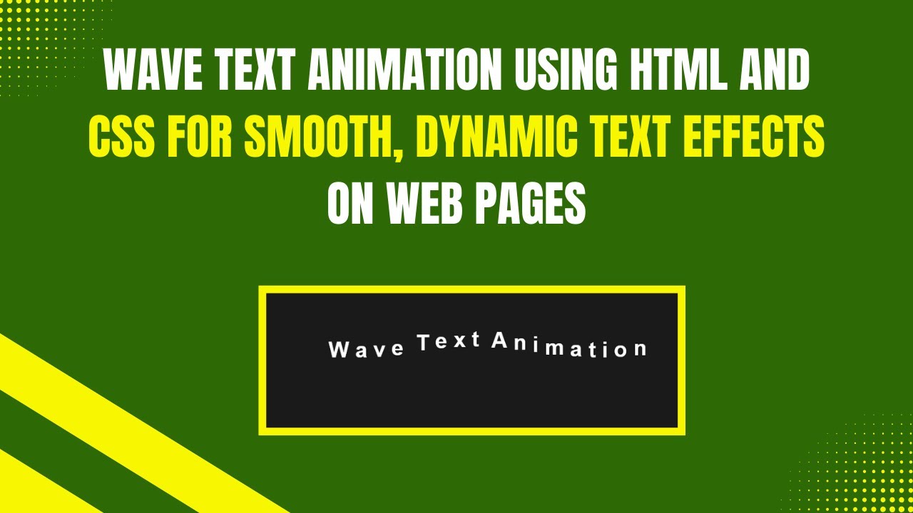
Adding animations to your website can make it more engaging and visually appealing. In this tutorial, we’ll explore how to create a wave text animation using only HTML and CSS. This animation gives a stylish and interactive effect where each letter moves in a wave-like motion. Perfect for headings, banners, or any creative text display! 🌊✨
What You’ll Learn 📌
✅ How to structure animated text with HTML 🖥️
✅ Using CSS to style text for bold and vibrant effects 🎨
✅ Creating keyframe animations for smooth wave motion 🔄
✅ Implementing CSS variables for flexible animation timing ⏱️
✅ Customizing font size, colors, and animation speed to match your design 🎯
By the end of this tutorial, you’ll have a stunning wave text animation that you can integrate into your web projects.
Step-by-Step Guide 📖
1️⃣ HTML Structure
First, let’s create the basic HTML structure:
<!DOCTYPE html>
<html lang="en">
<head>
  <meta charset="UTF-8">
  <meta name="viewport" content="width=device-width, initial-scale=1.0">
  <title>Wave Text Animation</title>
  <link rel="stylesheet" href="styles.css">
</head>
<body>
  <div class="wave-text">
    <span style="--i: 0;">W</span>
    <span style="--i: 1;">a</span>
    <span style="--i: 2;">v</span>
    <span style="--i: 3;">e</span>
    <span style="--i: 4;"> </span>
    <span style="--i: 5;">T</span>
    <span style="--i: 6;">e</span>
    <span style="--i: 7;">x</span>
    <span style="--i: 8;">t</span>
    <span style="--i: 9;"> </span>
    <span style="--i: 10;">A</span>
    <span style="--i: 11;">n</span>
    <span style="--i: 12;">i</span>
    <span style="--i: 13;">m</span>
    <span style="--i: 14;">a</span>
    <span style="--i: 15;">t</span>
    <span style="--i: 16;">i</span>
    <span style="--i: 17;">o</span>
    <span style="--i: 18;">n</span>
  </div>
</body>
</html>
2️⃣ CSS Styling and Animation
Now, let’s add some CSS styles to bring the animation to life:
body {
  margin: 0;
  padding: 0;
  height: 100vh;
  display: flex;
  justify-content: center;
  align-items: center;
  background-color: #1a1a1a;
  color: #ffffff;
  font-family: 'Arial', sans-serif;
}

.wave-text {
  font-size: 40px;
  font-weight: bold;
  display: inline-block;
  overflow: hidden;
  white-space: nowrap;
  padding: 50px;
}

.wave-text span {
  display: inline-block;
  animation: wave-animation 1.5s ease-in-out infinite;
  animation-delay: calc(var(--i) * 0.1s);
}

@keyframes wave-animation {
  0%, 100% {
    transform: translateY(0);
  }
  50% {
    transform: translateY(-20px);
  }
}
3️⃣ How the Code Works 💡
✔ Each letter is wrapped in a <span> tag, allowing us to animate them individually.
✔ CSS Variables (--i) control the delay, creating the wave effect.
✔ @keyframes animation moves each letter up and down in a smooth motion.
✔ calc(var(--i) * 0.1s) ensures each letter starts at a slightly different time.
✔ The background color, font size, and animation speed can be customized to match your style.
Live Demo 🎥
Watch the full video tutorial here:
Get the Source Code 📝
You can access the full source code on GitHub: 🔗 GitHub Repository
If you found this tutorial helpful, don’t forget to like, comment, and subscribe to Madras Academy for more exciting web development tutorials! 🚀🎨
#HTML #CSS #WebDesign #TextAnimation #WebDevelopment #Coding #FrontendDevelopment #InteractiveDesign #TechTutorial #WaveEffect #Animation #WebDesignInspiration