
Creating a visually engaging and dynamic website is essential for user interaction and design appeal. One great way to achieve this is by using a customizable gradient background that responds to user input. In this tutorial, you’ll learn how to build an interactive gradient background using HTML, CSS, and JavaScript.
This feature allows users to choose colors and adjust the gradient angle, making it a perfect addition to landing pages, dashboards, or any web project that needs a modern and interactive design. 🎨✨
What You’ll Learn
✅ Setting up a webpage structure with HTML 🖥️
✅ Styling elements using CSS 🎨
✅ Implementing color pickers and sliders for user input 🔧
✅ Using JavaScript to dynamically update the background ⬆️
✅ Adding smooth transitions for a polished effect 🌟
✅ Customizing the gradient to fit any design preference 🎯
Step 1: HTML Structure
We start by setting up a simple HTML structure that includes color pickers and a slider to allow users to adjust the gradient.
<!DOCTYPE html>
<html lang="en">
<head>
<meta charset="UTF-8">
<meta name="viewport" content="width=device-width, initial-scale=1.0">
<title>Interactive Gradient Background</title>
<link rel="stylesheet" href="styles.css">
</head>
<body>
<div>
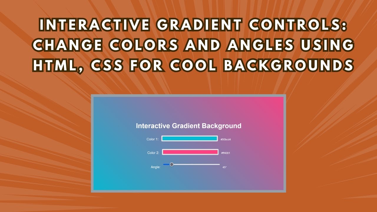
<h1>Interactive Gradient Background</h1>
<div class="gradient-controls">
<div>
<label class="slider-label">Color 1:</label>
<input type="color" id="color1" value="#00bcd4">
<span id="color1-value">#00bcd4</span>
</div>
<div>
<label class="slider-label">Color 2:</label>
<input type="color" id="color2" value="#ff4081">
<span id="color2-value">#ff4081</span>
</div>
<div>
<label class="slider-label">Angle:</label>
<input type="range" id="angle" min="0" max="360" value="45">
<span id="angle-value">45°</span>
</div>
</div>
</div>
<script src="script.js"></script>
</body>
</html>Step 2: CSS Styling
We use CSS to style the background, text, and user controls for a clean and modern look.
body {
  margin: 0;
  padding: 0;
  display: flex;
  justify-content: center;
  align-items: center;
  height: 100vh;
  transition: background 0.5s ease;
  font-family: 'Arial', sans-serif;
  text-align: center;
}

h1 {
  font-size: 36px;
  color: #fff;
}

.gradient-controls {
  display: flex;
  flex-direction: column;
  align-items: center;
  gap: 20px;
}

.slider-label {
  color: #fff;
  font-size: 18px;
}
Step 3: JavaScript for Interactivity
Now, we add JavaScript to listen for user input and update the background dynamically.
const color1Input = document.getElementById('color1');
const color2Input = document.getElementById('color2');
const angleInput = document.getElementById('angle');
const color1Value = document.getElementById('color1-value');
const color2Value = document.getElementById('color2-value');
const angleValue = document.getElementById('angle-value');

function updateGradient() {
  const color1 = color1Input.value;
  const color2 = color2Input.value;
  const angle = angleInput.value;
  document.body.style.background = `linear-gradient(${angle}deg, ${color1}, ${color2})`;
  color1Value.textContent = color1;
  color2Value.textContent = color2;
  angleValue.textContent = `${angle}°`;
}

color1Input.addEventListener('input', updateGradient);
color2Input.addEventListener('input', updateGradient);
angleInput.addEventListener('input', updateGradient);

updateGradient();
How It Works
- Users select two colors using color pickers.
- Users adjust the gradient angle using the slider.
- JavaScript updates the background in real time.
- The transition effect makes changes look smooth and natural.
Final Thoughts
This interactive gradient background is a great way to enhance user experience and give your website a modern and stylish touch. It’s simple to implement and can be customized to match your website’s theme.
🔹 Try it out and let us know how you use it in your projects!
🎥 Watch the full tutorial:
💻 Get the full source code: GitHub Repository
Don’t forget to like, comment, and subscribe for more web development tutorials! 🚀