
Welcome to this exciting tutorial where you’ll learn how to create dynamic morphing shapes using HTML, CSS, and JavaScript. This simple yet powerful effect allows shapes to smoothly transition between different forms, adding a modern and interactive touch to your website. 🚀
🌟 What You’ll Learn
- How to create morphing shapes with HTML 🖥️
- Using CSS animations for smooth shape transitions 🎨
- Implementing keyframe animations for morphing effects ⬇️
- Adding hover effects for interactive transformations 🌟
- Customizing the animation to match your unique design 🎯
By the end of this tutorial, you’ll have a fun, interactive morphing shape effect that enhances your website’s design. Let’s get started! 🎉
🎨 Step 1: Setting Up the HTML
Start by creating a simple HTML structure that includes a heading and a container for the morphing shape.
<!DOCTYPE html>
<html lang="en">
<head>
<meta charset="UTF-8">
<meta name="viewport" content="width=device-width, initial-scale=1.0">
<title>Morphing Shapes</title>
<link rel="stylesheet" href="styles.css">
</head>
<body>
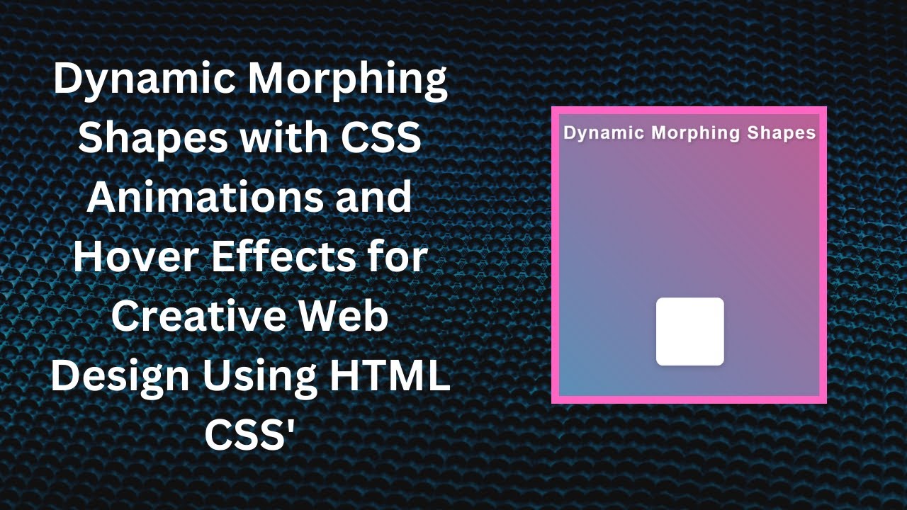
<h1>Dynamic Morphing Shapes</h1>
<div class="shape-container">
<div class="shape"></div>
</div>
</body>
</html>This creates a title and a shape that will morph through different forms.
🎭 Step 2: Adding CSS for Morphing Effects
Now, let’s apply CSS animations to create the morphing effect.
body {
  margin: 0;
  padding: 0;
  display: flex;
  justify-content: center;
  align-items: center;
  height: 100vh;
  background: linear-gradient(45deg, #00bcd4, #ff4081);
  font-family: 'Arial', sans-serif;
  overflow: hidden;
}

h1 {
  position: absolute;
  top: 20px;
  color: #fff;
  font-size: 36px;
  font-weight: bold;
  text-align: center;
  z-index: 10;
}

.shape-container {
  display: flex;
  justify-content: center;
  align-items: center;
}

.shape {
  width: 150px;
  height: 150px;
  background-color: #fff;
  box-shadow: 0 4px 10px rgba(0, 0, 0, 0.2);
  border-radius: 50%;
  animation: morph 5s infinite alternate;
}

@keyframes morph {
  0% { border-radius: 50%; transform: scale(1); }
  25% { border-radius: 0%; transform: scale(1.1); }
  50% { border-radius: 25%; transform: scale(1); }
  75% { border-radius: 10%; transform: scale(0.9); }
  100% { border-radius: 50%; transform: scale(1); }
}

.shape:hover {
  animation: morph 2s infinite alternate;
}
The @keyframes morph defines different stages of the transformation, making the shape change from a circle to a square and back.
🎬 Live Demo and Video Tutorial
Watch the full tutorial on YouTube to see the morphing effect in action! 🎥
📂 Get the Full Source Code
You can find the complete source code on GitHub: 🔗 GitHub Repository
🎯 Conclusion
With just HTML and CSS, you can create stunning morphing animations that bring life to your UI. Try customizing the shapes, colors, and animation speed to make it your own!
📢 Did you enjoy this tutorial? Don’t forget to like, comment, and subscribe to Madras Academy for more awesome web development tutorials! 🚀
#HTML #CSS #JavaScript #WebDesign #MorphingShapes #WebDevelopment #FrontendDevelopment #Animations