
Creating a seamless and stylish full-screen navigation menu is an excellent way to enhance user experience on modern websites. In this tutorial, we’ll build a full-screen overlay menu with a hamburger icon using HTML, CSS, and JavaScript. This interactive navigation system is perfect for minimalist designs, ensuring smooth transitions and an engaging UI. 🚀
What You’ll Learn:
✅ How to create a fixed hamburger menu icon with HTML 🖥️
✅ Styling a full-screen overlay menu with CSS for a modern look 🎨
✅ Implementing smooth transition effects to show and hide the menu ⬇️
✅ Adding navigation links and a close button for a user-friendly experience 🌟
✅ Customizing the design to fit different website styles 🎯
Step-by-Step Guide
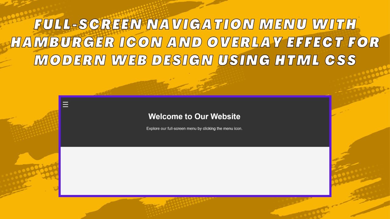
1. Structure the Navigation with HTML
We first define the structure of our navigation, including a hamburger menu icon, a full-screen overlay menu, navigation links, and a close button.
<div class="menu-icon" id="menuIcon">☰</div>
<div class="overlay-menu" id="overlayMenu">
<ul class="nav-links">
<li><a href="#">Home</a></li>
<li><a href="#">About</a></li>
<li><a href="#">Services</a></li>
<li><a href="#">Contact</a></li>
</ul>
<div class="close-btn" id="closeBtn">×</div>
</div>2. Style the Menu with CSS
We apply styles to ensure the overlay menu covers the entire screen smoothly and is hidden by default. The transitions create a seamless animation effect.
.overlay-menu {
  position: fixed;
  top: 0;
  left: 0;
  width: 100%;
  height: 100%;
  background-color: rgba(0, 0, 0, 0.9);
  transform: translateX(-100%);
  transition: transform 0.3s ease;
  display: flex;
  justify-content: center;
  align-items: center;
}

.overlay-menu.active {
  transform: translateX(0);
}
3. Add JavaScript for Menu Functionality
JavaScript handles the opening and closing of the menu when clicking the hamburger icon or close button.
const menuIcon = document.getElementById('menuIcon');
const overlayMenu = document.getElementById('overlayMenu');
const closeBtn = document.getElementById('closeBtn');

menuIcon.addEventListener('click', () => {
  overlayMenu.classList.add('active');
});

closeBtn.addEventListener('click', () => {
  overlayMenu.classList.remove('active');
});
Demo Video 🎥
Watch the full tutorial on YouTube to see the menu in action! 👇
Code Repository
Access the complete source code on GitHub:
🔗 Full-Screen Menu Source Code
Conclusion
By the end of this tutorial, you’ve successfully built a stylish, interactive, and fully responsive full-screen navigation menu. You can further customize it to match your website’s theme. If you enjoyed this tutorial, don’t forget to like 👍, comment 💬, and subscribe 🔔 to Madras Academy for more exciting web development guides! 🚀
#HTML #CSS #JavaScript #WebDesign #NavigationMenu #WebDevelopment #FrontendDevelopment #Coding #InteractiveDesign