
Creating interactive and visually appealing UI elements is essential for modern web design. In this tutorial, we will build an animated circular menu using HTML, CSS, and JavaScript. This stylish menu expands and reveals multiple options when clicked, making it an excellent addition to any website’s navigation.
🔹 Why Use a Circular Menu?
Circular menus are an effective way to present navigation options while saving screen space. They enhance user experience by adding a fun, interactive element to your website. Ideal for mobile apps, portfolio sites, and creative projects, this menu is both functional and visually engaging.
🛠️ What You’ll Learn
✅ Creating a circular menu structure with HTML
✅ Styling the menu with CSS for smooth animations
✅ Implementing a click event to trigger the menu animation with JavaScript
✅ Positioning menu items dynamically
✅ Customizing the menu for different UI designs
📌 Step-by-Step Guide
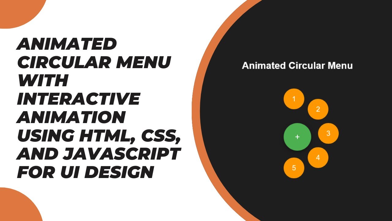
1️⃣ HTML Structure
We start by creating a container that holds the menu button and menu items:
<div class="menu-container">
  <div class="menu-button">+</div>
  <div class="menu-item item1">1</div>
  <div class="menu-item item2">2</div>
  <div class="menu-item item3">3</div>
  <div class="menu-item item4">4</div>
  <div class="menu-item item5">5</div>
</div>
The menu button acts as a trigger, while menu items are positioned in a circular layout.
2️⃣ Styling with CSS
We use CSS animations to make the menu appear dynamically:
body {
  display: flex;
  justify-content: center;
  align-items: center;
  height: 100vh;
  background-color: #1e1e1e;
  font-family: Arial, sans-serif;
}

.menu-container {
  position: relative;
  width: 80px;
  height: 80px;
}

.menu-button {
  width: 80px;
  height: 80px;
  border-radius: 50%;
  background-color: #4caf50;
  display: flex;
  justify-content: center;
  align-items: center;
  color: white;
  font-size: 24px;
  cursor: pointer;
}

.menu-item {
  position: absolute;
  width: 60px;
  height: 60px;
  background-color: #ff9800;
  border-radius: 50%;
  display: flex;
  justify-content: center;
  align-items: center;
  color: white;
  font-size: 20px;
  transform: scale(0);
  transition: transform 0.4s ease, top 0.4s ease, left 0.4s ease;
}

/* Positioning items in a circular pattern */
.item1 { top: -100px; left: 0; }
.item2 { top: -70px; left: 70px; }
.item3 { top: 0; left: 100px; }
.item4 { top: 70px; left: 70px; }
.item5 { top: 100px; left: 0; }

/* Activate menu */
.menu-container.active .menu-item {
  transform: scale(1);
}
The menu items remain hidden (scale: 0) until the menu is activated.
3️⃣ JavaScript for Animation
We use JavaScript to toggle the menu state:
const menuButton = document.querySelector('.menu-button');
const menuContainer = document.querySelector('.menu-container');

menuButton.addEventListener('click', () => {
  menuContainer.classList.toggle('active');
});
Clicking the menu button will add/remove the .active class, triggering the animation.
🎯 Customization Ideas
🔹 Change the number of menu items
🔹 Adjust the animation speed and easing effect
🔹 Modify the menu’s shape and colors
🔹 Add icons to menu items for a professional look
📹 Video Tutorial
Watch the full tutorial on YouTube:
📂 Source Code
💾 Download the complete project from GitHub:
🔗 GitHub Repository
🔥 Conclusion
With just HTML, CSS, and JavaScript, you can create an elegant and functional animated circular menu for your website. This UI component is perfect for navigation menus, action buttons, or even mobile-friendly designs. Try it out and customize it to fit your project! 🚀
If you found this tutorial helpful, like, comment, and subscribe to Madras Academy for more exciting web development tutorials! 🎉