
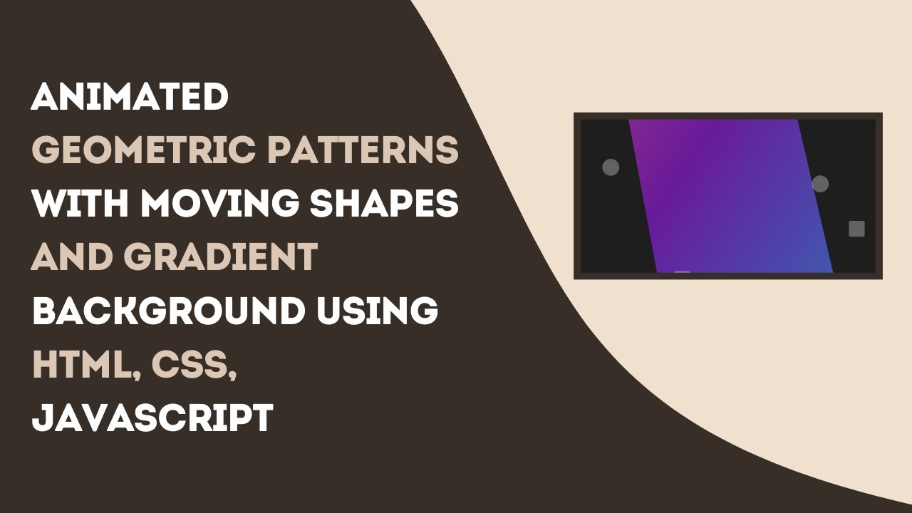
Creating animated geometric patterns is an excellent way to add a dynamic and visually appealing background to your website. In this tutorial, we’ll explore how to use HTML, CSS, and JavaScript to create moving geometric shapes, such as circles and squares, that change colors and positions over time. These animations can be used to create engaging backgrounds, interactive elements, or unique UI components.
What You’ll Learn
✅ How to create dynamic geometric shapes (circles and squares) using HTML ✅ Styling and animating the shapes using CSS ✅ Implementing smooth transitions with keyframe animations ✅ Customizing the animation and positioning for various effects ✅ Tips for using animated patterns to enhance your website’s design
Step 1: Setting Up the HTML Structure
We start by creating a simple HTML structure that includes a container for the animation and multiple geometric shapes.
<!DOCTYPE html>
<html lang="en">
<head>
  <meta charset="UTF-8">
  <meta name="viewport" content="width=device-width, initial-scale=1.0">
  <title>Animated Geometric Patterns</title>
  <link rel="stylesheet" href="styles.css">
</head>
<body>
  <div class="pattern-container"></div>
  <div class="circle"></div>
  <div class="square"></div>
  <div class="circle" style="top: 30%; left: 70%;"></div>
  <div class="square" style="top: 80%; left: 20%;"></div>
</body>
</html>
Step 2: Styling with CSS
Now, let’s style our geometric shapes and define their animations. We will create a rotating gradient background and animated shapes that move in a loop.
body {
  margin: 0;
  height: 100vh;
  display: flex;
  justify-content: center;
  align-items: center;
  background-color: #1e1e1e;
  overflow: hidden;
}

.pattern-container {
  position: absolute;
  width: 100%;
  height: 100%;
  top: 0;
  left: 0;
  animation: animateBackground 5s infinite alternate;
  z-index: -1;
}

@keyframes animateBackground {
  0% {
    transform: rotate(0deg);
    background: linear-gradient(45deg, #ff6f61, #6a1b9a, #00bcd4, #4caf50);
    background-size: 400% 400%;
  }
  100% {
    transform: rotate(360deg);
    background: linear-gradient(45deg, #9c27b0, #ffeb3b, #2196f3, #4caf50);
    background-size: 400% 400%;
  }
}

.circle, .square {
  position: absolute;
  width: 100px;
  height: 100px;
  background-color: rgba(255, 255, 255, 0.3);
  border-radius: 50%;
  animation: moveShapes 8s infinite ease-in-out;
}

.square {
  border-radius: 10px;
}

@keyframes moveShapes {
  0% { transform: translate(0, 0) scale(1); }
  25% { transform: translate(200px, -200px) scale(1.5); }
  50% { transform: translate(400px, 0) scale(1); }
  75% { transform: translate(200px, 200px) scale(0.8); }
  100% { transform: translate(0, 0) scale(1); }
}

.circle { top: 20%; left: 10%; animation-delay: 0s; }
.square { top: 50%; left: 70%; animation-delay: 2s; }
Step 3: Understanding the Animation Effects
- Background Animation: Uses
@keyframesto rotate a gradient background smoothly. - Geometric Shape Movement: Moves shapes in a loop with different positions and sizes using
@keyframes. - Multiple Shapes: Each shape has a different animation delay to create a dynamic effect.
Customization Tips
🎨 Color Variations: Experiment with different gradient colors to match your website’s theme. 🔄 Speed Adjustments: Modify animation durations for faster or slower movements. 🔳 More Shapes: Add additional squares, circles, or even polygons for a more complex effect. 📱 Responsiveness: Use media queries to ensure the animation works well on mobile devices.
Conclusion
By following these steps, you’ve created a visually captivating animated background with geometric patterns. This effect can be used for website backgrounds, hero sections, or interactive design elements to engage users.
If you found this tutorial helpful, don’t forget to like, comment, and share! 🚀
Watch the Full Tutorial Video 🎥
Get the Full Source Code 📂
Follow Madras Academy for more exciting web development tutorials! 🚀