
A dynamic navigation bar can enhance your website’s user experience by making it more interactive and visually appealing. In this tutorial, you’ll learn how to create a color-changing navigation bar that reacts to scrolling using HTML, CSS, and JavaScript. This effect is great for improving website navigation and making your design more engaging! 🚀
📌 What You’ll Learn
✅ How to create a fixed navigation bar with HTML 🖥️
✅ Styling the navbar and links using CSS 🎨
✅ Adding a scroll event listener in JavaScript to change the navbar color dynamically ⬇️
✅ Implementing smooth transitions for a polished effect ✨
✅ Customizing the navbar to fit your website’s theme 🎯
By the end of this tutorial, you’ll have a stylish, interactive navigation bar that responds to scrolling.
🏗 Step 1: HTML Structure
First, let’s create a simple navigation bar using HTML.
<!DOCTYPE html>
<html lang="en">
<head>
  <meta charset="UTF-8">
  <meta name="viewport" content="width=device-width, initial-scale=1.0">
  <title>Color-Changing Navigation Bar</title>
  <link rel="stylesheet" href="styles.css">
</head>
<body>
  <div class="navbar" id="navbar">
    <div class="logo">My Website</div>
    <div class="nav-links">
      <a href="#home">Home</a>
      <a href="#about">About</a>
      <a href="#services">Services</a>
      <a href="#contact">Contact</a>
    </div>
  </div>

  <script src="script.js"></script>
</body>
</html>
Explanation:
- We created a
<div>with the classnavbar, which contains a logo and navigation links. - Each
<a>tag represents a menu item. - The navbar will be styled and controlled using CSS and JavaScript.
🎨 Step 2: Styling with CSS
Now, let’s style the navigation bar to make it visually appealing.
body {
margin: 0;
font-family: Arial, sans-serif;
height: 2000px; /* Allows scrolling */
}
.navbar {
position: fixed;
top: 0;
left: 0;
width: 100%;
padding: 1rem;
background-color: #333;
color: white;
display: flex;
justify-content: space-between;
align-items: center;
transition: background-color 0.3s ease;
z-index: 1000;
}
.navbar a {
color: white;
text-decoration: none;
margin: 0 1rem;
font-size: 1.1rem;
}
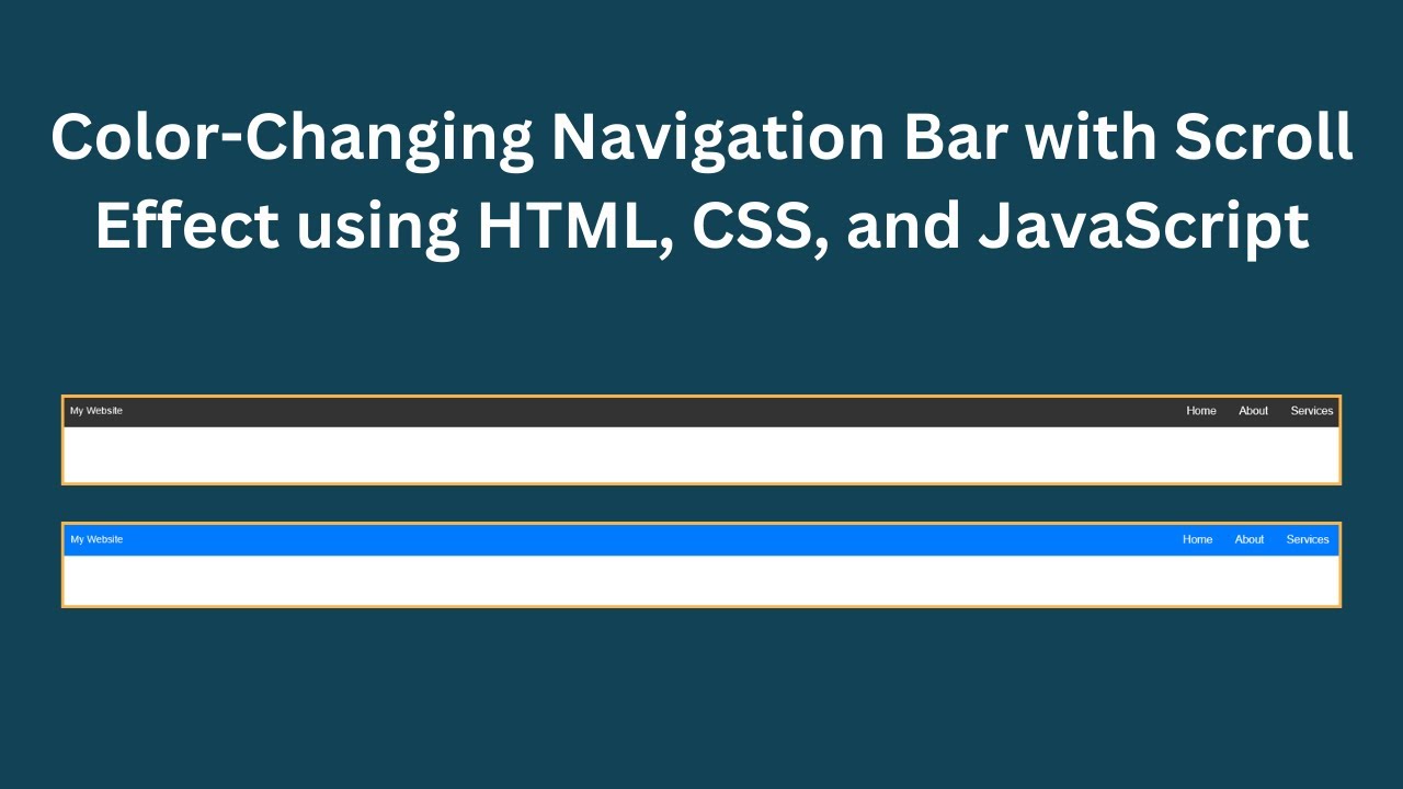
.scrolled {
background-color: #007bff; /* New color when scrolled */
}Explanation:
- The
.navbaris fixed at the top and stretches across the full width of the screen. - Default background color is dark gray (#333).
- Smooth transition is applied when the navbar color changes.
- The
.scrolledclass changes the navbar’s color to blue (#007bff) when the user scrolls down.
📝 Step 3: Adding JavaScript for Scroll Effect
Now, let’s write JavaScript to detect scrolling and change the navbar color dynamically.
window.addEventListener("scroll", function() {
  const navbar = document.getElementById("navbar");
  if (window.scrollY > 50) {
    navbar.classList.add("scrolled");
  } else {
    navbar.classList.remove("scrolled");
  }
});
Explanation:
window.addEventListener("scroll", function() {...})listens for the scroll event.- When the scroll position (
window.scrollY) exceeds 50 pixels, the.scrolledclass is added. - When the user scrolls back up, the
.scrolledclass is removed, returning to the original color.
🎥 Video Tutorial
Watch the full video tutorial for a step-by-step walkthrough:
📂 Get the Source Code
The complete source code for this project is available on GitHub:
🔗 GitHub Repository
🎯 Conclusion
Congratulations! 🎉 You’ve successfully created a color-changing navigation bar using HTML, CSS, and JavaScript. This technique can make your website more interactive and visually appealing. You can further customize the navbar by:
- Changing the colors and font styles.
- Adding animations or hover effects.
- Making the navbar responsive for mobile devices.
If you found this tutorial helpful, like, comment, and subscribe to Madras Academy for more web development tutorials! 🚀✨