
Introduction
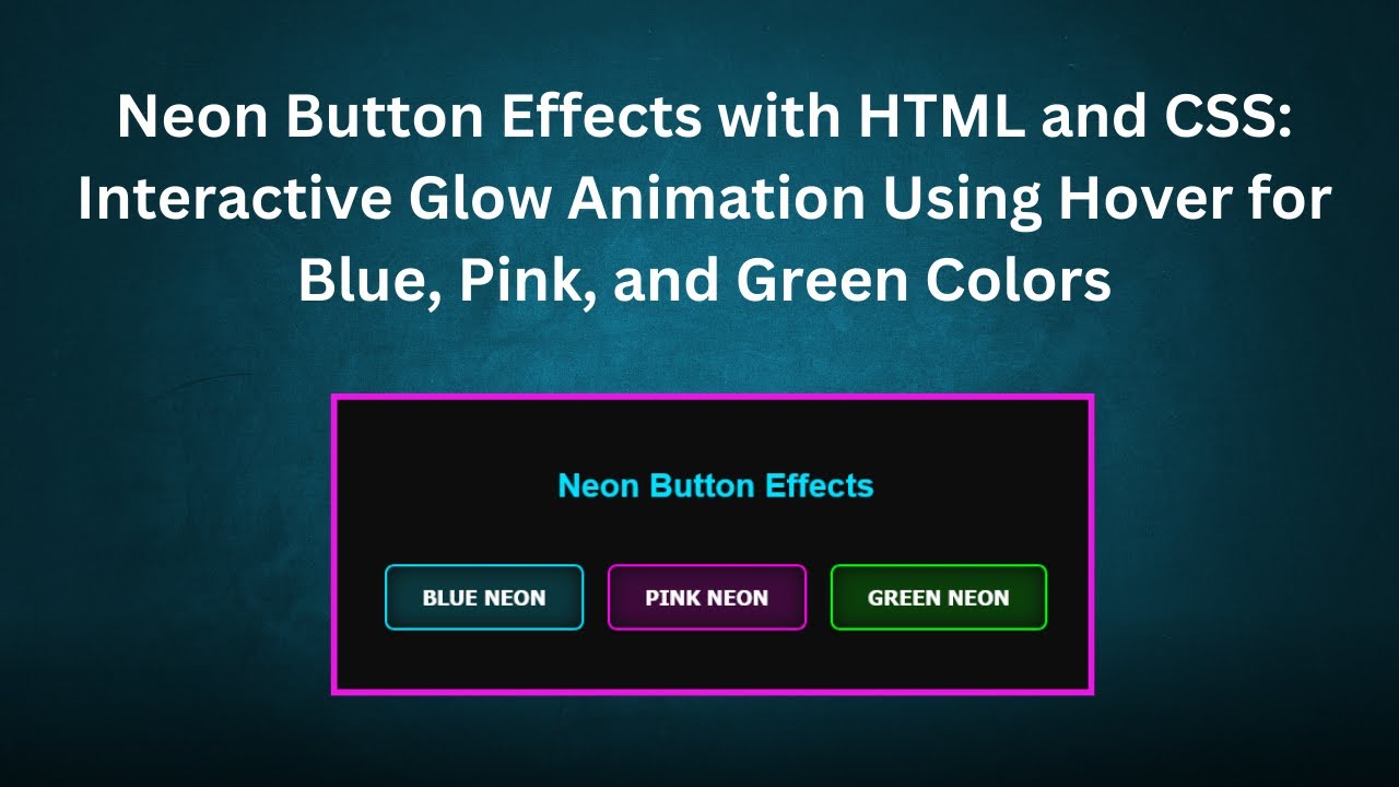
Want to add a futuristic, eye-catching effect to your website? In this tutorial, we’ll show you how to create Neon Button Effects using HTML, CSS, and JavaScript. These stylish glowing buttons will enhance your UI and make your web projects stand out with a modern, high-tech look.
Whether you’re designing a landing page, interactive UI elements, or just experimenting with cool CSS effects, this guide will help you achieve stunning neon-style buttons with hover animations and glowing effects. 🚀💡
What You’ll Learn:
✅ How to design neon buttons using HTML and CSS 🖥️
✅ Adding glowing effects with CSS for a futuristic look ✨
✅ Applying hover animations to enhance interactivity 🎢
✅ Customizing buttons with different colors and effects 🌈
✅ Improving user engagement with visually appealing interactions 🎨
By the end of this tutorial, you’ll be able to create beautiful neon buttons that can be easily integrated into any web project.
Source Code
Here’s the complete HTML and CSS code for creating Neon Button Effects:
HTML Structure
<!DOCTYPE html>
<html lang="en">
<head>
  <meta charset="UTF-8">
  <meta name="viewport" content="width=device-width, initial-scale=1.0">
  <title>Neon Button Effects</title>
  <link rel="stylesheet" href="styles.css">
</head>
<body>
  <h1>Neon Button Effects</h1>
  <div class="button-container">
    <button class="neon-btn">Blue Neon</button>
    <button class="neon-btn pink">Pink Neon</button>
    <button class="neon-btn green">Green Neon</button>
  </div>
</body>
</html>
CSS Styling
body {
  font-family: Arial, sans-serif;
  background-color: #0d0d0d;
  color: #ffffff;
  text-align: center;
  padding-top: 100px;
}

h1 {
  font-size: 28px;
  color: #00e0ff;
}

.button-container {
  display: flex;
  justify-content: center;
  gap: 20px;
  flex-wrap: wrap;
  margin-top: 50px;
}

/* Neon button styles */
.neon-btn {
  padding: 15px 30px;
  font-size: 18px;
  font-weight: bold;
  color: #ffffff;
  background-color: transparent;
  border: 2px solid #00e0ff;
  border-radius: 8px;
  cursor: pointer;
  text-transform: uppercase;
  position: relative;
  overflow: hidden;
  transition: all 0.3s ease-in-out;
}

/* Neon glow effect */
.neon-btn::before {
  content: "";
  position: absolute;
  top: 0;
  left: 0;
  width: 100%;
  height: 100%;
  background: #00e0ff;
  opacity: 0.2;
  filter: blur(8px);
  border-radius: 8px;
  z-index: -1;
  transition: all 0.3s ease-in-out;
}

/* Button hover effect */
.neon-btn:hover {
  color: #0d0d0d;
  background-color: #00e0ff;
  box-shadow: 0 0 20px #00e0ff, 0 0 40px #00e0ff, 0 0 60px #00e0ff;
}

/* Animation for the glow to intensify on hover */
.neon-btn:hover::before {
  opacity: 0.5;
  filter: blur(12px);
}

/* Additional button colors */
.neon-btn.pink {
  border-color: #ff00f0;
}
.neon-btn.pink::before {
  background: #ff00f0;
}
.neon-btn.pink:hover {
  background-color: #ff00f0;
  box-shadow: 0 0 20px #ff00f0, 0 0 40px #ff00f0, 0 0 60px #ff00f0;
}

.neon-btn.green {
  border-color: #00ff00;
}
.neon-btn.green::before {
  background: #00ff00;
}
.neon-btn.green:hover {
  background-color: #00ff00;
  box-shadow: 0 0 20px #00ff00, 0 0 40px #00ff00, 0 0 60px #00ff00;
}
Live Demo & Video Tutorial 🎥
Watch the step-by-step video tutorial on YouTube:
Code Repository 📂
Access the complete source code on GitHub:
🔗 Neon Button Effects – GitHub
Conclusion 🎯
With just HTML and CSS, you can create visually striking neon buttons that glow and react beautifully when hovered over. These buttons are perfect for modern web design, futuristic themes, and interactive user experiences.
👉 If you enjoyed this tutorial, don’t forget to: ✔️ Like this post ❤️
✔️ Comment your thoughts & questions 💬
✔️ Subscribe to Madras Academy for more web development tutorials! 🔔
Stay tuned for more exciting front-end projects! 🚀🎨💻
#HTML #CSS #JavaScript #NeonButtons #WebDesign #WebDevelopment #Tutorial #FrontendDevelopment #TechTutorial #Coding #LearnToCode #WebDesignTutorial #Programming