
Introduction
A collapsible sidebar menu is a great way to improve website navigation while saving space. Whether you’re building a dashboard, portfolio site, or admin panel, a sidebar that slides in and out can make your UI more interactive and user-friendly.
In this tutorial, we’ll learn how to build a collapsible sidebar menu using HTML, CSS, and JavaScript.
📌 What You’ll Learn
✅ Structuring the sidebar with HTML
✅ Styling the sidebar and content area using CSS
✅ Implementing smooth toggle effects with JavaScript
✅ Making the sidebar responsive and mobile-friendly
✅ Enhancing the user experience with sleek transitions
🔧 Step 1: HTML Structure
First, create the basic structure of the sidebar and the main content.
<!DOCTYPE html>
<html lang="en">
<head>
<meta charset="UTF-8">
<meta name="viewport" content="width=device-width, initial-scale=1.0">
<title>Collapsible Sidebar Menu</title>
<link href="https://cdn.jsdelivr.net/npm/tailwindcss@2.2.19/dist/tailwind.min.css" rel="stylesheet">
</head>
<body class="bg-gray-100">
<!-- Sidebar -->
<div id="sidebar" class="p-6 text-white fixed left-[-250px] top-0 w-[250px] h-full bg-gray-900 transition-all">
<h2 class="text-xl font-bold mb-6">Menu</h2>
<ul class="space-y-4">
<li><a href="#" class="hover:underline">Home</a></li>
<li><a href="#" class="hover:underline">About</a></li>
<li><a href="#" class="hover:underline">Services</a></li>
<li><a href="#" class="hover:underline">Contact</a></li>
</ul>
</div>
<!-- Main Content -->
<div id="content" class="p-6 transition-all">
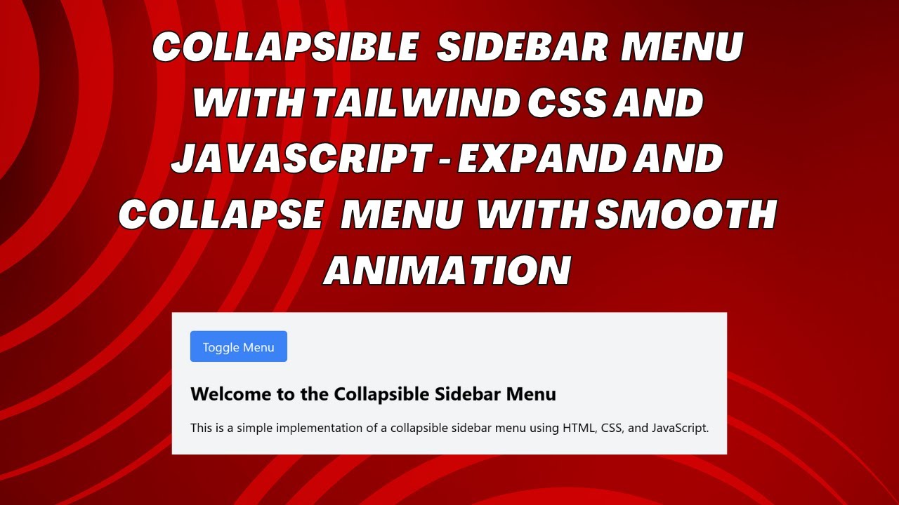
<button id="toggleBtn" class="bg-blue-500 text-white px-4 py-2 rounded">Toggle Menu</button>
<h1 class="text-2xl font-bold mt-6">Welcome to the Collapsible Sidebar Menu</h1>
<p class="mt-4">This sidebar smoothly slides in and out, enhancing your website’s navigation.</p>
</div>
<script src="script.js"></script>
</body>
</html>
🎨 Step 2: CSS for Styling
Use CSS to style the sidebar and create smooth transitions.
#sidebar {
  width: 250px;
  height: 100vh;
  position: fixed;
  left: -250px;
  top: 0;
  background-color: #1a202c;
  transition: all 0.3s;
}
#sidebar.open {
  left: 0;
}
#content {
  margin-left: 0;
  transition: margin-left 0.3s;
}
#content.shifted {
  margin-left: 250px;
}
This CSS:
✔ Creates a sidebar that is hidden by default
✔ Animates the opening and closing smoothly
💻 Step 3: JavaScript for Toggle Effect
Now, let’s add JavaScript to handle the toggle effect when clicking the button.
const toggleBtn = document.getElementById('toggleBtn');
const sidebar = document.getElementById('sidebar');
const content = document.getElementById('content');

toggleBtn.addEventListener('click', function() {
  sidebar.classList.toggle('open');
  content.classList.toggle('shifted');
});
This JavaScript:
✔ Adds a click event listener to the button
✔ Toggles the sidebar open and closed
✔ Shifts the content to accommodate the sidebar
📱 Making It Responsive
To make the sidebar mobile-friendly, you can tweak the CSS and JavaScript further:
- Adjust the sidebar width for smaller screens
- Hide the sidebar on mobile devices by default
- Modify the toggle behavior for touch devices
🎥 Watch the Full Video Tutorial
✅ Subscribe to Madras Academy for more coding tutorials!
👍 Like & Share if this helped you!
💬 Comment below with your questions!
📂 Access the Complete Source Code
🔗 GitHub Repository: Collapsible Sidebar Menu Code
🚀 Final Thoughts
With this simple HTML, CSS, and JavaScript setup, you now have a fully functional collapsible sidebar menu! 🎉
🔹 Use this in your projects for better navigation.
🔹 Experiment with different styles and animations.
🔹 Improve user experience by making it responsive.
📢 Stay Connected!
💻 #HTML #CSS #JavaScript #WebDevelopment #FrontendDevelopment #UXDesign #ResponsiveDesign #WebDesign 🚀