
Glitch effects are a fantastic way to add a futuristic, cyberpunk-style aesthetic to your web projects. In this tutorial, we’ll create a glitch text effect using just HTML and CSS—no JavaScript required! 🚀
Why Use a Glitch Effect?
Glitch effects are great for:
- Cyberpunk and futuristic UI designs 💻
- Tech or gaming websites 🎮
- Animated banners and headings 🔥
By the end of this tutorial, you’ll have a fully functional glitch text animation that brings a distorted, broken-screen vibe to your webpage.
📌 Step 1: HTML Structure
We’ll start with a simple HTML structure. The text will be wrapped inside a div element with the class .glitch.
<!DOCTYPE html>
<html lang="en">
<head>
<meta charset="UTF-8">
<meta name="viewport" content="width=device-width, initial-scale=1.0">
<title>Glitch Text Effect</title>
<link rel="stylesheet" href="styles.css">
</head>
<body>
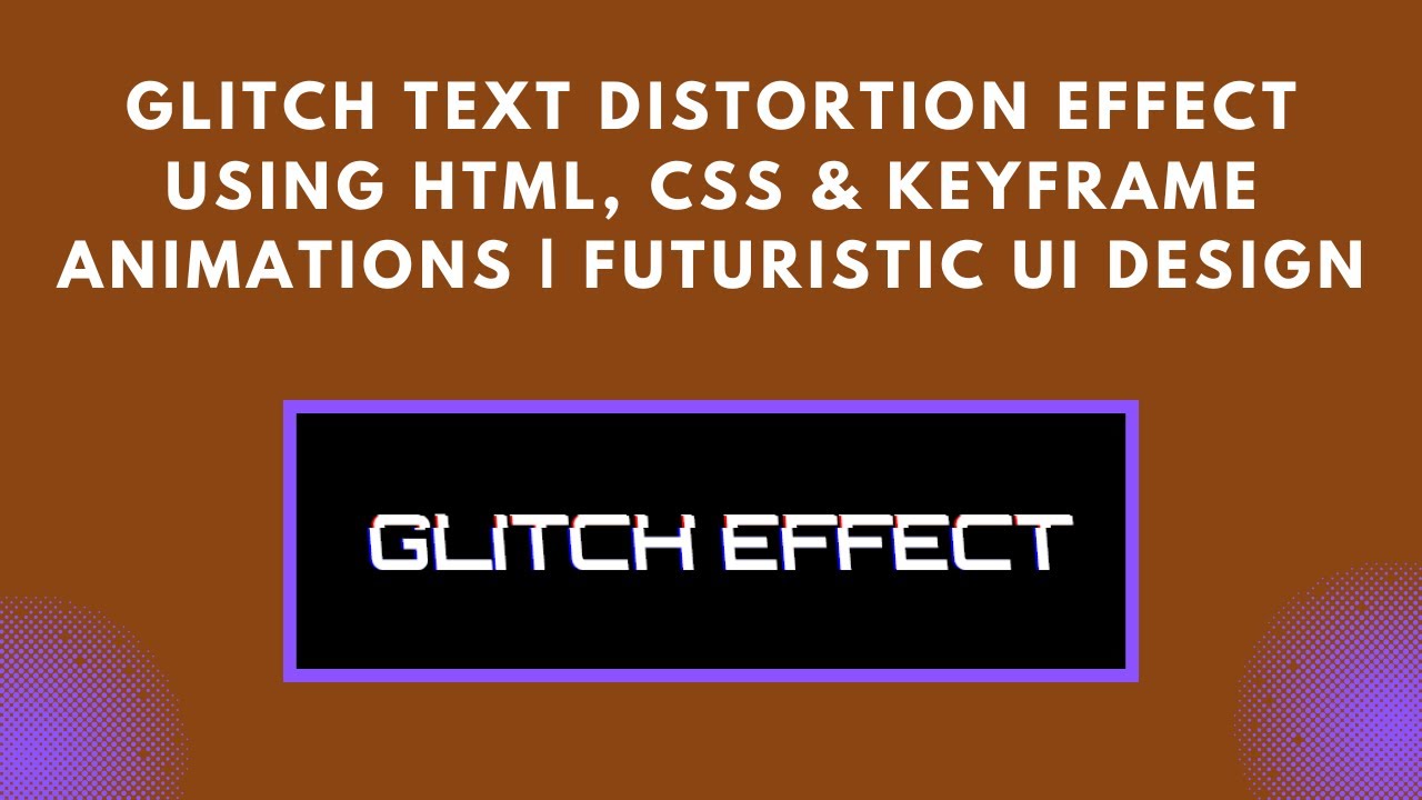
<div class="glitch" data-text="GLITCH EFFECT">GLITCH EFFECT</div>
</body>
</html>🎨 Step 2: CSS Styling
Now, let’s create the glitch effect using CSS animations and pseudo-elements.
@import url('https://fonts.googleapis.com/css2?family=Orbitron:wght@700&display=swap');

body {
    background: black;
    color: white;
    display: flex;
    justify-content: center;
    align-items: center;
    height: 100vh;
    font-family: 'Orbitron', sans-serif;
    overflow: hidden;
}

.glitch {
    font-size: 4rem;
    position: relative;
    text-transform: uppercase;
    color: white;
    animation: glitch 1s infinite;
}

.glitch::before,
.glitch::after {
    content: attr(data-text);
    position: absolute;
    top: 0;
    left: 0;
    width: 100%;
    color: white;
    background: black;
    overflow: hidden;
}

.glitch::before {
    left: 2px;
    text-shadow: -2px 0 red;
    clip: rect(0, 0, 0, 0);
    animation: glitch-before 0.5s infinite linear alternate-reverse;
}

.glitch::after {
    left: -2px;
    text-shadow: -2px 0 blue;
    clip: rect(0, 0, 0, 0);
    animation: glitch-after 0.5s infinite linear alternate-reverse;
}

@keyframes glitch {
    0% { transform: skew(0deg); }
    20% { transform: skew(-5deg); }
    40% { transform: skew(5deg); }
    60% { transform: skew(-5deg); }
    80% { transform: skew(5deg); }
    100% { transform: skew(0deg); }
}

@keyframes glitch-before {
    0% { clip: rect(10px, 9999px, 50px, 0); }
    100% { clip: rect(30px, 9999px, 80px, 0); }
}

@keyframes glitch-after {
    0% { clip: rect(20px, 9999px, 60px, 0); }
    100% { clip: rect(40px, 9999px, 90px, 0); }
}
🎬 How It Works:
- The
::beforeand::afterpseudo-elements create layered copies of the text. text-shadowandclipcreate a distorted glitch effect.@keyframesanimations shift the layers back and forth, creating an eye-catching flicker.
🔥 Final Thoughts
With just a few lines of CSS, you’ve created a cool glitch effect that works without JavaScript! You can customize it by:
- Changing the text color or animation speed.
- Adding hover effects.
- Using different fonts for a unique style.
📺 Watch the Video Tutorial
Check out the full tutorial video here:
📂 Get the Full Source Code
Access the complete code on GitHub: 🔗 GitHub Repository
💬 Got questions? Drop a comment below, and don’t forget to like, share, and subscribe for more web development tutorials! 🚀
#HTML #CSS #GlitchEffect #WebDesign #TextAnimation #Cyberpunk #FrontendDevelopment #TechTutorial #CreativeCoding