
Welcome to this step-by-step tutorial, where we’ll show you how to create a stunning hover reveal effect using just HTML, CSS, and JavaScript. This technique will allow you to design interactive image cards, where hidden content smoothly appears when hovered. It’s perfect for portfolios, galleries, or any UI design that needs a little extra touch of interactivity.
What You’ll Learn:
- Structuring an image container with HTML 🏗️
- Styling the hover effect with CSS for smooth transitions 🎨
- Adding a sleek scaling effect for the image 🖼️
- Implementing a fade-in text animation for dynamic content ✨
- Customizing the design to fit your website’s theme 🎯
Step-by-Step Guide:
1. HTML Structure 🏗️
We start by creating the basic HTML structure. The container holds the image, and the content (text) is initially hidden. When the user hovers over the container, the content fades in and the image scales up.
<!DOCTYPE html>
<html lang="en">
<head>
<meta charset="UTF-8">
<meta name="viewport" content="width=device-width, initial-scale=1.0">
<title>Hover Reveal Effect</title>
<style>
/* Your CSS goes here */
</style>
</head>
<body>
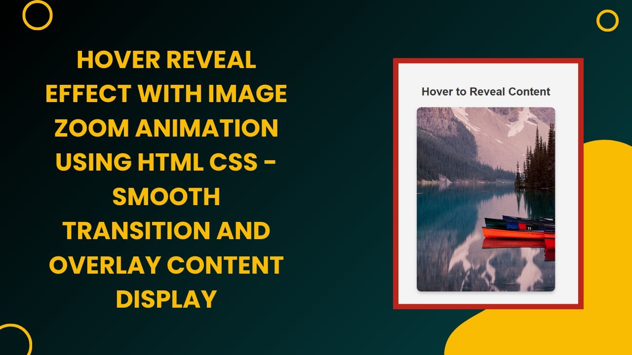
<h1>Hover to Reveal Content</h1>
<div class="container">
<img src="../image/desktop-wallpaper-lake-mountains-canoe-kayak.jpg" alt="Nature Image">
<div class="content">
<h3>Beautiful Nature</h3>
<p>Experience the serene beauty of nature in its purest form.</p>
</div>
</div>
</body>
</html>
2. CSS Styling 🎨
We will now style the image container and the content. The .container holds both the image and content. Initially, the content is hidden with opacity: 0 and positioned at the bottom of the container. When the container is hovered, the content will become visible and the image will scale.
* {
    margin: 0;
    padding: 0;
    box-sizing: border-box;
    font-family: Arial, sans-serif;
}

body {
    display: flex;
    flex-direction: column;
    justify-content: center;
    align-items: center;
    height: 100vh;
    background: #f4f4f4;
    text-align: center;
}

h1 {
    margin-bottom: 20px;
    font-size: 24px;
    color: #333;
}

.container {
    position: relative;
    width: 300px;
    height: 400px;
    overflow: hidden;
    border-radius: 10px;
    box-shadow: 0 4px 6px rgba(0, 0, 0, 0.2);
}

.container img {
    width: 100%;
    height: 100%;
    object-fit: cover;
    transition: transform 0.5s ease-in-out;
}

.content {
    position: absolute;
    bottom: 0;
    left: 0;
    width: 100%;
    height: 100%;
    background: rgba(0, 0, 0, 0.6);
    color: white;
    display: flex;
    flex-direction: column;
    justify-content: center;
    align-items: center;
    opacity: 0;
    transform: translateY(100%);
    transition: all 0.5s ease-in-out;
    text-align: center;
    padding: 20px;
}

.container:hover img {
    transform: scale(1.1);
}

.container:hover .content {
    opacity: 1;
    transform: translateY(0);
}
3. How It Works ✨
- Hover Effect on Image: When you hover over the
.container, the image inside will smoothly scale up usingtransform: scale(1.1). This creates a zoom-in effect, drawing attention to the image. - Fade-In Content: The
.contentdiv is initially hidden withopacity: 0and positioned off the screen. When the container is hovered, the content fades in and slides up usingopacity: 1andtransform: translateY(0).
Customization:
You can customize the hover reveal effect by changing the image, text, or colors. This effect is also responsive, so it will adapt to various screen sizes and device resolutions.
Final Thoughts:
By the end of this tutorial, you will have a stylish, responsive hover reveal effect that can be applied to various sections of your website. It’s a simple yet powerful way to engage users and make your web design more interactive.
Don’t forget to like 👍, subscribe 🔔, and hit the bell icon for more exciting tutorials on web development! 🎥🚀
Watch the Full Tutorial:
You can also check out the detailed tutorial video on YouTube:
Access the Code:
Download the complete source code from the GitHub repository: GitHub Repo – Hover Reveal Effect
Enjoy coding and stay tuned for more web development tutorials from Madras Academy! 🚀