
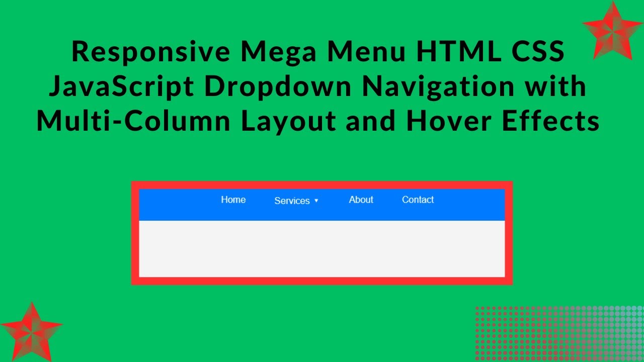
In today’s web development tutorial, we’ll show you how to create a responsive mega menu using HTML, CSS, and a bit of JavaScript. This step-by-step guide will help you design a modern navigation menu that works smoothly across various devices, providing an excellent user experience on both desktop and mobile screens. Whether you’re building an e-commerce site, business website, or dynamic web app, this mega menu will be a great addition!
What You’ll Learn:
- Structuring the Navigation Menu with HTML 🏗️
- Styling the Mega Menu with CSS for a Sleek Look 🎨
- Adding Hover Effects for Smooth Dropdowns ⬇️
- Making the Menu Fully Responsive for Mobile Devices 📱
- Customizing the Menu to Match Your Site’s Branding 🎯
Step-by-Step Guide:
1. HTML Structure 🏗️
First, let’s create the basic structure of our navigation menu. We’ll use a ul list to hold the menu items, and for the mega menu, we’ll add dropdown content inside a <div> with the class mega-menu.
<!DOCTYPE html>
<html lang="en">
<head>
    <meta charset="UTF-8">
    <meta name="viewport" content="width=device-width, initial-scale=1.0">
    <title>Responsive Mega Menu</title>
    <style>
        /* Your CSS goes here */
    </style>
</head>
<body>

    <nav>
        <ul class="menu">
            <li>
                <a href="#">Home</a>
            </li>
            <li>
                <a href="#">Services ▾</a>
                <div class="mega-menu">
                    <div class="column">
                        <h3>Web Development</h3>
                        <a href="#">HTML & CSS</a>
                        <a href="#">JavaScript</a>
                        <a href="#">PHP & Laravel</a>
                    </div>
                    <div class="column">
                        <h3>Design</h3>
                        <a href="#">UI/UX</a>
                        <a href="#">Graphics</a>
                        <a href="#">Illustrations</a>
                    </div>
                    <div class="column">
                        <h3>Marketing</h3>
                        <a href="#">SEO</a>
                        <a href="#">Social Media</a>
                        <a href="#">Email Marketing</a>
                    </div>
                </div>
            </li>
            <li>
                <a href="#">About</a>
            </li>
            <li>
                <a href="#">Contact</a>
            </li>
        </ul>
    </nav>

</body>
</html>
2. CSS Styling 🎨
Now that the basic HTML structure is in place, let’s style the menu to make it look sleek and modern. We’ll make use of flexbox for alignment and add hover effects for the dropdown menu.
* {
    margin: 0;
    padding: 0;
    box-sizing: border-box;
    font-family: Arial, sans-serif;
}

body {
    background: #f4f4f4;
}

nav {
    background: #007bff;
    padding: 15px;
}

.menu {
    display: flex;
    list-style: none;
    justify-content: center;
    gap: 20px;
}

.menu li {
    position: relative;
}

.menu a {
    text-decoration: none;
    color: white;
    padding: 10px 15px;
    display: block;
}

.mega-menu {
    position: absolute;
    top: 100%;
    left: 0;
    width: 600px;
    background: white;
    display: none;
    padding: 20px;
    box-shadow: 0 4px 6px rgba(0, 0, 0, 0.1);
    border-radius: 5px;
}

.menu li:hover .mega-menu {
    display: flex;
    justify-content: space-between;
}

.mega-menu .column {
    width: 30%;
}

.mega-menu h3 {
    font-size: 16px;
    margin-bottom: 10px;
    color: #007bff;
}

.mega-menu a {
    color: #333;
    padding: 5px 0;
}

.mega-menu a:hover {
    color: #007bff;
}
3. Making It Responsive 📱
Now, let’s ensure that our mega menu looks great on all devices, including mobile. We’ll use media queries to make the menu items stack vertically and adjust the mega menu’s layout for smaller screens.
/* Responsive Styles */
@media (max-width: 768px) {
    .menu {
        flex-direction: column;
        align-items: center;
    }
    .mega-menu {
        width: 100%;
        position: relative;
        flex-direction: column;
    }
    .mega-menu .column {
        width: 100%;
    }
}
With these simple changes, the menu will stack vertically on smaller screens and the mega menu will take up the full width of the screen, making it user-friendly on mobile devices.
Final Thoughts:
By the end of this tutorial, you’ll have a fully functional, stylish, and responsive mega menu for your website. The combination of hover effects, flexible layout, and responsiveness ensures that this menu works seamlessly across desktop and mobile devices.
Watch the Full Tutorial: For a more in-depth guide, check out the full video tutorial on YouTube:
Access the Code: You can access the complete source code for this mega menu on GitHub: GitHub Repo – Responsive Mega Menu
If you found this tutorial helpful, don’t forget to like 👍, comment, and subscribe 🔔 to Madras Academy for more exciting web development tutorials! 🚀