
Tabs are a great way to organize content efficiently, allowing users to switch between sections without reloading the page. In this tutorial, we’ll build a fully functional, stylish, and interactive tabbed navigation system using HTML, CSS, and JavaScript.
By the end of this guide, you’ll have a smooth, animated tab system that enhances your website’s user experience! 🎨✨
📌 What You’ll Learn in This Tutorial
✅ How to structure a tabbed interface with HTML 🏗️
✅ Styling tabs with CSS for a modern and sleek look 🎨
✅ Adding click events in JavaScript to switch between tabs ⚡
✅ Implementing smooth animations for a better user experience ✨
✅ Customizing tabs to match your website’s design 🎯
Let’s dive in and start coding! 🚀
🔹 Step 1: HTML Structure
We start by creating the structure of our dynamic tabs. The tabs will be inside a container, and each tab will have associated content.
<!DOCTYPE html>
<html lang="en">
<head>
<meta charset="UTF-8">
<meta name="viewport" content="width=device-width, initial-scale=1.0">
<title>Dynamic Tabs</title>
<link rel="stylesheet" href="styles.css">
</head>
<body>
<div class="tabs-container">
<div class="tabs">
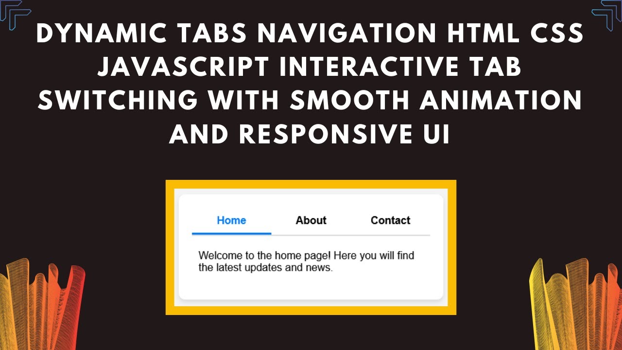
<div class="tab active" data-tab="tab1">Home</div>
<div class="tab" data-tab="tab2">About</div>
<div class="tab" data-tab="tab3">Contact</div>
</div>
<div class="tab-content active" id="tab1">
<p>Welcome to the home page! Here you will find the latest updates and news.</p>
</div>
<div class="tab-content" id="tab2">
<p>About us: We are a leading provider of innovative solutions in the tech industry.</p>
</div>
<div class="tab-content" id="tab3">
<p>Contact us at: example@example.com or call us at +91 9876543210.</p>
</div>
</div>
<script src="script.js"></script>
</body>
</html>
🔹 Step 2: Styling the Tabs with CSS
Now, let’s style our tabs for a modern and responsive look using CSS.
* {
    margin: 0;
    padding: 0;
    box-sizing: border-box;
    font-family: Arial, sans-serif;
}
body {
    display: flex;
    justify-content: center;
    align-items: center;
    height: 100vh;
    background: #f4f4f4;
}
.tabs-container {
    width: 400px;
    background: white;
    padding: 20px;
    border-radius: 10px;
    box-shadow: 0 4px 6px rgba(0, 0, 0, 0.1);
}
.tabs {
    display: flex;
    border-bottom: 2px solid #ddd;
}
.tab {
    flex: 1;
    padding: 10px;
    text-align: center;
    cursor: pointer;
    font-weight: bold;
    border-bottom: 3px solid transparent;
    transition: all 0.3s ease-in-out;
}
.tab.active {
    border-bottom: 3px solid #007bff;
    color: #007bff;
}
.tab-content {
    display: none;
    padding: 20px 10px;
    animation: fadeIn 0.5s ease-in-out;
}
.tab-content.active {
    display: block;
}
@keyframes fadeIn {
    from { opacity: 0; transform: translateY(10px); }
    to { opacity: 1; transform: translateY(0); }
}
🔹 Key Features of This CSS
✔ Responsive & modern design
✔ Smooth animations for tab switching
✔ Highlighting active tabs
🔹 Step 3: Adding Functionality with JavaScript
To make our tabs functional, we’ll use JavaScript to handle click events and switch between different content sections.
const tabs = document.querySelectorAll(".tab");
const contents = document.querySelectorAll(".tab-content");

tabs.forEach(tab => {
    tab.addEventListener("click", () => {
        tabs.forEach(t => t.classList.remove("active"));
        contents.forEach(c => c.classList.remove("active"));

        tab.classList.add("active");
        document.getElementById(tab.getAttribute("data-tab")).classList.add("active");
    });
});
🔹 How This JavaScript Works
✔ Adds event listeners to each tab
✔ Removes active class from all tabs and content sections
✔ Activates the selected tab and displays the corresponding content
🎬 Watch the Video Tutorial!
Want to see this in action? Watch our full tutorial on YouTube for a step-by-step demonstration!
📺 Watch Now
💾 Get the Source Code
🔗 Access the complete source code on GitHub:
Dynamic Tabs – GitHub Repository
🚀 Customize Your Tabs
Now that you have the basic tab system ready, you can customize it to match your website’s theme. Here are some ideas:
✅ Change Colors & Fonts – Use custom CSS styles
✅ Add More Tabs – Expand the content sections
✅ Integrate Icons – Add FontAwesome or Material Icons
✅ Make it Responsive – Use media queries for better mobile support
Feel free to experiment and enhance your tabs to make them more interactive and engaging!
💬 Have Questions? Let’s Discuss!
If you have any questions, drop a comment below! We’d love to help.
🔥 Don’t forget to LIKE 👍, SHARE 🔄, and SUBSCRIBE 🔔 to Madras Academy for more web development tutorials!
📢 Stay Connected with Madras Academy
Follow us for more coding tutorials, project ideas, and web development tips!
#HTML #CSS #JavaScript #DynamicTabs #WebDevelopment #Frontend #WebDesign #InteractiveUI #Coding #TechTutorial 🚀🎉