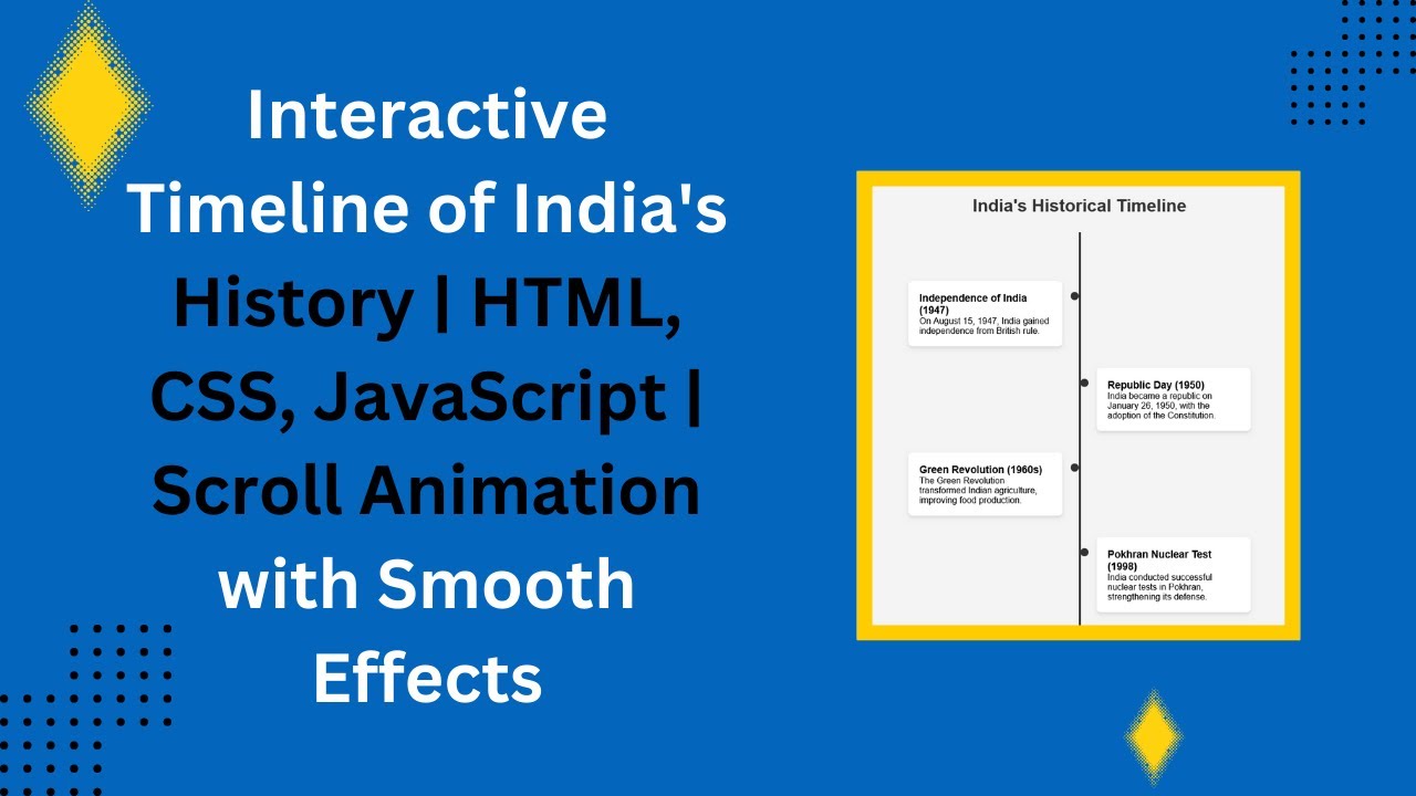
An interactive timeline is a fantastic way to display key events or milestones on your website. Whether you’re showcasing historical events, project milestones, or personal achievements, this type of timeline can help bring your content to life in a visually engaging and dynamic way. In this tutorial, we’ll walk you through how to create a sleek, interactive timeline using HTML, CSS, and JavaScript. 🏆📅
What You’ll Learn:
- Structuring the Timeline with HTML 🏗️
- Styling the Timeline and Animations with CSS 🎨
- Implementing Scroll-Triggered Animations using JavaScript ⬇️
- Creating a Responsive Timeline for All Devices 📱💻
- Customizing the Design to Match Your Website’s Theme 🎯
Step 1: HTML Structure
We start by structuring the HTML for our timeline. Each event is wrapped in a timeline-item div, and a central vertical line is created using a pseudo-element (::before) to connect each event. Here’s the structure:
<div class="timeline">
    <div class="timeline-item">
        <div class="timeline-dot"></div>
        <h3>Independence of India (1947)</h3>
        <p>On August 15, 1947, India gained independence from British rule.</p>
    </div>
    <!-- Repeat for other timeline items -->
</div>
Step 2: CSS Styling & Animations
Next, we style the timeline using CSS. We create a vertical line in the center of the timeline, with timeline events aligned alternately on either side. We also use @keyframes to animate the appearance of the timeline items as the user scrolls down.
.timeline {
    position: relative;
    max-width: 700px;
    padding: 50px 0;
}

.timeline::before {
    content: "";
    position: absolute;
    top: 0;
    left: 50%;
    width: 4px;
    height: 100%;
    background: #333;
    transform: translateX(-50%);
}

.timeline-item {
    position: relative;
    width: 45%;
    padding: 20px;
    margin: 40px 0;
    background: white;
    border-radius: 8px;
    box-shadow: 0 4px 6px rgba(0, 0, 0, 0.1);
    opacity: 0;
    transform: translateY(30px);
    transition: all 0.6s ease-in-out;
}
Step 3: JavaScript for Scroll Animation
To make the timeline items appear as the user scrolls down the page, we use JavaScript. The revealTimelineItems function checks if an item is within the viewport and adds the show class to trigger its animation.
function revealTimelineItems() {
    const items = document.querySelectorAll(".timeline-item");
    const triggerBottom = window.innerHeight * 0.85;

    items.forEach(item => {
        const itemTop = item.getBoundingClientRect().top;
        if (itemTop < triggerBottom) {
            item.classList.add("show");
        }
    });
}

document.addEventListener("scroll", revealTimelineItems);
window.addEventListener("load", revealTimelineItems);
The items will fade in and move up as they enter the viewport, creating a smooth scrolling effect.
Step 4: Responsiveness
To ensure the timeline looks great on all devices, we’ve added media queries to adjust the layout for smaller screen sizes. On mobile devices, the timeline items will stack vertically, ensuring a seamless experience.
@media screen and (max-width: 768px) {
    .timeline::before {
        left: 20px;
    }
    .timeline-item {
        width: 100%;
        left: 0 !important;
        padding-left: 40px;
    }
}
Customizing Your Timeline
You can easily customize this interactive timeline to fit your style and content:
- Change the colors of the timeline and dots.
- Adjust the animations to make the items appear differently (e.g., by sliding in from the sides).
- Add more events by simply copying the
timeline-itemstructure and modifying the content.
Demo & Code Repository
Check out the live demo of this interactive timeline:
You can also access the full source code on GitHub:
Complete Source Code on GitHub
If you enjoyed this tutorial, don’t forget to like, comment, and subscribe for more exciting web development tutorials! 🚀🎉
#HTML #CSS #JavaScript #TimelineDesign #InteractiveWeb #FrontendDevelopment #WebDesignInspiration #CodingTutorial #WebDevelopment