
Adding unique visual elements to a website can make it stand out, and animated doodle borders are a fun way to achieve this effect. In this tutorial, you’ll learn how to create an eye-catching animated doodle border using HTML and CSS. This creative design is perfect for adding a playful, hand-drawn look to your website!
What You’ll Learn 🎨
✅ How to structure a content box with HTML 🖥️
✅ Designing an animated border using SVG paths 📏
✅ Applying CSS animations for a smooth stroke effect 🔄
✅ Customizing colors, stroke thickness, and animation speed 🎯
✅ Creating a seamless, looping doodle effect to enhance user experience 🌟
By the end of this tutorial, you’ll have a fully functional animated doodle border that you can modify to fit your website’s theme!
Step 1: Setting Up the HTML
First, create a simple HTML structure with a div that will contain the doodle border. Inside this div, add an SVG element to define the animated border.
<!DOCTYPE html>
<html lang="en">
<head>
<meta charset="UTF-8">
<meta name="viewport" content="width=device-width, initial-scale=1.0">
<title>Animated Doodle Borders</title>
<link rel="stylesheet" href="styles.css">
</head>
<body>
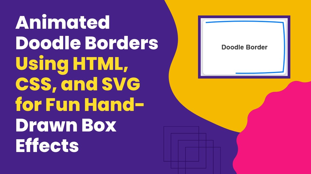
<div class="doodle-box">
Doodle Border
<svg xmlns="http://www.w3.org/2000/svg" viewBox="0 0 300 200" preserveAspectRatio="none">
<path d="M10,10 Q150,0 290,10
Q300,100 290,190
Q150,200 10,190
Q0,100 10,10 Z" />
</svg>
</div>
</body>
</html>Step 2: Styling with CSS
Now, let’s style the content box and animate the SVG border using CSS.
body {
  margin: 0;
  height: 100vh;
  display: flex;
  justify-content: center;
  align-items: center;
  background-color: #f0f0f5;
  font-family: Arial, sans-serif;
}

.doodle-box {
  position: relative;
  width: 300px;
  height: 200px;
  background-color: #ffffff;
  border-radius: 12px;
  display: flex;
  justify-content: center;
  align-items: center;
  font-size: 24px;
  font-weight: bold;
  color: #333;
  box-shadow: 0 4px 12px rgba(0, 0, 0, 0.2);
  overflow: hidden;
}

svg {
  position: absolute;
  top: 0;
  left: 0;
  width: 100%;
  height: 100%;
}

path {
  fill: none;
  stroke: #007bff;
  stroke-width: 4;
  stroke-dasharray: 700;
  stroke-dashoffset: 700;
  animation: draw-border 2s ease-in-out infinite;
}

@keyframes draw-border {
  0% {
    stroke-dashoffset: 700;
  }
  50% {
    stroke-dashoffset: 0;
  }
  100% {
    stroke-dashoffset: 700;
  }
}
How It Works 🛠️
- The SVG path creates a custom hand-drawn border.
- The stroke-dasharray property controls the dashed appearance of the stroke.
- The stroke-dashoffset property animates the stroke to simulate a drawing effect.
- The
@keyframes draw-borderanimation makes the border appear and disappear continuously.
Final Thoughts 🎯
This animated doodle border effect adds a creative and interactive touch to your website. You can customize the color, speed, and shape of the doodle to fit your theme. Try experimenting with different SVG paths to create unique border designs!
Watch the Video Tutorial 📺
Want a step-by-step visual guide? Watch the full tutorial here:
Get the Source Code on GitHub 🖥️
Access the complete source code here:
🔗 GitHub Repository
If you enjoyed this tutorial, don’t forget to like, comment, and subscribe to Madras Academy for more exciting web development tutorials! 🚀