
Creating a sleek and modern navigation bar is essential for enhancing user experience on your website. In this tutorial, you’ll learn how to build an animated icon navigation bar using only HTML and CSS. The icons will scale up on hover, providing a smooth interactive effect that makes navigation more engaging. 🚀
🔥 What You’ll Learn
✅ Structuring the navigation bar with HTML 🏗️
✅ Styling the navbar and icons using CSS 🎨
✅ Adding hover effects for smooth animations ✨
✅ Enhancing user experience with active states 🎯
✅ Customizing the navbar to match your website’s theme 🌐
🏗️ Step 1: HTML Structure
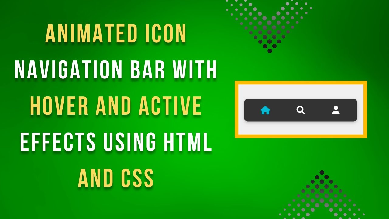
We’ll start by creating a simple navigation bar with three icons – Home, Search, and User.
<!DOCTYPE html>
<html lang="en">
<head>
    <meta charset="UTF-8">
    <meta name="viewport" content="width=device-width, initial-scale=1.0">
    <title>Animated Icon Navigation</title>
    <link rel="stylesheet" href="https://cdnjs.cloudflare.com/ajax/libs/font-awesome/6.0.0/css/all.min.css">
    <link rel="stylesheet" href="styles.css">
</head>
<body>
    <div class="nav-bar">
        <a href="#" class="nav-item active"><i class="fas fa-home"></i></a>
        <a href="#" class="nav-item"><i class="fas fa-search"></i></a>
        <a href="#" class="nav-item"><i class="fas fa-user"></i></a>
    </div>
</body>
</html>
This structure includes a nav-bar container and three icon links, each wrapped inside <a> tags for navigation.
🎨 Step 2: Styling the Navigation Bar
Now, let’s add CSS to style the navbar and implement the hover animation.
body {
    font-family: Arial, sans-serif;
    background-color: #f0f0f0;
    margin: 0;
    display: flex;
    justify-content: center;
    align-items: center;
    height: 100vh;
}

.nav-bar {
    display: flex;
    justify-content: space-between;
    width: 300px;
    background-color: #333;
    padding: 10px;
    border-radius: 10px;
    box-shadow: 0 4px 8px rgba(0, 0, 0, 0.2);
}

.nav-item {
    color: #ffffff;
    font-size: 24px;
    text-decoration: none;
    display: flex;
    align-items: center;
    justify-content: center;
    flex: 1;
    padding: 10px;
    transition: transform 0.3s ease, color 0.3s ease;
}

.nav-item:hover {
    transform: scale(1.2);
    color: #00bcd4;
}

.nav-item.active {
    color: #00bcd4;
}
✨ Key Features in CSS:
- Flexbox layout for evenly spaced icons.
- Hover effects to scale icons and change color.
- Active state to highlight the selected item.
- Smooth transitions for a polished look.
🎥 Live Demo & Video Tutorial
Check out the complete video tutorial on YouTube for a detailed walkthrough:
📂 Source Code
Access the complete source code on GitHub: 🔗 GitHub Repository
🎯 Final Thoughts
Congratulations! 🎉 You’ve successfully built an animated icon navigation bar with a clean design and smooth effects. This technique is simple yet effective for improving user interaction on your website.
What’s next? Try customizing the colors, adding more icons, or incorporating this navbar into your projects! 🚀
👉 If you enjoyed this tutorial, don’t forget to like, comment, and subscribe to Madras Academy for more web development tutorials. Stay creative! 🎨🔥