
Creating a frosted glass UI effect is a great way to add a modern and elegant look to your website. This design trend is widely used in web and mobile applications to achieve a sleek, semi-transparent effect that blends seamlessly with background images. In this tutorial, you’ll learn how to create a frosted glass effect using HTML and CSS.
What is the Frosted Glass Effect?
The frosted glass effect mimics the look of glass that has been blurred or diffused, allowing background elements to show through while maintaining readability and aesthetics. This effect is achieved using the CSS backdrop-filter property, which applies a blur to the background of an element.
🛠 What You’ll Learn
✅ How to create a frosted glass effect with CSS using backdrop-filter 🖥️
✅ Styling the background with images and adding smooth blur effects 🎨
✅ Creating a stylish card with rounded corners and soft shadows 🃏
✅ Enhancing the UI with a translucent effect and polished design 🌟
✅ Tips for using the frosted glass effect effectively in web design 🎯
📌 Step-by-Step Guide
1️⃣ Setting Up the HTML Structure
We’ll start by creating a simple HTML structure that contains a div element acting as a frosted glass card.
<!DOCTYPE html>
<html lang="en">
<head>
<meta charset="UTF-8">
<meta name="viewport" content="width=device-width, initial-scale=1.0">
<title>Frosted Glass Effect</title>
<link rel="stylesheet" href="styles.css">
</head>
<body>
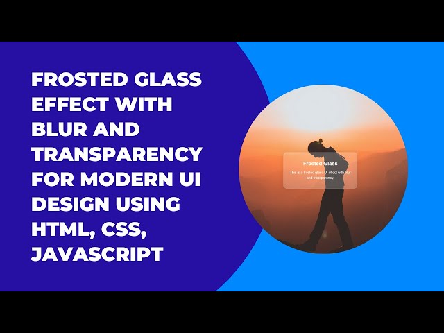
<div class="card">
<h1>Frosted Glass</h1>
<p>This is a frosted glass UI effect with blur and transparency.</p>
</div>
</body>
</html>2️⃣ Styling the Frosted Glass Effect with CSS
The key to achieving the frosted glass effect is the backdrop-filter property. It applies a blur effect to the background while keeping the content inside clear and readable.
body {
  margin: 0;
  height: 100vh;
  display: flex;
  justify-content: center;
  align-items: center;
  font-family: Arial, sans-serif;
  background-image: url('https://images.unsplash.com/photo-1506748686214-e9df14d4d9d0');
  background-size: cover;
  background-position: center;
}

.card {
  width: 300px;
  padding: 20px;
  border-radius: 15px;
  background: rgba(255, 255, 255, 0.2); /* Semi-transparent white */
  backdrop-filter: blur(10px); /* Frosted glass effect */
  box-shadow: 0 4px 30px rgba(0, 0, 0, 0.1); /* Soft shadow */
  border: 1px solid rgba(255, 255, 255, 0.3);
  color: #fff;
  text-align: center;
}

h1 {
  font-size: 24px;
  margin-bottom: 10px;
}

p {
  font-size: 16px;
  line-height: 1.5;
}
3️⃣ Explanation of Key CSS Properties
backdrop-filter: blur(10px);– Creates the frosted glass effect by blurring the background behind the element.background: rgba(255, 255, 255, 0.2);– Gives the card a translucent white background.box-shadow: 0 4px 30px rgba(0, 0, 0, 0.1);– Adds a subtle shadow for a 3D floating effect.border: 1px solid rgba(255, 255, 255, 0.3);– Adds a soft border to enhance visibility.
🎥 Video Tutorial
Want a visual walkthrough? Watch the full tutorial on YouTube here:
🔗 GitHub Repository
Get the complete source code for this project on GitHub:
🔗 Frosted Glass Effect Code
📌 Where to Use the Frosted Glass Effect?
This UI effect can be applied in various web design scenarios:
- Navigation Menus – Creating sleek and modern menu designs.
- Modals & Popups – Enhancing the UI without blocking background content.
- Login & Signup Forms – Making forms look stylish and clean.
- Card-Based Layouts – Perfect for displaying content in a unique way.
🎯 Conclusion
By implementing the frosted glass effect, you can elevate the visual appeal of your web applications while maintaining readability and user experience. This technique is simple yet powerful, and with just a few lines of CSS, you can achieve a beautiful, modern UI effect.
If you found this tutorial helpful, don’t forget to share, comment, and subscribe to Madras Academy for more web development tutorials! 🚀✨