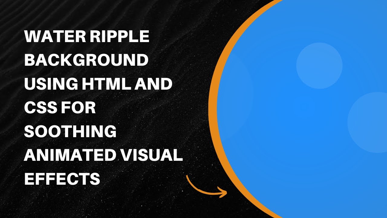
Adding animated effects to a website can enhance user engagement and make the design more visually appealing. One such effect is the Water Ripple Background, which creates a smooth and calming animation resembling ripples on a water surface. In this tutorial, we’ll guide you through creating this effect using HTML and CSS.
What You’ll Learn
✅ How to create a full-screen ripple background using HTML and CSS 🖥️
✅ How to animate ripples for a realistic water effect 💦
✅ How to layer multiple ripples for a natural look 🎨
✅ How to customize animation speeds and sizes 🔄
✅ How to create a smooth, continuous ripple effect 🌟
By the end of this tutorial, you’ll be able to add a dynamic, animated water ripple background to your projects effortlessly.
Step 1: Setting Up the HTML
We begin with a basic HTML structure that includes a container for the ripple animation.
<!DOCTYPE html>
<html lang="en">
<head>
  <meta charset="UTF-8">
  <meta name="viewport" content="width=device-width, initial-scale=1.0">
  <title>Water Ripple Background</title>
  <link rel="stylesheet" href="styles.css">
</head>
<body>
  <div class="ripple-background">
    <div class="ripple"></div>
    <div class="ripple"></div>
    <div class="ripple"></div>
    <div class="ripple"></div>
  </div>
</body>
</html>
This code creates a div container (ripple-background) that holds four ripple elements. These elements will be animated to create the ripple effect.
Step 2: Styling with CSS
Now, let’s add CSS to style the background and animate the ripples.
body {
  margin: 0;
  padding: 0;
  display: flex;
  justify-content: center;
  align-items: center;
  height: 100vh;
  background-color: #000;
  overflow: hidden;
}

.ripple-background {
  position: relative;
  width: 100vw;
  height: 100vh;
  background: radial-gradient(circle, #1e90ff, #4682b4);
  overflow: hidden;
}

.ripple {
  position: absolute;
  width: 100px;
  height: 100px;
  border-radius: 50%;
  background-color: rgba(255, 255, 255, 0.2);
  animation: ripple-animation 6s infinite;
  opacity: 0;
}

@keyframes ripple-animation {
  0% {
    transform: scale(0.5);
    opacity: 0.8;
  }
  50% {
    transform: scale(2);
    opacity: 0.4;
  }
  100% {
    transform: scale(4);
    opacity: 0;
  }
}

/* Creating multiple ripples with different delays */
.ripple:nth-child(1) {
  animation-delay: 0s;
  left: 30%;
  top: 40%;
}

.ripple:nth-child(2) {
  animation-delay: 1.5s;
  left: 60%;
  top: 50%;
}

.ripple:nth-child(3) {
  animation-delay: 3s;
  left: 50%;
  top: 30%;
}

.ripple:nth-child(4) {
  animation-delay: 4.5s;
  left: 70%;
  top: 60%;
}
How It Works
- The
.ripple-backgrounddiv is styled with a radial gradient to mimic a water surface. - The
.rippleelements are positioned absolutely and given a circular shape. - The
@keyframes ripple-animationcontrols the ripple effect, expanding and fading them over time. - Different animation delays are set for each
.rippleto create a natural, staggered effect.
Final Result
By implementing these steps, you’ll create an animated water ripple effect that adds a touch of elegance to your website. You can modify the colors, animation speed, and ripple sizes to customize the effect further.
💡 Tip: Try adding more .ripple elements or adjusting the animation duration to experiment with different ripple behaviors.
Watch the Tutorial Video 🎥
For a visual walkthrough, check out our full video tutorial on YouTube:
Get the Full Code on GitHub 📂
You can access and download the complete source code from our GitHub repository:
🔗 GitHub Repository
Conclusion
This tutorial showed you how to build an animated water ripple background using HTML and CSS. This effect is perfect for creating engaging backgrounds for websites, landing pages, and creative web projects.
🚀 If you found this tutorial helpful, don’t forget to like, comment, and subscribe to Madras Academy for more awesome web development guides!
Happy coding! 🎨💻

