
Want to make your website text stand out with vibrant animations? In this tutorial, we’ll create a beautiful color-changing text effect using only HTML and CSS—no JavaScript required! 🚀
This effect is perfect for headlines, banners, or eye-catching titles, adding a modern and dynamic feel to your web pages.
What You’ll Learn
✅ HTML setup for adding text 📄
✅ CSS gradients for colorful effects 🎨
✅ Background clipping to apply gradients inside text ✂️
✅ Keyframes animation for smooth color transitions 🌟
✅ Customization options for different colors, speeds, and styles 🛠️
Step 1: Basic HTML Structure
Start by setting up a simple HTML file with a div to hold the animated text.
<!DOCTYPE html>
<html lang="en">
<head>
  <meta charset="UTF-8">
  <meta name="viewport" content="width=device-width, initial-scale=1.0">
  <title>Animated Color Changing Text</title>
  <link rel="stylesheet" href="styles.css">
</head>
<body>
  <div class="color-changing-text">Animated Color Changing Text</div>
</body>
</html>
✔ Defines the structure of the page
✔ Links to an external CSS file for clean code
Step 2: Styling with CSS
Now, let’s add CSS styles to create the color-changing effect.
/* Center content */
body {
  display: flex;
  justify-content: center;
  align-items: center;
  height: 100vh;
  margin: 0;
  background-color: #1e1e1e;
  font-family: Arial, sans-serif;
}

/* Animated Text */
.color-changing-text {
  font-size: 48px;
  font-weight: bold;
  background-image: linear-gradient(90deg, red, orange, yellow, green, cyan, blue, violet);
  -webkit-background-clip: text;
  color: transparent;
  animation: color-shift 5s infinite linear;
}

/* Keyframes for continuous color shift */
@keyframes color-shift {
  0% {
    filter: hue-rotate(0deg);
  }
  100% {
    filter: hue-rotate(360deg);
  }
}
✔ Uses a linear-gradient to create a multi-color effect
✔ Applies -webkit-background-clip: text; to make the text transparent and reveal the gradient
✔ Uses filter: hue-rotate() in a @keyframes animation to smoothly shift colors
✔ Loops the animation infinitely for a continuous effect
How It Works 🎥
🌈 Text changes color continuously with a smooth gradient effect
⏳ Animation runs infinitely with no extra scripts needed
🎨 Fully customizable—change colors, speed, and size to match your design
Customization Tips
🔹 Change animation speed: Modify the 5s value in animation: color-shift 5s infinite linear;
🔹 Use different colors: Replace the gradient colors in background-image
🔹 Adjust font size: Modify the font-size in .color-changing-text
🔹 Experiment with easing effects: Try ease-in-out instead of linear
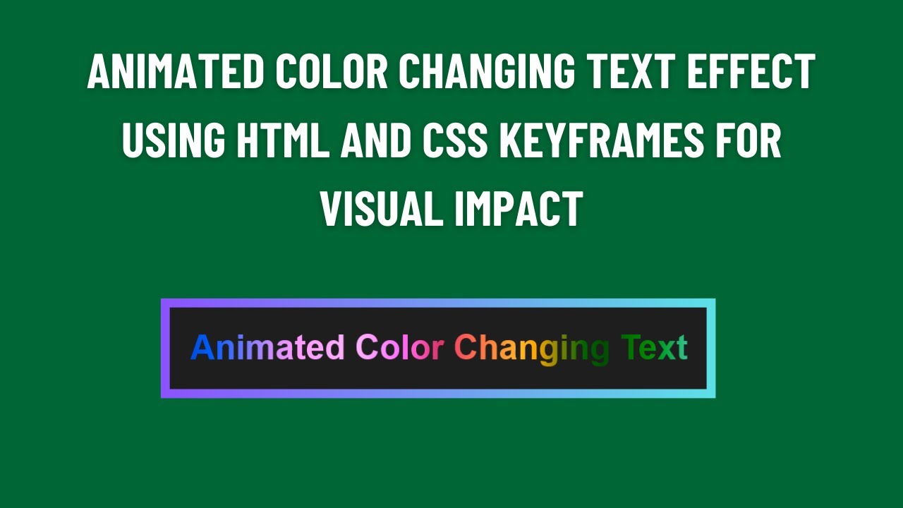
Final Output: A Stunning Color-Changing Text Animation!
This simple yet powerful effect adds a dynamic touch to your website without any JavaScript. Try it out and see how it transforms your text!
Watch the Full Video Tutorial 🎥
See the step-by-step process and live demonstration of the animated text effect!
Download the Full Code
Get the complete source code on GitHub:
🔗 GitHub – Color Changing Text
Conclusion
In this tutorial, we created a cool animated text effect using only HTML and CSS.
💡 Next Steps:
✔ Experiment with different color combinations 🎨
✔ Add hover effects for interactive animations 🖱️
✔ Use this effect in headlines, banners, and hero sections 🚀
Did you enjoy this tutorial?
💡 Like this post
💬 Comment your thoughts
🔔 Subscribe for more web development tutorials!
🚀 Happy Coding! 🎨🖥️✨