
Creating interactive elements on your website enhances user experience and engagement. One simple yet effective way to add a dynamic touch is by implementing an elastic button animation using only HTML and CSS. This tutorial will guide you through creating a stylish button with a smooth hover and bounce effect. Let’s dive in! 🚀
What You’ll Learn
✅ How to create a button with HTML 🖥️
✅ Styling buttons with modern CSS for a sleek look 🎨
✅ Adding hover effects for better interactivity ✋
✅ Applying keyframe animations to achieve an elastic bounce effect 🔄
✅ Customizing the button’s color, size, and animation speed 🛠️
✅ Ensuring smooth transitions for a polished user experience 🌟
Step 1: HTML Structure
Start by creating a simple button element inside your HTML file:
<!DOCTYPE html>
<html lang="en">
<head>
  <meta charset="UTF-8">
  <meta name="viewport" content="width=device-width, initial-scale=1.0">
  <title>Elastic Button Animation</title>
  <link rel="stylesheet" href="styles.css">
</head>
<body>
  <button class="elastic-button">Elastic Button</button>
</body>
</html>
This button will be styled and animated using CSS in the next step.
Step 2: CSS Styling and Animation
Now, let’s add styles and animations using CSS.
body {
  font-family: Arial, sans-serif;
  display: flex;
  justify-content: center;
  align-items: center;
  height: 100vh;
  margin: 0;
  background-color: #f0f0f0;
}

/* Button styling */
.elastic-button {
  padding: 15px 30px;
  font-size: 1.2rem;
  font-weight: bold;
  color: white;
  background-color: #6C63FF;
  border: none;
  border-radius: 8px;
  cursor: pointer;
  outline: none;
  transition: all 0.3s ease;
  position: relative;
  overflow: hidden;
}

/* Elastic effect */
.elastic-button:hover {
  transform: scale(1.1);
  animation: bounce 0.5s ease-out;
}

/* Bouncing effect */
@keyframes bounce {
  0% { transform: scale(1.1); }
  50% { transform: scale(1.2, 0.9); }
  100% { transform: scale(1.1); }
}
Step 3: How It Works
- The
.elastic-buttonclass styles the button with a modern, sleek design. - The
hoverstate applies ascale(1.1)transformation for a subtle growth effect. - The
@keyframes bounceanimation creates an elastic bounce effect when the button is hovered over. - The
transitionproperty ensures a smooth and natural animation experience.
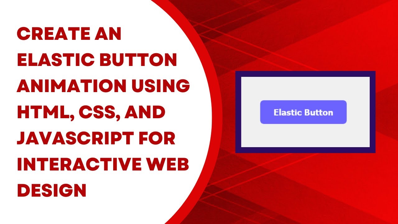
Final Output
When you hover over the button, it will expand slightly and bounce, creating an engaging interactive effect that enhances the user experience.
🚀 Try it out and customize the animation speed, colors, or button size to fit your design needs! 🚀
Watch the Video Tutorial 🎥
Want a step-by-step walkthrough? Watch this tutorial on YouTube:
Access the Code on GitHub
Get the full source code here:
🔗 GitHub Repository
Conclusion
By following this guide, you’ve successfully created an interactive elastic button with only HTML and CSS. This technique is a great way to improve user interaction and make your buttons stand out. Keep experimenting with different animations and transitions to enhance your website’s design! 🎨💡
If you found this tutorial helpful, don’t forget to like, comment, and share. For more exciting web development tutorials, subscribe to Madras Academy on YouTube! 🎯🔥