
Gradient borders are a fantastic way to enhance the visual appeal of buttons and cards on your website. With just HTML and CSS, you can add vibrant gradient effects and even animate them for a dynamic look! In this tutorial, you’ll learn how to create both static and animated gradient borders to make your UI elements stand out.
Why Use Gradient Borders?
- Modern Aesthetic: Gradient borders provide a sleek, trendy appearance.
- Customizable: You can easily adjust colors and animation effects to match your design.
- Interactive: Hover effects and animations improve user engagement.
Step 1: Setting Up the HTML Structure
To begin, we’ll create a button and a card, which will have gradient borders applied.
<!DOCTYPE html>
<html lang="en">
<head>
  <meta charset="UTF-8">
  <meta name="viewport" content="width=device-width, initial-scale=1.0">
  <title>Gradient Borders</title>
  <link rel="stylesheet" href="styles.css">
</head>
<body>
  <button class="gradient-border-button">Click Me</button>
  <div class="gradient-border-card">This is a card with an animated gradient border.</div>
</body>
</html>
Step 2: Styling the Gradient Borders with CSS
We will use border-image-source to create the gradient effect.
body {
  font-family: Arial, sans-serif;
  display: flex;
  flex-direction: column;
  justify-content: center;
  align-items: center;
  height: 100vh;
  margin: 0;
  background-color: #f0f8ff;
}

.gradient-border-button {
  padding: 15px 30px;
  font-size: 18px;
  font-weight: bold;
  color: white;
  background: #000;
  border: 4px solid;
  border-image-slice: 1;
  border-width: 4px;
  border-image-source: linear-gradient(45deg, #ff7f50, #1e90ff, #32cd32);
  border-radius: 12px;
  cursor: pointer;
  text-transform: uppercase;
  transition: background 0.3s;
}

.gradient-border-button:hover {
  background: linear-gradient(45deg, #ff7f50, #1e90ff, #32cd32);
  color: #000;
}

.gradient-border-card {
  margin: 20px 0;
  padding: 30px;
  font-size: 18px;
  color: #333;
  text-align: center;
  width: 300px;
  background-color: white;
  border: 4px solid;
  border-image-slice: 1;
  border-width: 4px;
  border-image-source: linear-gradient(45deg, #ff4500, #1e90ff, #9400d3);
  border-radius: 16px;
  box-shadow: 0 4px 12px rgba(0, 0, 0, 0.1);
  animation: border-animation 6s infinite linear;
}
Step 3: Adding Border Animation
We can animate the gradient border by changing the border-image-source over time.
@keyframes border-animation {
0% {
border-image-source: linear-gradient(45deg, #ff4500, #1e90ff, #9400d3);
}
50% {
border-image-source: linear-gradient(135deg, #9400d3, #32cd32, #ff4500);
}
100% {
border-image-source: linear-gradient(45deg, #ff4500, #1e90ff, #9400d3);
}
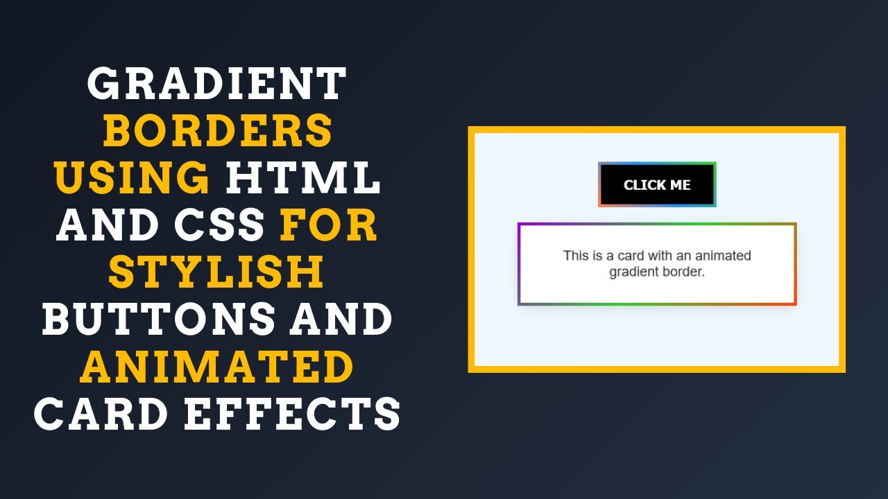
}Final Output 🎨
By applying these styles, you’ll have a button with a gradient border that changes on hover and a card with an animated gradient border. This effect adds a vibrant and modern touch to your UI elements!
🎯 What You Learned:
✅ How to add gradient borders to buttons and cards with CSS 🎨
✅ Using border-image-source for seamless gradient effects ✨
✅ Creating hover effects for interactive button designs 🔄
✅ Applying keyframe animations for dynamic gradient borders 🌈
✅ Customizing colors and animations to suit any design 🎯
Watch the Full Tutorial 🎥
Check out the video tutorial for a step-by-step guide:
Code Repository 📂
Get the complete source code on GitHub:
🔗 GitHub Repository
Keep Learning & Stay Inspired 🚀
If you enjoyed this tutorial, don’t forget to like, comment, and subscribe to Madras Academy for more exciting web development tutorials! 🌟
#HTML #CSS #WebDesign #GradientBorders #WebDevelopment #Coding #FrontendDevelopment #InteractiveDesign #TechTutorial #Animation #WebDesignInspiration 🚀🎉