
A shimmer effect is a sleek and modern way to add a glowing animation to text elements on your website. This tutorial will guide you through creating a stunning shimmer effect using only HTML and CSS, making your headings and titles stand out.
What is a Shimmer Effect?
The shimmer effect creates a moving light reflection across text, giving it a polished and dynamic look. This effect is widely used in UI elements, loading screens, and modern web design to enhance visual appeal.
Why Use the Shimmer Effect?
✅ Enhances the aesthetic appeal of text ✨
✅ Creates an eye-catching, modern design 🎨
✅ Uses only HTML and CSS—no JavaScript needed! 🛠️
✅ Works across all devices and browsers 🌐
✅ Lightweight and performance-friendly 🚀
Step-by-Step Guide to Creating a Shimmer Effect
1️⃣ Set Up the HTML Structure
Begin with a simple HTML file that includes a heading where the shimmer effect will be applied:
<!DOCTYPE html>
<html lang="en">
<head>
<meta charset="UTF-8">
<meta name="viewport" content="width=device-width, initial-scale=1.0">
<title>Shimmer Effect</title>
<link rel="stylesheet" href="styles.css">
</head>
<body>
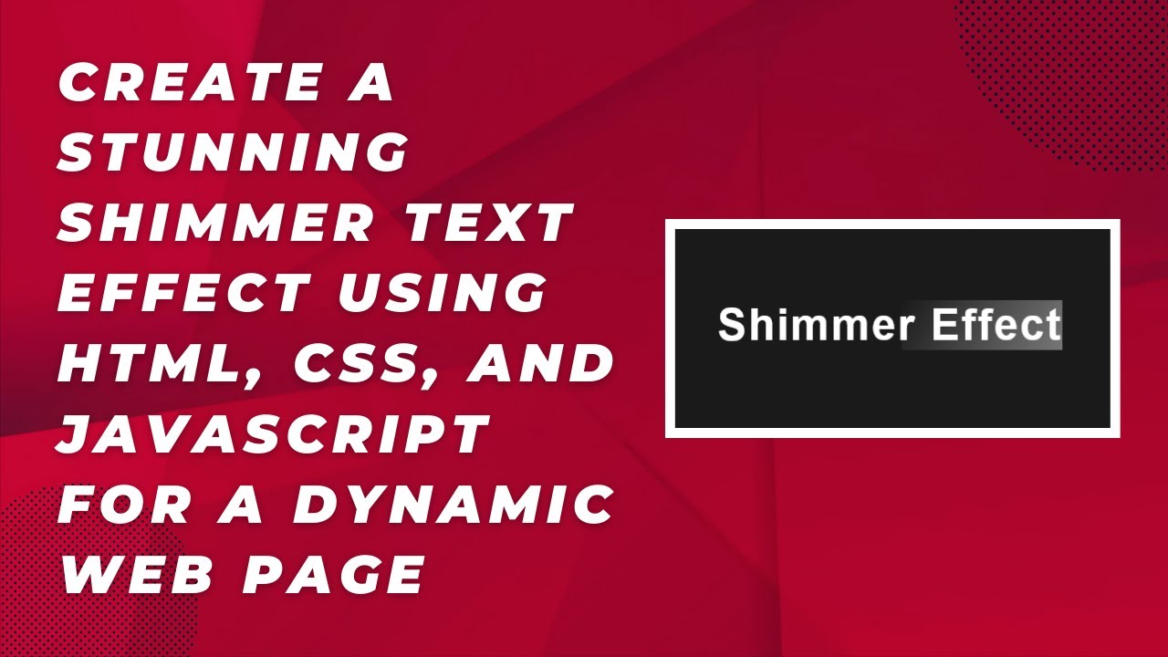
<h1 class="shimmer-text">Shimmer Effect</h1>
</body>
</html>2️⃣ Styling the Shimmer Effect with CSS
Now, let’s add some CSS to create the shimmer animation:
body {
  margin: 0;
  padding: 0;
  display: flex;
  justify-content: center;
  align-items: center;
  height: 100vh;
  font-family: Arial, sans-serif;
  background-color: #1a1a1a;
  color: white;
}

/* Shimmer Text Style */
.shimmer-text {
  font-size: 3rem;
  font-weight: bold;
  position: relative;
  color: #fff;
  overflow: hidden;
  white-space: nowrap;
  letter-spacing: 2px;
}

/* Shimmer Animation */
.shimmer-text::before {
  content: '';
  position: absolute;
  top: 0;
  left: -100%;
  height: 100%;
  width: 100%;
  background: linear-gradient(120deg, rgba(255, 255, 255, 0) 0%, rgba(255, 255, 255, 0.4) 50%, rgba(255, 255, 255, 0) 100%);
  animation: shimmer-animation 2s infinite;
}

/* Shimmer Animation Keyframes */
@keyframes shimmer-animation {
  0% {
    left: -100%;
  }
  100% {
    left: 100%;
  }
}
3️⃣ How It Works
- The
.shimmer-textclass styles the text and positions it relatively. - The
::beforepseudo-element creates an overlay with a gradient effect. - The
@keyframesanimation moves the gradient from left to right, creating a shimmering effect.
Customization Options
You can tweak the effect to suit your design:
- Change animation speed: Adjust the
2sduration in@keyframesto make it faster or slower. - Modify the gradient: Experiment with different opacity values for a softer or sharper effect.
- Apply to other elements: Use the
.shimmer-textclass on buttons, divs, or other elements for a unique look.
Where to Use the Shimmer Effect?
💡 Animated headings for websites
🎮 Game UI elements
🔄 Loading indicators
✨ Attention-grabbing call-to-action buttons
Watch the Video Tutorial
🎥 Learn visually with our step-by-step video guide! Watch it here:
Get the Source Code
📂 Access the complete source code on GitHub: Madras Academy GitHub
By following this guide, you’ve successfully created a smooth shimmer effect using only HTML and CSS. Try experimenting with different styles to enhance your web design!
If you found this tutorial helpful, don’t forget to like, comment, and share! 🚀💡