
Are you looking to add a smooth and mesmerizing wave animation to your website? In this tutorial, we’ll guide you through creating a beautiful wave background animation using just HTML and CSS. This effect can be used for landing pages, website headers, or even as a dynamic background for various web elements.
What You’ll Learn
✅ How to set up a full-page wave background using HTML 🌍
✅ Styling the waves with CSS for smooth animations 🎨
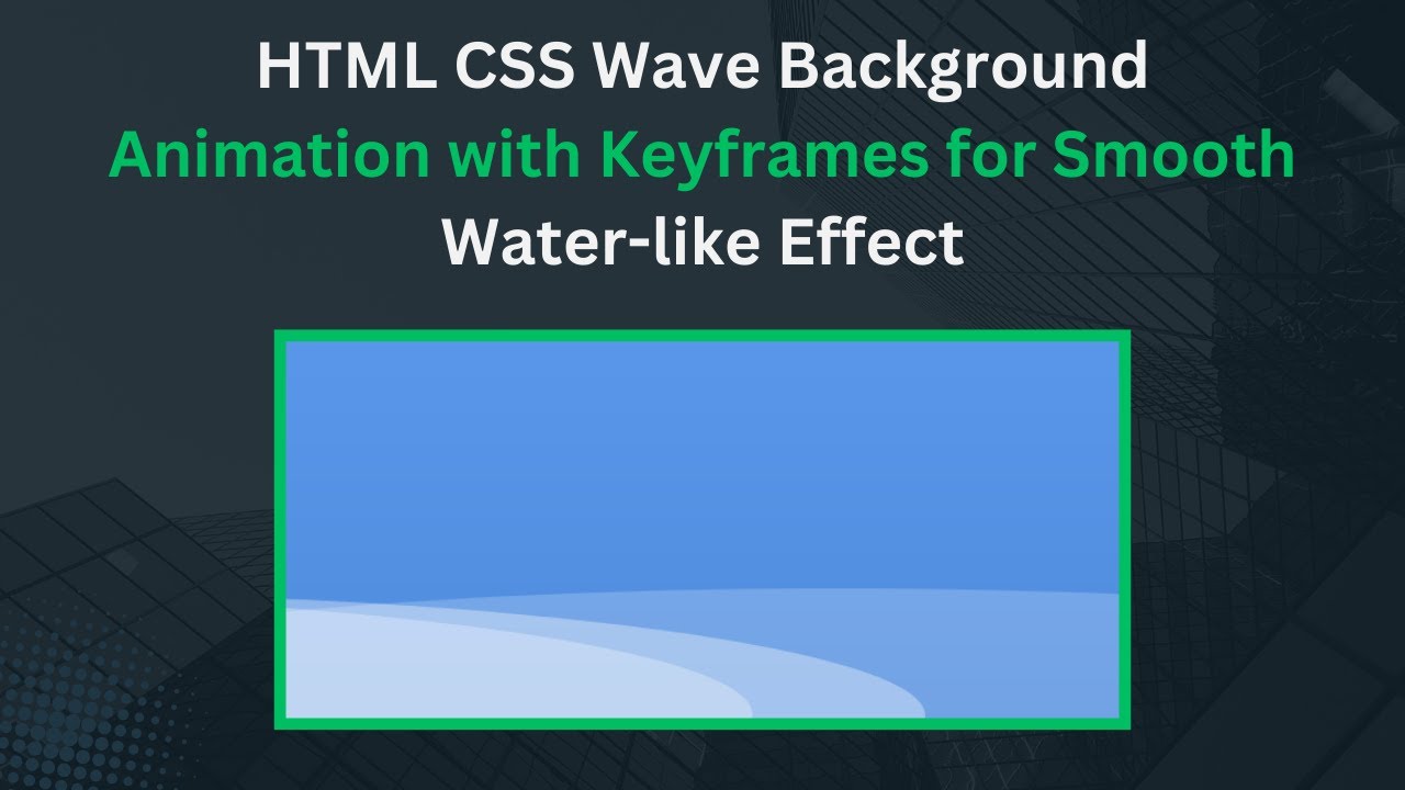
✅ Creating multiple layers of animated waves 🌊✨
✅ Making the waves move at different speeds for a realistic effect 🏄♂️
✅ Optimizing the animation for responsiveness and performance 📱💻
Step 1: Setting Up the HTML Structure
First, create the basic structure for your webpage. We’ll use a <div> container to hold the wave elements.
<!DOCTYPE html>
<html lang="en">
<head>
  <meta charset="UTF-8">
  <meta name="viewport" content="width=device-width, initial-scale=1.0">
  <title>Wave Background Animation</title>
  <link rel="stylesheet" href="styles.css">
</head>
<body>
  <div class="wave-container">
    <div class="wave wave1"></div>
    <div class="wave wave2"></div>
    <div class="wave wave3"></div>
  </div>
</body>
</html>
Step 2: Styling the Waves with CSS
Now, let’s add the CSS to create the wave animation. We’ll use @keyframes to animate the waves.
body, html {
  margin: 0;
  padding: 0;
  width: 100%;
  height: 100%;
  overflow: hidden;
}

.wave-container {
  position: relative;
  width: 100%;
  height: 100vh;
  background: linear-gradient(to bottom, #6aa9ff, #4c88d9);
  overflow: hidden;
}

.wave {
  position: absolute;
  bottom: 0;
  left: 0;
  width: 200%;
  height: 200px;
  background: rgba(255, 255, 255, 0.5);
  opacity: 0.7;
  border-radius: 50%;
  animation: wave-animation 6s linear infinite;
}

.wave2 {
  animation: wave-animation 8s linear infinite;
  opacity: 0.6;
}

.wave3 {
  animation: wave-animation 10s linear infinite;
  opacity: 0.4;
}

@keyframes wave-animation {
  0% {
    transform: translateX(0) translateY(0);
  }
  50% {
    transform: translateX(-50%) translateY(10px);
  }
  100% {
    transform: translateX(-100%) translateY(0);
  }
}
Step 3: Explanation of the Code
- Creating the Wave Layers: We add three
<div>elements inside the.wave-container, each representing a different wave. - Background Styling: We apply a gradient background to the
.wave-containerto enhance the visual effect. - Wave Animation: Using
@keyframes, we animate the waves to move horizontally and slightly vertically. - Layering Waves: Each wave has a different animation duration (
6s,8s, and10s) to create a dynamic movement effect.
Step 4: Optimizing for Performance
- Keep the number of waves minimal to avoid performance issues.
- Use CSS animations instead of JavaScript for better efficiency.
- Test the animation on different screen sizes to ensure responsiveness.
Final Thoughts
By following this tutorial, you now have a beautiful, animated wave background that can make your website more visually appealing. You can tweak the colors, opacity, and animation speed to match your design needs.
Don’t forget to like, comment, and subscribe to stay updated on more exciting web development tutorials! 🚀
📌 Code Repository:
Access the full source code on GitHub:
🔗 GitHub Repo
🎥 Watch the tutorial on YouTube:
📢 Stay Connected
💬 Have questions? Drop a comment below!
📢 Follow Madras Academy for more exciting web design tutorials. 🚀