
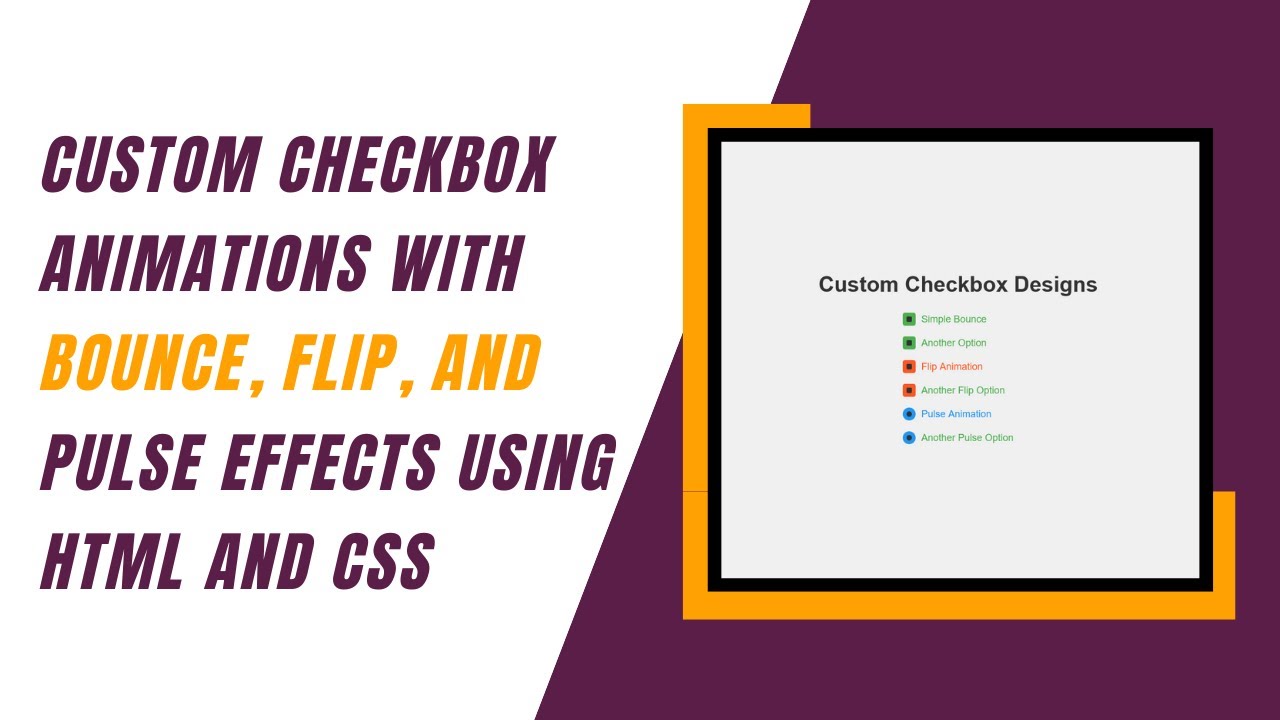
Checkboxes are an essential part of web forms, but they often look plain and boring. In this tutorial, we’ll learn how to create stylish, animated checkboxes using HTML and CSS. These checkboxes include bounce, flip, and pulse effects, making your forms and UI components more interactive and visually appealing. 🌟
Why Use Custom Checkboxes?
By default, checkboxes are basic UI elements with limited styling options. Custom checkboxes allow you to: ✅ Improve the visual appeal of your website 🎨
✅ Enhance user experience with smooth animations 💡
✅ Make your forms more engaging and interactive 🚀
✅ Maintain consistency with your design theme 🎯
Technologies Used
- HTML for structuring the checkboxes
- CSS for styling and animations
Step 1: HTML Structure
We’ll create a simple HTML layout with multiple checkboxes, each with a unique animation style.
<div class="checkbox-container">
    <!-- Style 1: Simple Bounce -->
    <div class="checkbox-item">
        <input type="checkbox" id="checkbox1">
        <label for="checkbox1" class="checkbox-label">
            <span class="checkbox-custom-1"></span>
            Simple Bounce
        </label>
    </div>

    <!-- Style 2: Flip Animation -->
    <div class="checkbox-item">
        <input type="checkbox" id="checkbox4">
        <label for="checkbox4" class="checkbox-label">
            <span class="checkbox-custom-2"></span>
            Flip Animation
        </label>
    </div>

    <!-- Style 3: Pulse Animation -->
    <div class="checkbox-item">
        <input type="checkbox" id="checkbox7">
        <label for="checkbox7" class="checkbox-label">
            <span class="checkbox-custom-3"></span>
            Pulse Animation
        </label>
    </div>
</div>
Step 2: CSS Styling and Animations
Now, let’s style the checkboxes and apply animations.
General Styling
body {
    font-family: Arial, sans-serif;
    display: flex;
    justify-content: center;
    align-items: center;
    height: 100vh;
    background-color: #f0f0f0;
    margin: 0;
    flex-direction: column;
}

.checkbox-container {
    display: flex;
    flex-direction: column;
    gap: 20px;
}

.checkbox-item {
    display: flex;
    align-items: center;
}

.checkbox-label {
    display: flex;
    align-items: center;
    cursor: pointer;
    font-size: 18px;
    color: #333;
}
Style 1: Bounce Animation
.checkbox-custom-1 {
    width: 20px;
    height: 20px;
    border: 2px solid #333;
    border-radius: 4px;
    margin-right: 10px;
    position: relative;
    transition: all 0.3s ease;
}

input[type="checkbox"]:checked + .checkbox-label .checkbox-custom-1 {
    border-color: #4CAF50;
    background-color: #4CAF50;
    animation: bounce 0.5s ease;
}

@keyframes bounce {
    0%, 100% {
        transform: scale(1);
    }
    50% {
        transform: scale(1.2);
    }
}
Style 2: Flip Animation
.checkbox-custom-2 {
    width: 20px;
    height: 20px;
    border: 2px solid #333;
    border-radius: 4px;
    margin-right: 10px;
    position: relative;
    transition: all 0.3s ease;
    transform-style: preserve-3d;
}

input[type="checkbox"]:checked + .checkbox-label .checkbox-custom-2 {
    border-color: #FF5722;
    background-color: #FF5722;
    transform: rotateY(180deg);
}
Style 3: Pulse Animation
.checkbox-custom-3 {
    width: 20px;
    height: 20px;
    border: 2px solid #333;
    border-radius: 50%;
    margin-right: 10px;
    position: relative;
    transition: all 0.3s ease;
}

input[type="checkbox"]:checked + .checkbox-label .checkbox-custom-3 {
    border-color: #2196F3;
    background-color: #2196F3;
    animation: pulse 0.5s ease;
}

@keyframes pulse {
    0%, 100% {
        transform: scale(1);
    }
    50% {
        transform: scale(1.1);
    }
}
Final Thoughts
By following this tutorial, you’ve learned how to create custom animated checkboxes with different effects like bounce, flip, and pulse. These animations make your checkboxes more interactive and visually appealing, improving the user experience on your website. 🎨✨
🚀 Next Steps: Try customizing the colors, sizes, and animation speeds to match your website’s theme!
Watch the Tutorial
🎥 Watch the full video tutorial on YouTube:
Access the Code
💻 Get the complete source code on GitHub: Madras Academy
If you found this tutorial helpful, don’t forget to like, comment, and subscribe to Madras Academy for more exciting web development tutorials! 🚀🎉
#HTML #CSS #WebDesign #CheckboxAnimation #WebDevelopment #Tutorial #FrontendDevelopment #UI #InteractiveDesign #WebDesignInspiration