
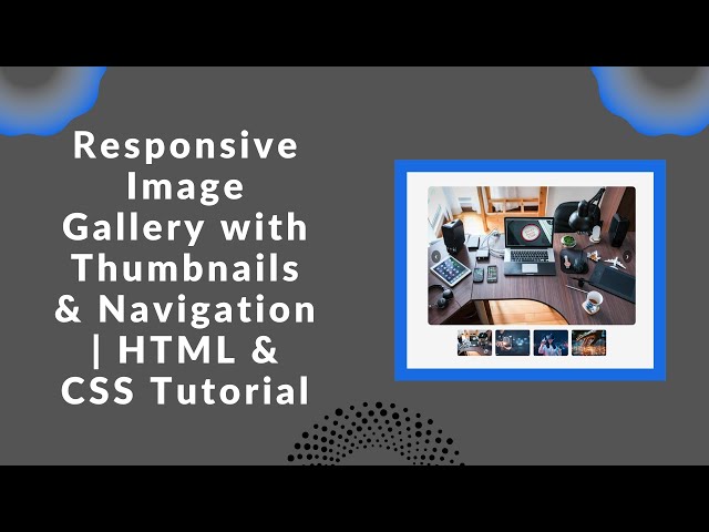
Creating a visually appealing and fully responsive image gallery is a great way to enhance any website. In this step-by-step tutorial, we’ll walk you through how to build a modern image gallery using HTML, CSS, and a bit of JavaScript for smooth navigation.
With this guide, you’ll learn how to implement thumbnail previews and navigation arrows, making it easy for users to browse through images seamlessly. Whether you’re a beginner or an experienced developer, this tutorial will help you create a stylish gallery that adapts perfectly to different screen sizes.
🎯 What You’ll Learn
✅ Designing a responsive image gallery layout
✅ Adding thumbnail previews for quick navigation
✅ Implementing next/previous navigation arrows
✅ Optimizing the gallery for mobile-friendly browsing
📌 Step 1: Setting Up the HTML Structure
We’ll start by creating the basic structure of our gallery using HTML. This will include:
- A main image display area
- Left and right navigation arrows
- A thumbnail section for selecting images
Here’s the HTML code for our gallery:
<!DOCTYPE html>
<html lang="en">
<head>
<meta charset="UTF-8">
<meta name="viewport" content="width=device-width, initial-scale=1.0">
<title>Responsive Image Gallery</title>
<link rel="stylesheet" href="styles.css">
</head>
<body>
<div class="gallery">
<div class="main-image">
<button class="arrow arrow-left" onclick="prevImage()">❮</button>
<img id="displayedImage" src="1.jpg" alt="Main Image">
<button class="arrow arrow-right" onclick="nextImage()">❯</button>
</div>
<div class="thumbnails">
<img src="1.jpg" onclick="changeImage(this.src)" alt="Thumbnail 1">
<img src="2.jpg" onclick="changeImage(this.src)" alt="Thumbnail 2">
<img src="3.jpg" onclick="changeImage(this.src)" alt="Thumbnail 3">
<img src="4.jpg" onclick="changeImage(this.src)" alt="Thumbnail 4">
</div>
</div>
<script src="script.js"></script>
</body>
</html>
📌 Step 2: Styling the Gallery with CSS
Next, let’s style our gallery to make it visually appealing and responsive. We’ll use CSS to:
- Adjust the layout and positioning
- Style the navigation arrows
- Add hover effects to thumbnails
Here’s the CSS code:
body {
    font-family: Arial, sans-serif;
    display: flex;
    justify-content: center;
    align-items: center;
    height: 100vh;
    background-color: #f5f5f5;
}
.gallery {
    position: relative;
    max-width: 600px;
    width: 100%;
}
.main-image {
    position: relative;
}
.main-image img {
    width: 100%;
    height: 400px;
    object-fit: cover;
    border-radius: 10px;
}
.arrow {
    position: absolute;
    top: 50%;
    transform: translateY(-50%);
    background: rgba(0, 0, 0, 0.5);
    color: white;
    border: none;
    padding: 10px;
    cursor: pointer;
    border-radius: 50%;
}
.arrow-left {
    left: 10px;
}
.arrow-right {
    right: 10px;
}
.thumbnails {
    display: flex;
    justify-content: center;
    gap: 10px;
    margin-top: 10px;
    flex-wrap: wrap;
}
.thumbnails img {
    width: 22%;
    max-width: 100px;
    height: auto;
    aspect-ratio: 4/3;
    object-fit: cover;
    cursor: pointer;
    border-radius: 5px;
    transition: transform 0.3s;
}
.thumbnails img:hover {
    transform: scale(1.1);
}
📌 Step 3: Adding Functionality with JavaScript
Now, let’s add JavaScript to enable navigation through the images. The script will:
- Change the main image when clicking a thumbnail
- Navigate images using left and right arrows
Here’s the JavaScript code:
const images = ["1.jpg", "2.jpg", "3.jpg", "4.jpg"];
let currentIndex = 0;

function changeImage(src) {
    document.getElementById('displayedImage').src = src;
    currentIndex = images.indexOf(src);
}

function prevImage() {
    currentIndex = (currentIndex - 1 + images.length) % images.length;
    document.getElementById('displayedImage').src = images[currentIndex];
}

function nextImage() {
    currentIndex = (currentIndex + 1) % images.length;
    document.getElementById('displayedImage').src = images[currentIndex];
}
🚀 Final Thoughts
With just HTML, CSS, and a bit of JavaScript, you’ve built a fully responsive image gallery that allows users to navigate images easily using thumbnails and arrows. You can further customize it by adding animations or integrating a lightbox effect!
📌 Want the full source code? Check it out here:
🔗 GitHub Repository
📺 Watch the step-by-step video tutorial:
Don’t forget to LIKE 👍, COMMENT 💬, and SUBSCRIBE 🔔 for more web development tutorials!
#WebDevelopment #ResponsiveDesign #ImageGallery #HTML #CSS #JavaScript