
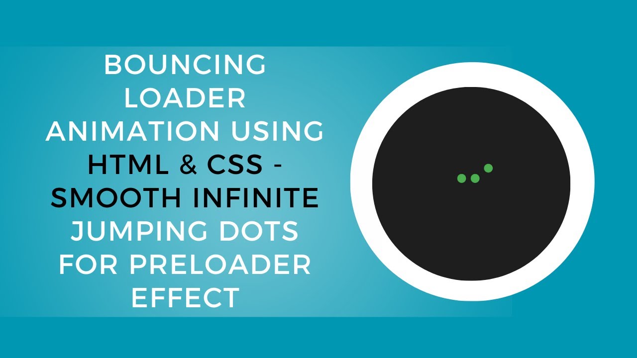
A great user experience is key to keeping visitors engaged, and a smooth loading animation can make the waiting time feel shorter and more visually appealing. In this tutorial, you’ll learn how to create a bouncing loader animation using HTML and CSS. This modern preloader adds a fun and interactive element to your website, making it more engaging for users during page load times.
What You’ll Learn:
- Creating a basic loader structure using HTML 🖥️
- Styling the loader with CSS animations for a smooth bounce effect 🎨
- Using keyframes to animate multiple elements for a dynamic effect 🎬
- Applying staggered animations to create natural movement 🔄
- Customizing the loader to fit your website’s theme 🎯
Step 1: Basic HTML Structure for the Loader
The first thing you need is a simple HTML structure. We’ll create a div container to hold the individual bouncing balls. Each ball will be a div element within this container.
<div class="loader">
    <div></div>
    <div></div>
    <div></div>
</div>
Step 2: Styling the Loader with CSS
We will use CSS Flexbox to align the loader items. Each ball will be a circle, and we’ll apply animations to make them bounce. Let’s start with the basic styling for the loader.
body {
  display: flex;
  justify-content: center;
  align-items: center;
  height: 100vh;
  margin: 0;
  background-color: #1e1e1e;
  font-family: Arial, sans-serif;
}

.loader {
  display: flex;
  justify-content: space-between;
  align-items: flex-end;
  width: 80px;
}

.loader div {
  width: 20px;
  height: 20px;
  background-color: #4caf50;
  border-radius: 50%;
  animation: bounce 0.6s infinite ease-in-out;
}
Step 3: Adding the Bounce Animation
The next step is to add the animation. We’ll use CSS keyframes to animate the bounce effect. The balls will bounce up and down in a smooth, looping motion. To create a staggered effect, we’ll delay the animations for each ball.
.loader div:nth-child(1) {
  animation-delay: 0s;
}

.loader div:nth-child(2) {
  animation-delay: 0.2s;
}

.loader div:nth-child(3) {
  animation-delay: 0.4s;
}

@keyframes bounce {
  0%, 100% {
    transform: translateY(0);
  }
  50% {
    transform: translateY(-30px);
  }
}
Step 4: Customizing the Loader
You can easily customize the loader’s colors, size, and speed to match your website’s theme. For example, changing the background color of the loader or adjusting the animation duration can create different visual effects.
YouTube Tutorial
If you want a more detailed, step-by-step walkthrough, check out the YouTube video tutorial below:
Conclusion
In this tutorial, you’ve learned how to create a fun and visually appealing bouncing loader animation using HTML and CSS. You can now apply this technique to enhance your website’s loading experience and engage your users while they wait. It’s a simple yet effective way to improve the overall feel of your website.
For the complete source code, visit the GitHub repository:
Code Repository:
GitHub – Bouncing Loader Animation
If you enjoyed this tutorial, don’t forget to like, comment, and subscribe for more exciting web development tutorials!