
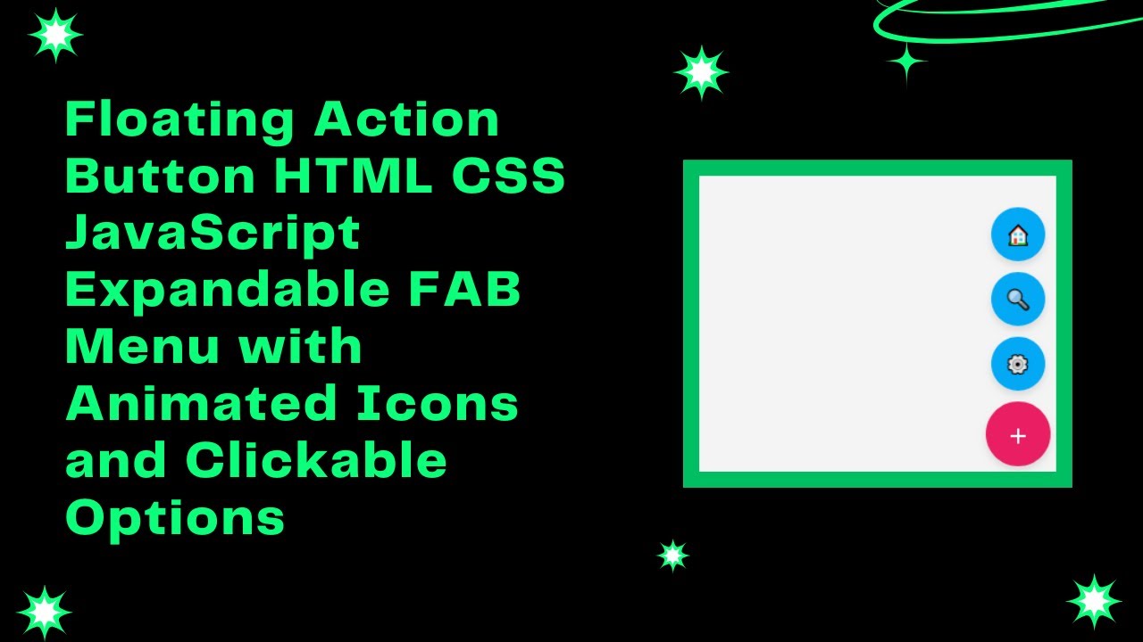
In this tutorial, we’ll walk you through the process of creating a Floating Action Button (FAB) using HTML, CSS, and JavaScript. A FAB is a modern and intuitive UI element that allows users to quickly access key actions like Home, Search, and Settings. It’s a great way to enhance the usability and user experience of your website or web app! 🚀🔘
What You’ll Learn:
- How to Create a FAB with HTML 🏗️
- Styling the FAB with CSS for a Sleek and Modern Look 🎨
- Adding Hover Effects and Animations for Smooth Interactions ⬆️
- Implementing a Toggle Function with JavaScript for Dynamic Behavior ⚙️
- Customizing the FAB to Fit Your Website’s Design and Branding 🎯
Step-by-Step Guide:
1. HTML Structure for the FAB 🏗️
We’ll begin by structuring the HTML. The FAB will be a button that sits on the bottom-right corner of the screen. It will reveal additional action buttons when clicked.
<!DOCTYPE html>
<html lang="en">
<head>
    <meta charset="UTF-8">
    <meta name="viewport" content="width=device-width, initial-scale=1.0">
    <title>Floating Action Button</title>
    <style>
        /* Your CSS goes here */
    </style>
</head>
<body>

    <div class="fab-container">
        <button class="fab" onclick="toggleFab()">+</button>
        <div class="fab-options">
            <button onclick="alert('Home Clicked!')">🏠</button>
            <button onclick="alert('Search Clicked!')">🔍</button>
            <button onclick="alert('Settings Clicked!')">⚙️</button>
        </div>
    </div>

    <script>
        function toggleFab() {
            const fabOptions = document.querySelector('.fab-options');
            fabOptions.style.display = fabOptions.style.display === 'flex' ? 'none' : 'flex';
        }
    </script>

</body>
</html>
2. CSS Styling for the FAB 🎨
Next, let’s style the FAB and the action buttons. The main FAB button will be a circle with a “+” sign, and when hovered, it will change colors. We’ll also style the action buttons to look like smaller floating circles.
body {
    font-family: Arial, sans-serif;
    margin: 0;
    height: 100vh;
    display: flex;
    justify-content: center;
    align-items: center;
    background: #f4f4f4;
}

.fab-container {
    position: fixed;
    bottom: 20px;
    right: 20px;
}

.fab {
    width: 60px;
    height: 60px;
    background: #ff4081;
    color: white;
    border: none;
    border-radius: 50%;
    font-size: 24px;
    display: flex;
    align-items: center;
    justify-content: center;
    cursor: pointer;
    box-shadow: 0 4px 6px rgba(0, 0, 0, 0.1);
    transition: transform 0.3s ease-in-out;
}

.fab:hover {
    background: #e91e63;
}

.fab-options {
    position: absolute;
    bottom: 70px;
    right: 5px;
    display: none;
    flex-direction: column;
    gap: 10px;
}

.fab-options button {
    width: 50px;
    height: 50px;
    border: none;
    border-radius: 50%;
    background: #03a9f4;
    color: white;
    font-size: 18px;
    cursor: pointer;
    box-shadow: 0 4px 6px rgba(0, 0, 0, 0.1);
}

.fab-options button:hover {
    background: #0288d1;
}
3. JavaScript for the Toggle Functionality ⚙️
We want the FAB to toggle between showing and hiding the additional action buttons when clicked. Let’s implement a simple JavaScript function to do this.
function toggleFab() {
    const fabOptions = document.querySelector('.fab-options');
    fabOptions.style.display = fabOptions.style.display === 'flex' ? 'none' : 'flex';
}
This JavaScript function will toggle the visibility of the .fab-options div whenever the main FAB button is clicked.
Final Thoughts:
By the end of this tutorial, you’ll have created a fully functional, interactive, and mobile-friendly Floating Action Button (FAB). The FAB provides a modern and user-friendly way to access important actions on your website, improving both navigation and user experience.
Watch the Full Tutorial: For a more in-depth guide, check out the full video tutorial on YouTube:
Access the Code: You can access the complete source code for this FAB on GitHub: GitHub Repo – Floating Action Button
If you found this tutorial helpful, don’t forget to like, comment, and subscribe to Madras Academy for more exciting web development tutorials! 🚀