
Adding dynamic animations to your website can enhance the user experience and make your design more engaging. In this tutorial, you’ll learn how to create a mesmerizing animated morphing blob using only HTML and CSS. This animation loops infinitely and can be used for creative landing pages, UI elements, or just for fun!
🔥 What You’ll Learn
✅ How to create a smooth morphing animation with CSS 🎨
✅ Styling the blob shape with gradients for a vibrant effect 🌈
✅ Using CSS keyframes to animate shape transformations 🔄
✅ Making the animation loop infinitely for continuous movement ♻️
✅ Adding a colorful background to enhance the overall look 🌟
By the end of this tutorial, you’ll have an eye-catching animated blob that you can integrate into your web projects.
✨ Step 1: Setting Up the HTML Structure
We start with a simple HTML structure. The blob animation will be wrapped inside a div with the class .blob.
<!DOCTYPE html>
<html lang="en">
<head>
<meta charset="UTF-8">
<meta name="viewport" content="width=device-width, initial-scale=1.0">
<title>Blob Animation</title>
<link rel="stylesheet" href="styles.css">
</head>
<body>
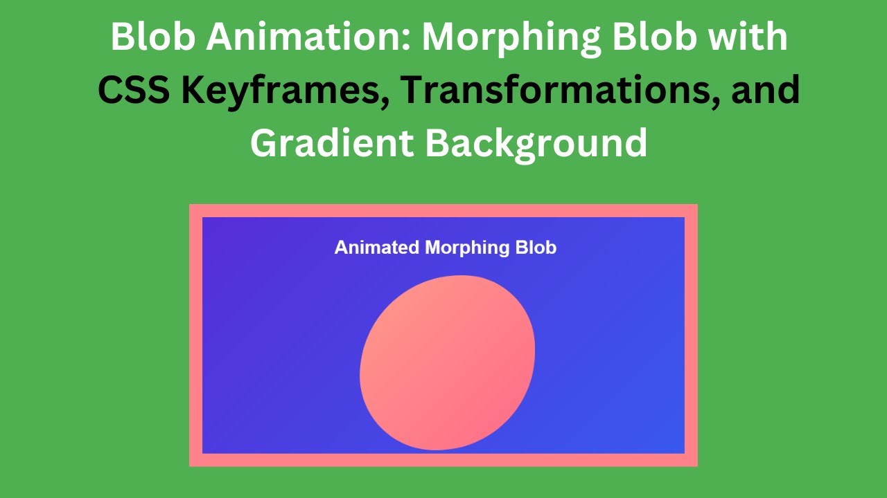
<h1>Animated Morphing Blob</h1>
<div class="blob"></div>
</body>
</html>🎨 Step 2: Styling the Blob with CSS
Now, let’s add some styling to create the animated blob effect. We’ll use CSS keyframes to create a smooth morphing animation.
body {
  margin: 0;
  padding: 0;
  height: 100vh;
  display: flex;
  flex-direction: column;
  justify-content: center;
  align-items: center;
  background: linear-gradient(135deg, #6a11cb, #2575fc);
  overflow: hidden;
  font-family: Arial, sans-serif;
  color: #ffffff;
}

h1 {
  margin-bottom: 2rem;
  font-size: 2rem;
  font-weight: bold;
}

.blob {
  width: 300px;
  height: 300px;
  background: linear-gradient(135deg, #ff9a8b, #ff6a88);
  border-radius: 50%;
  position: relative;
  animation: morph 8s infinite ease-in-out;
}

@keyframes morph {
  0% {
    border-radius: 60% 40% 60% 40%;
    transform: translate(0, 0);
  }
  25% {
    border-radius: 50% 50% 40% 60%;
    transform: translate(20px, -20px);
  }
  50% {
    border-radius: 40% 60% 60% 40%;
    transform: translate(-20px, 20px);
  }
  75% {
    border-radius: 60% 40% 50% 50%;
    transform: translate(10px, -10px);
  }
  100% {
    border-radius: 60% 40% 60% 40%;
    transform: translate(0, 0);
  }
}
🚀 Final Thoughts
With just HTML and CSS, you’ve created a beautiful, animated morphing blob that adds a unique visual effect to your website. You can customize the colors, speed, and shape transitions to fit your design needs.
👉 Want more interactive web designs? Check out the complete source code on GitHub:
🔗 GitHub Repository
🎥 Watch the video tutorial on YouTube:
If you found this tutorial helpful, don’t forget to like, comment, and subscribe to Madras Academy for more exciting web development guides! 🚀✨
#HTML #CSS #Animation #WebDesign #FrontendDevelopment #TechTutorial #WebDevelopment #CreativeCoding