
Creating an interactive particle background can add a modern and engaging effect to your website. In this tutorial, we’ll walk through the process of building a dynamic particle animation using HTML, CSS, and JavaScript.
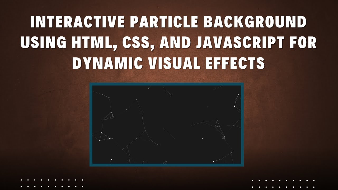
What is a Particle Background?
A particle background consists of small animated dots (particles) that move around the screen, dynamically connecting when they get close to each other. This effect is often used in modern web design to enhance visual appeal and interactivity.
Features of This Particle Animation
✅ Full-screen animated background 🎨
✅ Moving particles that bounce off screen edges ⚡
✅ Dynamic connections between nearby particles 🌟
✅ Responsive design that adapts to screen size 📐
✅ Customizable speed, size, and color settings 🎯
Step-by-Step Guide to Building the Particle Background
1. Setting Up the HTML Structure
We start with a simple HTML structure that includes a <canvas> element where our animation will be rendered.
<!DOCTYPE html>
<html lang="en">
<head>
  <meta charset="UTF-8">
  <meta name="viewport" content="width=device-width, initial-scale=1.0">
  <title>Interactive Particle Background</title>
  <style>
    body {
      margin: 0;
      padding: 0;
      overflow: hidden;
      height: 100vh;
      display: flex;
      align-items: center;
      justify-content: center;
      background-color: #1a1a1a;
    }

    canvas {
      position: absolute;
      top: 0;
      left: 0;
    }
  </style>
</head>
<body>
  <canvas id="particle-canvas"></canvas>
</body>
</html>
2. Adding the JavaScript for Particle Animation
Next, we create a JavaScript file that will handle the particle animation.
const canvas = document.getElementById('particle-canvas');
const ctx = canvas.getContext('2d');

// Resize canvas to fill the screen
canvas.width = window.innerWidth;
canvas.height = window.innerHeight;

const particlesArray = [];
const particleCount = 100;
const maxDistance = 150;

// Particle object
class Particle {
  constructor(x, y, size, speedX, speedY) {
    this.x = x;
    this.y = y;
    this.size = size;
    this.speedX = speedX;
    this.speedY = speedY;
  }

  draw() {
    ctx.fillStyle = '#ffffff';
    ctx.beginPath();
    ctx.arc(this.x, this.y, this.size, 0, Math.PI * 2);
    ctx.closePath();
    ctx.fill();
  }

  update() {
    this.x += this.speedX;
    this.y += this.speedY;

    // Bounce off edges
    if (this.x < 0 || this.x > canvas.width) this.speedX *= -1;
    if (this.y < 0 || this.y > canvas.height) this.speedY *= -1;
  }
}

// Create particles
function initParticles() {
  for (let i = 0; i < particleCount; i++) {
    const size = Math.random() * 3 + 1;
    const x = Math.random() * canvas.width;
    const y = Math.random() * canvas.height;
    const speedX = (Math.random() - 0.5) * 2;
    const speedY = (Math.random() - 0.5) * 2;
    particlesArray.push(new Particle(x, y, size, speedX, speedY));
  }
}

// Draw lines between particles close to each other
function connectParticles() {
  for (let i = 0; i < particlesArray.length; i++) {
    for (let j = i + 1; j < particlesArray.length; j++) {
      const dx = particlesArray[i].x - particlesArray[j].x;
      const dy = particlesArray[i].y - particlesArray[j].y;
      const distance = Math.sqrt(dx * dx + dy * dy);
      if (distance < maxDistance) {
        ctx.strokeStyle = `rgba(255, 255, 255, ${1 - distance / maxDistance})`;
        ctx.lineWidth = 1;
        ctx.beginPath();
        ctx.moveTo(particlesArray[i].x, particlesArray[i].y);
        ctx.lineTo(particlesArray[j].x, particlesArray[j].y);
        ctx.stroke();
      }
    }
  }
}

// Animate particles
function animate() {
  ctx.clearRect(0, 0, canvas.width, canvas.height);
  particlesArray.forEach(particle => {
    particle.update();
    particle.draw();
  });
  connectParticles();
  requestAnimationFrame(animate);
}

// Adjust canvas size on window resize
window.addEventListener('resize', () => {
  canvas.width = window.innerWidth;
  canvas.height = window.innerHeight;
});

// Initialize and start animation
initParticles();
animate();
Customization Options
You can modify the following parameters to suit your design needs:
- Particle Size: Adjust the
sizeproperty inside theinitParticles()function. - Particle Speed: Modify
speedXandspeedYto control movement. - Particle Count: Increase or decrease
particleCountfor different effects. - Line Connection Distance: Change
maxDistanceto modify the range of connections.
Final Thoughts
By following this tutorial, you’ve successfully built an interactive particle background using HTML, CSS, and JavaScript! This effect can enhance the aesthetics of your website, making it more visually appealing and interactive.
🔗 Live Demo & Source Code: GitHub Repository
🎥 Video Tutorial:
If you found this tutorial helpful, don’t forget to share, like, and subscribe to Madras Academy for more web development tutorials! 🚀