
Adding interactive elements to your website enhances user engagement and makes your design more appealing. In this tutorial, you’ll learn how to create an interactive star design using HTML, CSS, and JavaScript. This star will rotate and change color when hovered over, adding a dynamic effect to your webpage. Perfect for UI enhancements, animations, or creative web projects! 🌟✨
What You’ll Learn
✅ How to create an SVG star shape using HTML 🖥️
✅ Styling the star with CSS for a polished and interactive look 🎨
✅ Adding hover effects to rotate and change the star’s color 💫
✅ Creating smooth animations and transitions for better UX 🌟
✅ Customizing the star design to match your creative vision 🎯
Step 1: HTML Structure
First, let’s create the basic structure using HTML. The star shape is implemented using an SVG element.
<!DOCTYPE html>
<html lang="en">
<head>
<meta charset="UTF-8">
<meta name="viewport" content="width=device-width, initial-scale=1.0">
<title>Interactive Star Design</title>
<link rel="stylesheet" href="styles.css">
</head>
<body>
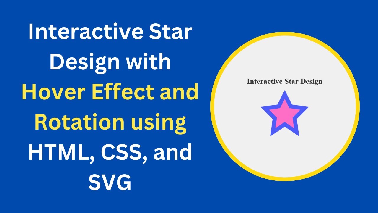
<h1>Interactive Star Design</h1>
<div class="star-container">
<svg viewBox="0 0 24 24" xmlns="http://www.w3.org/2000/svg">
<path class="star" d="M12 2L15 8L22 9L17 14L18 21L12 17L6 21L7 14L2 9L9 8L12 2Z" />
</svg>
</div>
</body>
</html>Step 2: Styling with CSS
Now, let’s style the star using CSS to give it a modern and interactive look.
body, html {
  margin: 0;
  padding: 0;
  height: 100%;
  display: flex;
  justify-content: center;
  align-items: center;
  flex-direction: column;
  background-color: #f0f0f0;
}

h1 {
  font-size: 2em;
  margin-bottom: 20px;
  color: #333;
}

.star-container {
  width: 200px;
  height: 200px;
  cursor: pointer;
}

svg {
  width: 100%;
  height: 100%;
  transition: transform 0.5s ease, fill 0.5s ease;
}

.star {
  fill: #ff6ec7;
  stroke: #4d5bf9;
  stroke-width: 2;
  transition: fill 0.3s ease;
}

.star-container:hover svg {
  transform: rotate(360deg);
  fill: #4d5bf9;
}
This CSS code ensures that when the user hovers over the star, it rotates and changes color smoothly.
Demo Video 🎥
Watch the step-by-step video tutorial here:
Code Repository 📂
Get the full source code on GitHub:
👉 GitHub Repository
Conclusion
By following this tutorial, you’ve learned how to create an interactive star design using HTML, CSS, and JavaScript. You can now integrate this effect into your web projects to make them more engaging and visually appealing. Feel free to customize the colors, size, and animations to match your website’s theme! 🚀
If you enjoyed this tutorial, don’t forget to like, comment, and subscribe to Madras Academy for more web development guides and creative design tutorials. Happy coding! 🎨✨