
A well-designed footer is essential for any website. It enhances navigation, improves user experience, and adds professionalism to your site. In this tutorial, we’ll create a modern, responsive footer with social icons, quick links, and a newsletter subscription form using HTML and CSS. Let’s dive in! 🚀
Why a Good Footer Matters?
A website footer is more than just an afterthought. It serves several purposes: ✅ Provides important links for easy navigation 📌
✅ Enhances brand credibility with an about section 📖
✅ Includes social media icons for better engagement 📢
✅ Offers a newsletter signup to retain visitors ✉️
✅ Improves overall website aesthetics and usability 🎨
With these in mind, let’s create a professional and functional footer that fits any website! 🌐
Step 1: HTML Structure
We’ll start by structuring the footer using semantic HTML. This includes sections for About Us, Quick Links, and a Newsletter Subscription Form.
<!DOCTYPE html>
<html lang="en">
<head>
<meta charset="UTF-8">
<meta name="viewport" content="width=device-width, initial-scale=1.0">
<title>Enhanced Footer Design</title>
<link href="https://cdnjs.cloudflare.com/ajax/libs/font-awesome/6.0.0/css/all.min.css" rel="stylesheet">
<link rel="stylesheet" href="styles.css">
</head>
<body>
<div class="content">
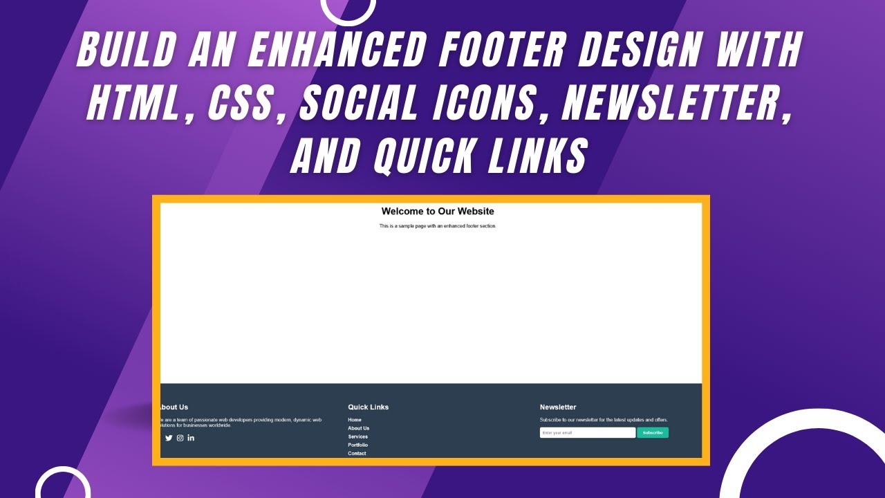
<h1>Welcome to Our Website</h1>
<p>This is a sample page with an enhanced footer section.</p>
</div>
<footer class="footer">
<!-- About Us Section -->
<div class="footer-section">
<h3>About Us</h3>
<p>We are a team of passionate web developers providing modern, dynamic web solutions for businesses worldwide.</p>
<div class="social-icons">
<a href="#" title="Facebook"><i class="fab fa-facebook-f"></i></a>
<a href="#" title="Twitter"><i class="fab fa-twitter"></i></a>
<a href="#" title="Instagram"><i class="fab fa-instagram"></i></a>
<a href="#" title="LinkedIn"><i class="fab fa-linkedin-in"></i></a>
</div>
</div>
<!-- Quick Links Section -->
<div class="footer-section">
<h3>Quick Links</h3>
<ul class="footer-links">
<li><a href="#">Home</a></li>
<li><a href="#">About Us</a></li>
<li><a href="#">Services</a></li>
<li><a href="#">Portfolio</a></li>
<li><a href="#">Contact</a></li>
</ul>
</div>
<!-- Newsletter Section -->
<div class="footer-section">
<h3>Newsletter</h3>
<p>Subscribe to our newsletter for the latest updates and offers.</p>
<input type="email" class="newsletter-input" placeholder="Enter your email">
<button class="subscribe-btn">Subscribe</button>
</div>
</footer>
</body>
</html>✔ Uses semantic HTML for better readability and SEO.
✔ Divides the footer into clear sections for easy navigation.
✔ Includes social media icons using Font Awesome.
Step 2: Styling with CSS
Now, let’s add styling to make our footer look sleek and professional.
body {
  font-family: Arial, sans-serif;
  margin: 0;
  padding: 0;
  display: flex;
  flex-direction: column;
  min-height: 100vh;
}

.content {
  flex: 1;
  padding: 20px;
  text-align: center;
}

/* Footer styles */
.footer {
  background-color: #2c3e50;
  color: #ffffff;
  padding: 40px 20px;
  text-align: left;
  display: flex;
  flex-wrap: wrap;
  justify-content: space-between;
  gap: 40px;
}

.footer-section {
  flex: 1 1 250px;
}

.footer h3 {
  margin-bottom: 20px;
  font-size: 1.5rem;
}

/* Footer links */
.footer-links {
  list-style: none;
  padding: 0;
  margin: 0;
}

.footer-links a {
  text-decoration: none;
  color: #ffffff;
  display: block;
  margin-bottom: 10px;
  font-weight: bold;
  transition: color 0.3s;
}

.footer-links a:hover {
  color: #1abc9c;
}

/* Social icons */
.social-icons {
  display: flex;
  gap: 15px;
  margin-top: 20px;
}

.social-icons a {
  color: #ffffff;
  font-size: 1.5rem;
  text-decoration: none;
  transition: transform 0.3s;
}

.social-icons a:hover {
  transform: scale(1.2);
  color: #1abc9c;
}

/* Newsletter input styles */
.newsletter-input {
  padding: 10px;
  width: 80%;
  max-width: 300px;
  border: none;
  border-radius: 5px;
  margin-bottom: 10px;
}

.subscribe-btn {
  padding: 10px 20px;
  background-color: #1abc9c;
  color: #ffffff;
  border: none;
  border-radius: 5px;
  cursor: pointer;
  font-weight: bold;
  transition: background-color 0.3s;
}

.subscribe-btn:hover {
  background-color: #16a085;
}
✔ Uses flexbox for a responsive layout.
✔ Adds hover effects for interactive elements.
✔ Uses contemporary colors and fonts for a modern look.
Final Thoughts
In this tutorial, we built a modern, professional footer using HTML and CSS. This design is fully customizable and can be adapted to any website.
💡 Next Steps:
✅ Experiment with different color themes 🎨
✅ Make it fully responsive for mobile users 📱
✅ Add JavaScript validation for the newsletter form 🛠️
🎥 Watch the Full Video Tutorial
📂 Download the Full Code
🔗 GitHub Repository
👍 If you found this tutorial helpful, like, comment, and subscribe to Madras Academy for more exciting web development content! 🚀